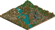
Park / Busch Gardens North America
-
 20-November 08
- Views 7,583
- Downloads 819
- Fans 1
- Comments 24
-

-
 76.79%(required: 65%) Pro Tour 3
FullMetal 90% nin 90% Kumba 85% CedarPoint6 80% ChillerHockey33 80% Fr3ak 80% Magnus 80% posix 80% Xcoaster 80% Evil WME 75% geewhzz 75% Milo 75% RCTFAN 70% zodiac 65% postit 60% chapelz 55% 76.79% -
1 fan Fans of this park
-
Full-Size Map
-
Download Park
819
-
Tags
Similar Parks
-
NeMica-Forgotten Land
-
Canthose Valley Theme Park
-
Tropico Cove
-
Terra Antico
-
Pangaea
-
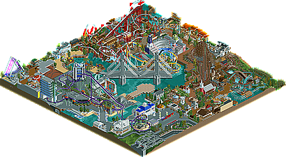
Busch Gardens North America (2010)
What's the difference in score? Busch Gardens North America got a score of 15.31 and Pangaea had 14.62. This means only a 4.72% increase in score over Pangaea. Basically it couldn't have been much closer. Now it's only one more entry until we have our winner!
I hate it with a passion. It's the style that I really dislike. Yes it's very well done and everything and it shows that you have the skill. But it really misses the fun factor. I found the park overall to be incredibly boring and drab and it lacked the fun elements that can be found in other realistic parks. I'm not really a fan of realistic parks and I prefer Gwazi's and Jazz's parks both over this one. Jazz's park had the fun factor in it and gwazi's had the chill factor. It's a great effort and a good job but it's not what I like.
I do not like this theme park!
.Very confused
.Incomplete
.Does not have harmony between different environments and attractions
.Poor organization
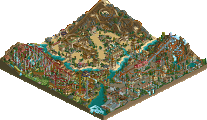
In my opinion Busch Gardens North America should be in 6th place...
Edited by X_Fusion, 20 November 2008 - 06:18 PM.
Xcoaster Offline
Anyways, great job on the #2 spot and I hope you'll still finish this up!
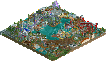
There were countless details, you can make huge structures that rival RCTNW, every layout and support was perfect, your hacks were ingenious and original, and the architecture was perfect.
That being said I actually really really disliked the park. While it had decent flow to it the themed areas all seemed random and everything was so far on top of each other that I just got distracted. Even though I loved everything you had on the lake, I probably would have liked the park even more without them.
The patio sticking out into the lake had great atmosphere, the Dive Machine construction was done more realistically then any counstruction site before, and the bridge was like no other I've ever seen, but they sort of ruined the atmosphere in the end. The peaceful lake in the middle was turned into a construction site, and now the stadium appears as an arena to sit and watch a coaster instruction rather then to sit and enjoy a show.
Overall you showed by far the most skill in this competition, and I wouldn't say anyone even rivaled you in that department, but IMO there has been at least two better parks so far.
I did have a few problems with this, however. The unfinishedness alone should have moved this back a few places. If this had been complete, I could deffinitely imagine it being a contender for the win, but incomplete, it obviously felt like it was lacking. I know I should be the last one to say this, as Phatage's work is my main inspiration, but I really felt like this was take two at BGS. It was a Busch park, with a north American theme, an inverted coaster that looked and felt like Denali (especially with the Alpengeist supports and drop), and architecture that looked almost exactly the same as BGS's western section. Again, I should be the last one to talk, especially since some things in that Bueno Beach park I built with Dr. Dirt for RCPro Summer Showdown a few years ago were almost exactly copied from BGS. Whatever, its really not a big deal, it's just that it felt old in some places.
I also agree with some that the entry as a whole was slightly confusing. I loved some of your themed areas, but others baffled me completely. When Phatage did the North America concept, it was really obvious what the themes were. Here, it was slightly confusing. The last problem I had was the Suicide free fall tower. It just seemed so out of place. I couldn't see a park ever theming a ride after a person jumping to their death. It just doesn't seem "family firendly," if you know what I mean. I've always had a bit of a problem with Supreme Screamer's Premier Park for the same reason. Suicide, Lumber Massacre, Grave-Digger--some ride names just seem out of place.
But really, overall, I was incredibly impressed with this. Finished, it could have been incredible. And you were so close too, haha.
Edited by zburns999, 20 November 2008 - 11:02 PM.
Anyhow i would have placed it in 4th and if finished and less confusing then I could understand 2nd
Negatives
- The suicide ride was a little bizarre, and didn't fit at all. Concept worked, and the ride was nice, but as zburns said, it's completely unnecessary in a family park.
- As impressive as the bridge was, I honestly felt you could have left it out completely and the park would have been better. I think I know what you were trying to do (It felt like the bridge was there before, and the park built around it?) but I think it didn't work with such a large bridge on such a small map. A larger map would have suited the concept better.
- Painful to see this unfinished. It's not THAT far away from being complete, and honestly would have been one of my favorite parks ever if it had been.
- With such a cramped map and building style, you need some negative space, like the orchard in the corner for instance. There wasn't enough of it in my opinion (see bridge comment above).
- Some of the themes could have been presented better? The Canadian one, for instance, I couldn't tell it was Canadian until I saw the coaster name. However, I don't know how much Busch Gardens theme their themes, having never been there, you'd probably know better than me about the realism.
- I thought the city theme was a little bland in places, it looked almost out of place there.
Positives
- Foliage throughout was well thought out and beautiful.
- I can't fault the coaster layouts very much, if at all. Three very memorable coasters, there.
- The two large custom flat rides are the best of their kind i've ever seen, and added so much to the park.
- The construction area was fantastic, it's the first time i've ever seen one that I WANT to see the end product. I feel like you actually have a ride planned for it, and it has some cool elements already.
- Some buildings really blew me away with their level of detail, yet cohesiveness at the same time. Fantastic. You've always been good at that.
- The log flume was extensive in it's planning. I love to see minor rides that are well thought out.
- The first unfinished park that i've ever seen that I care a jot about whether it gets finished or not.
I'm sorry that on weight, the negatives outweigh the positives here, because that's not what I thought at all. I just felt that I had to explain them more. In this contest environment, I probably would have given this park a 14 or 15, so about right really. Finished, this is a 19 for me.
Technically, it shows your great skill. You know how to make things look good in RCT - you know how to translate the idea in your head to an actual in-game ride/structure.
Ride-wise - I really liked the woodie - I love how it has all these surprising features to its layout and it seems to increase speed as the train progresses through the circuit, rather than slow down. The B&M Mini-Hyper was also really good. Most RCT players will tend to build a 200ft+ ride, but nice to see you pull of this 'junior' version very well. I actually didn't like the Inverted coaster. I felt it was *almost* right, and with a few tweaks, would have been perfect. However, as it is, the train flies through some elements way way waaaay too fast, whilst completing others at just the right speed. So I'd say the pacing is off. Visually it's great. It LOOKS as if it's going to be an awesome ride. But then when I actually watched the train, that perception was ruined because the pacing is totally off. This is reflected in the ride's ratings. I know you should take these with a pinch of salt - particularly an Inverted coaster ratings - BUT they do give an indication of how aggressive your ride is; and the Extreme Intensity rating, did confirm my suspicions that some of the pacing was really off.
Custom flats were immense. Screaming Swing was stunning. Massive Pirate Ship likewise. The little Topple Tower too. Log Flume was sweet too.
Then we move on to this concept of 'flow' people have been mentioning, or 'confusion'. I'd agree entirely with it. Some bits of the park seemed added in just for the sake of it. They worked well individually, but not as an overall piece. It almost seemed like a collection of ideas in places, rather than a well-thought out, planned park. Examples were everywhere: the Suicide ride for instance, which is a cool idea by itself, but in the park, seemed totally inappropriate. The bridge. Technically amazing. It really does show off your RCT skill, and is one of the best bridges I've seen in RCT. But in this park, it did not work. It was too big and dominating, and didn't really seem to have any proper function. The Dive Machine construction site. Again, it looks brilliant. But it just doesn't *work* in the overall scheme of the park, it doesn't fit in.
Ummm... so yeh, I haven't really mentioned enough positives... but it's clear that this is some really good RCT skill on display here - but as an overall 'piece', I didn't think it flowed, I thought it was confused and some things were just shoved in for the hell of it. I don't know. It's hard to place it exactly, other than to just say it was 'confusing'! That all said, I really think finishing the park would help piece everything together. Obviously the incompleteness does detract from the overall thing, but I think that finishing it could actually alleviate some of the other problems. I think this probably is the best of the PT parks so far, but it's very much in the 'almost great' category.
Congrats Disneylhand!
USA: I think you should've chosen another name for suicide, something like 'base jumper' etc... I really liked the idea, although the name wasn't fitting. The Guardian was really cool. Nice interaction with the buildings and the path. The archy really was a bit bland, but that's what a city looks like. The superhero island in IOA looks nearly the same and still it looks good. The screaming swing was one of the best I've ever seen.
Bahamas: That little Topple Tower was amazing. I loved that one! The giant swing was awesome as hell too. I'm really envious! I also liked that little bar near the lake. It had a nice charming feel.
Canada: Mountee was the best ride in the park imo. It reminded me a bit of El Encierro and Denali. A mix between both of them. If only the area was finished :[ Maybe you could work on the area a bit more, it didn't remind me much of Canada. The details you have are amazing, the path going over and under the rides, the rope-game, the realistic touches like transfer tracks,... Awesome!
Mexico: Apart from that white Bahama-house and the station of the Adventure Tour, this area features the best archy in the park IMO. The area was by far the smallest and had great potential. Maybe the vertical coaster was planned in this theme? I also thought the stadium would've been better in a mexican theme.
Wild West: The water ride was really unique. I liked it, although it sometimes seemed a bit 'over-hacked'... haha I didn't like the buildings in the area, they didn't looked very western IMO.
Colonial Area: Another great coaster in this area. The GCI was very cool. The custom supports and interaction were sick. Really awesome work on that! Also the car ride was one of my favorites, great work. The archy was really nice. I think that area had the most appeal and atmosphere.
Oh and the entrance area was also very nice. I like the custom sign, although it glitched... And the street was also a nice touch with the bridge!
I didn't really know what to think of the construction site. On one hand it really looked good with the crane and all the details, on the other hand it had no real theme that fit the area and it also blocked out the view a bit. Maybe if you would've left that one out you could've finished the park?
Again, I was missing the kiddy ride. And I also don't like the bridge I most say. It really was executed really nice, but it was just too huge for the park center. The park was really crammed, but I also thought BGS was, so I have no problem with that. I must say, I've spent the most time on this entry, so good job on that! Please finish it!
"MFG"
I apologize and I do not want to get the disneylhand honors the player who is good.
Enet but not like this theme park (Busch Gardens North America) can be in front of Pangaea, Earth and Antico NeMica-Forgotten.
Pangaea, Earth and Antico NeMica-Forgotten staying much better.
It seems that there are people who are looking for the Roller Coaster and others who talk about architecture and do not know what it is.
But ok ...
if anything this park has a very unique style to it, and i give you a lot of credit on that note. however, it was so unfinished that it makes me doubt its placing. i would have personally put terra antico over this, because everything flows. this entry lacks any sort of cohesion, and that is a major flaw. the individual parts themselves are interesting to observe, but it does not tie in together at all. the archy and coasters were innovative, but once again not the style i prefer. on the positive side, the custom rides were quite amazing, and the diagonal bridge was quite a feat, despite its lack of a purpose. overall, a captivating park to say the least, but i do have to question its placement at this point.
Edited by Jazz, 21 November 2008 - 07:44 PM.