Park / Xuan Pu - a Chinese Myth
-
 06-June 05
- Views 19,723
- Downloads 288
- Fans 0
- Comments 34
-
No fans of this park
-
Download Park
288
-
Tags
Community Forum Software by IP.Board
![park_3230 [MM2014 Final] The Time Traveler](https://www.nedesigns.com/uploads/parks/3230/aerialt2951.png)
![park_4119 [H2H8 R4] Incident at Billy Wonka's](https://www.nedesigns.com/uploads/parks/4119/aerialt3859.png)
![park_3153 [MM2014 R1] Bad Kraken!](https://www.nedesigns.com/uploads/parks/3153/aerialt2759.png)
Congratulations to Six Frags, becoming the third parkmaker to earn his invitation to the second Pro Tour. This marks the second time Six Frags has earned his way into the tour, last year he won the "Best Member-Themed Entry", and then submitted a very underrated entry, The 10th Kingdom, that was very hit or miss with the judges, yet still showed just how refreshing of a parkmaker Six Frags can be. Here he brings us the sequel to Stephen King's famous clown-killer "It" with a very cool 4D coaster, fully equipped with custom clown scenery. I personally can't wait to see what Six Frags will bring us in this year's final, as his parkmaking style is easily one of a kind, very fun and refreshing. Good luck SF!
It II by Six Frags
A big thanks go out to the other five entrants...as this week was easily the toughest round yet, which I actually didn't expect since the Multi-Dimension Coasters are really sparingly used in RCT2 parks. Just like last week though, Six Frags was the first to submit an entry, and he kept his top spot all the way through to the very end, with a few scares along the way, since most of the playing field was ridiculously even. Magnus came in second for the second time (week 1), with a Chinese Mythology themed set of trackless 4D's. Unfortunately they weren't really 4D coasters by definition which is what I was looking for, and the ratings also didn't help the cause...still the idea and the execution of the theme was done very nicely. Mag seems very determined to get into this contest. Master Jay came in third place with a very pleasent coaster, using the LL-style of track for the 4D (Beemer track with 4D cars). It was very nice but still, I was looking for 4D coasters in this really...although there's no denying the skill in this one. Chapelz came fourth with a nice, yet unfinished looking entry that got a little bit too repetitive, yet still showed lots of promise. Yeshli2Nuts came fifth with a solid, but unoriginal (floating islands have been done..and done perfectly, time to move on) and Tom_DJ came last...yet with a very nice and original entry. Great job to all participants.
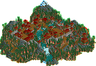
2.Xuan Lu - A Chinese Myth by magnus
3.Calamity by Master Jay
4.Constantine by Chapelz
5.Apoapsis Aphelion by yeshli2nuts
6.Into The Deep by Tom_Dj
*points to self*
Another great system-stopper was Yeshli2nuts, but I didn't care, because of it's quality. 1st, it was the only entry to truly take advantage of being a 4D! 2nd, it was truly original. Iris: while a technique can be original, it can never be unoriginal. He did something original within the technique, and that is enough. 3rd, it was quite exciting to look at, even with the low fps. However, it has 2 fatal laws: terrible ratings, and a lack of beauty. Back in my Blue Meanies days that wouldn't be a problem, but at the moment, I demand more.
The next best entry was Master Jay. It was nearly my favorite. Unlike what Iris said, this is a true 4D! The vehicles do change position across the course of the ride, although it's subtle. Too subtle, perhaps. It also seemed the most "complete", and was certainly the most polished of the entries. The fatal flaw here is boredom.
My favorite entry was Chapelz. Despite being completely unfinished, it was a great example of what I love. It was fun, innovative, exciting, and wonderfully surreal, yes, but it was also beautiful. A genuine pleasure to view! I love how he pulled off the theme perfectly, while resorting to none of the theme's cliches! My favorite bit was the gothic arches on the lift. Very Gaudi, very beautiful. I hope he finishes it.
It was very close between those 3, however.
congratiulation SF
six frags, it was a nice 4d. actually the first rct2 4d i wanted to look at. a theme was there but i thought it was ugly. you can do way better, i believe.
glad to see you're still here and still producing rct. looking forward to seeing new stuff from you.
I've only looked at the first three so far but here's my comments on them:
Six Frags
I disagree with Posix and I think that this your best RCT2 stuff to date. The colours were vibrant but all seemed to come together gracefully. I've underestimated your ability and skill in the past but this makes me realize that you are a way above average parkmaker with an original style.
Magnus
My favourite entry this round. I can see how it didn't win though. For the most part, it wasn't actually a 4D, it was an adventure ride. And, there was some sync problems between the dragon and the paddy farmers. From the readme, I gathered that the dragon came under the paddy farmers and they were on top. It didn't work on my comp, the paddy farmers, randomly flew off with no dragon.. The themeing was top notch though.
Master Jay
Another ride that I can see why it didn't place higher, though it was a bit more 4D than Magnus' was. The themeing was classic Junya goodness though.
Xuan Lu --- in a way impressive, but made my rct run veeeerrrrrrrrryyyyy slow. It was a bit to repetitive in it's theming and could have used more variation. Oh and if you are going for the LL-style 4D then just use LL imo.
Constantine --- too plain, too simple and overdone if you ask me.
Calamity --- Jay shows he can design a proper coaster and I see some interesting methods making a 4D. Still it didn't contain anything much more than that though.
Apoapsis Aphelion --- this one was very interesting IMO. it was very well executed, but maybe it was a bit to small
Into The Deep --- Don't say I didn't warn you all at RCTM. It was actually fun to look at, but also made some serious mistakes. What 4D coaster?!?!? It was only viewable at a few locations! Also you need to vary your building then only using 2X2 building. Fun thing is though that you show how much variation you can bring with only those though
Six Frags: Cool 4D with some elaborate looking supports there. Couldn't help but think you needed to get rid of the original supports on the coaster though. A solid layout, a little slow in places, but definately solid. Some nice theming, and considering I enjoyed the original IT, I enjoyed this too. Great work with the spiral staircases and stuff on the rooves, that worked well. Wasn't sure about doing all those flat rides...you did the same thing last time. Well done on the win
Magnus: Some very nice theming, maybe lacked some variation, needed a few more colours perhaps. I was a little confused when the 4D just took off for no particular reason and started flying about...but I understand (by jons post) that the dragon was supposed to lift the slaves into the air. That was a cool concept, just wish it would have worked. One of the reasons I don't really get into hacking like that. I felt perhaps the coaster outside the town thingy could have been a little better themed. Oh, and too much fire and smoke, made my computer run it slowly
Junya: I liked the colours on this coaster, and the layout was very good. Not sure why the b&m track over the original 4d track. Didn't really add anything IMO. The architecture was the same everywhere and seemed to serve little purpose, a trait i seem to find in all of you parks. Just because you are going for a certain theme, doesn't mean all architecture needs to be the same sort of shapes and use the same textures. That's why I don't enjoy your work as much as others seem to. Definately the neatest entry though. Good job
Chapel: Nice entry. You made the white look very good. Definately had the strongest 4D layout. Probably would have given SF a run for his money if it was done. Not sure why you sent it in incompleted...complete it for the bonus round! You're just not going to win with an incomplete entry! Also, i found the foliage around the station horrible. Big overuse of those ugly faded green 1/4 tile trees. But yeah, the structures and landscaping was cool.
Yeshli: A cool entry. I would have ranked it a bit higher personally. Yes, the whole island thing has been done, and GCC will not be beaten, but this was kinda different in a way. The coaster was very slow in places, not a layout i really enjoyed to be honest. Cool structures around the places though, and some nice theming. Some of your better work. Nice work.
Tom dj: Didn't enjoy this one at all. Didn't enjoy the architecture, props on using variation in textures, but it just looked pretty messy. The 4d was mostly indoor/underground, so very hard to follow and made the architecture the focus of it, rather than the coaster itself, which i feel it should be in these rounds. Good effort though.
Metro
Chapel's was awesome, even unfinished - shoulda spent more time theming and less time making the pretty waterfall edges! Although, looking at it, it DOES look finished, in a kind of weird alice in wonderland way...
Master Jay's was nice, but not much more.
Magnus...I didn't really leave yours open long enough to find out what was going on. Stuff flying around, lag, flames everywhere...bleurgh.
Tom Dj's suffered from being too deep in buildings/land to be visible.
I really liked Yeshli's - I like the fact that people are using the islands. I'd say keep using them, cos they're cool.
Magnus park was a very nice park too i like the chinese theme and master jay's park was ok.
I hope i'll be better the next time
actually the dragon and the paddy farmes worked well on my comp as i said in the readme. the only thing that confused me was that it sometimes worked and sometimes not, though i didn't change anything with the coasters.
i don't see why this made any computer run slow. ok a bit slower than usual, but i think not too slow at all.
anyways. didn't expect to win this one as this was not the best effort i'm capable of.
I thought, like iris said, that 4D's are rarely used, so it could be an 'easy' round to win...
Magnus' entry was very nice.. A lot of atmosphere there, and the idea was very clever too...
Junya's entry was typical Junya once again; A nice coaster surrounded by his one-of-a-kind style of architecture..
Chapelz was nice too, somewhat inspired by Toon's unfinished qftbx liquid coaster he posted a while ago I guess, but with your own nice touches.. Too bad it was unfinished..
Yeshli; I was very surprised by his entry.. Nice idea and good excecution.. Maybe a little too fantasmic for my taste...
Tom's was a bit too cluttered I think.. It was also hard to follow the coaster.. Still good effort...
Round 3 seems to be my lucky round, as I also got in last year in round 3...
SF
Six Frags: This entry was awesome. Creative idea, nicely executed; exactly how the winning coasters should be done. The archy was nice and colorful, kind of like a JKay style without all the 1/4 stuff everywhere. The layout was pretty good, the diagonals and the crazy inversion (donno what it's called?) were the highlights. The only problem I had with this was the ending, with the brake run and then the lift hill, just poor planning unless you were going for that.
Master Jay: Decent entry, but nothing better. I liked the archy actually and felt for what he was going for the entry needed consistency. The layout was entirely too fast in my opinion and was paced poorly. Again, like others said, didn't like the break from the traditional 4D track, but it didn't take THAT much away from it IMO. Solid though.
Magnus: Sorry, didn't take the time to look at it for a while, just too much smoke, fire, etc. and felt like my computer was going to explode. But a creative idea with the dragon, and the archy was nice for the feel you were going for. Just too intense for my liking.
Chapelz: Ehh, way too much white for my liking, and it didn't really work for me. The structure in the corner was nice, but again, you need to vary it up a bit with the colors. The station area was ugly, with the foliage (as Metro mentioned) and then the building itself didn't really appeal to me. The layout was solid but a bit too short possibly.
Yeshli: The station archy and all was nice, and the idea's been used before a few times, so that takes some away from it. The coaster itself was kind of extreme and didn't do much for me. Keep at it, work on redefining what you're trying to do a bit.
Tom DJ: Man, you need to work on your general style. In all of your parks, you overuse those Spanish rooves and cover the entire park with archy, which gets tiresome and repetitive, as opposed to the actual coaster. If you keep doing things like this and your recent RR park @ RCT2.com, your work just won't be appealing, the style is so off. But if that's what you were going for, then keep doing it. It wasn't terrible, just needed to vent that out.
Six Frags: Wow, I really liked this. I think your best work yet. The only things I didn't like was that big thing in the middle and the custom supports.
Tom Dj: I liked this for the most part, but it did get a bit repetitive with the rooves.
Magnus: It was nice, but it lagged on my computer. The fire wasn't really good imo, and the coaster was a little long, but still, I watched it, then after 5 minutes, it stopped and wouldn't go again...
Master Jay: Hmm. I haven't seen a 4d like that before... The archy was kinda nice, but a bit boring in some places.
Chapelz: Too much white. The supports were ugly imo as well.
Yeshli: The worst of the bunch imo. It looked like a cheap dark version of GCC.
I knew this was going to be a hit or a miss. Also I'm not going to bullshit you and say that I meant for all that grass what I really wanted to do was create a whole city of buildings and such all throughout the island but bad for me was the fact that I finally decided on the theme around Thursday and I'm one of the slower builders around and this was a big task so I did as much as I could and then sent it off and for all you saying why didn't you save it I didn't save it because I have a hotel I have been working on for that round. Also I will not finish this but just for cg?'s knowledge I have decided to add this theme to my currrent solo. And congrats to six frags.
Magnus - Weird stuff man... From the overview i was totally puzzled, the buildings when you look at them close up are a little repetative, but they have style and character which is good. The coaster layout confused the hell outta me, but i watched it all, was like 10mins or summat. But i watched it! It didn't get back into the station, got stuck underground somewhere near a waterfall.. Bit disapointing. However, a lot of work must have been put into this entry and i admire that. I am sure you will get through the prelims, good luck...!
Junya Boy - What a fantastic little coaster! I love its layout, and its B&M appearance. The surroundings suited it perfectly, probably my fav entry out the lot as it was a realistic design (if B&M were to make a 4D, i think it would look exactly like that). I quite enjoyed it, plus came with some nice custom scenery!
Chapelz - Could have won if been completed, but yeh a little repetative. I like the white however, think it worked quite well in this situation.
SFGadvKing - Nice idea with the island, nice layout and good station. Nothing really stood out though, still, i have a sneaking feeling you will get through the prelims...
Tom Dj - The coaster was too hard to follow, and the variation in textures made it look a little tacky. Nice effort, good luck with the rest of the prelims.
Very good round.
-X-
Awesome layout but you went a little overboard with the white supports. Couldve won if you had finished it.
magnus:
A very creative idea should be commended.
The "flying dragon" was cool.
Went overboard with the fire and smoke and that got annoying when viewing the park.
I know there was a MD coaster in there somewhere.... but with all the hacking... it was kinda hard to see....I would've preferred a normal coaster.
Master Jay:
Good archy and use of water.
Coaster layout gets a C+ cause you should have put a hyperbolic steep-to flat piece at the bottom of the first hill. That would have gotten rid of the high positive vert g's and made the stats better. Its a very obvious error.
Six Frags:
The winner IMO (and the judges opinion's too apparently). Your colorful style is so wonderful to look at. Your coaster layout is the best, and your object selection is very diversified.
Tom_DJ:
A very colorful town on the water was nice, and a good coaster layout too. For y'all that complained his was indoor/undergroud too much, hit 4, V, and H on the keyboard while in the game to "improve your view" Works everytime for me
yeshli:
A launched MD over 4200 ft long with pos g's over 4.20 is destined to be too intense. If you were gonna make a launched MD, you should have taken more care to make the coaster less intense. But the archy was creative and detailed, very nice visually.
Basically I'm a Chapel fan, but really, his was by far the most beautiful and refined. I agree with mantis when he said that's it is sorta finished in an alice in wonderland sense. Those waterfalls are awasome by the way. Very cool.
ride6