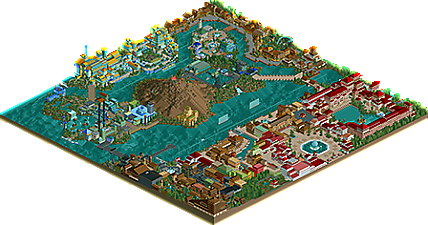
Park / DisneySEA Spain
-
 10-June 04
- Views 10,609
- Downloads 4,911
- Fans 3
- Comments 44
-

-
 68.13%(required: none) Spotlight
MCI 80% Cocoa 70% Faas 70% G Force 70% geewhzz 70% trav 70% 5dave 65% alex 65% chorkiel 65% Liampie 65% 68.13% -
3 fans Fans of this park
-
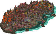
Full-Size Map
-
Download Park
4,911
-
Tags
I LOVED some of your flat rides...such as the swinging ship on the waterfall, the double decker carousel kinda almost underwater...storm riders' queue alone was brilliant.
You are dangerous with those tunnel glass peices.
I'm with iris on the new england waterfront...big and boring. I'd love to see more atlantisesque type themes from you too. Loved the hotel btw. Great park!
Ok. This is just awesome. I love your architecture sooooo much more than anyone else's as far as RCT2. I loved the Symphony of the Seas...were the waterfalls supposed to be like Fantasmic or whatever that shows is at MGM where they show movies and stuff on the water? Awesome job Corky...I can't wait til WDE is released.
Corky, you made a pretty sweet park, and it totally earns the Disney name. I'm tempted to do a walkthrough, even...I like it that much. I don't think it's quite Rivers of Babylon, but in my book as a Disney fiend myself, it's awfully close. Congrats, Corky - see you at next year's awards.
I wish I could look at it, but of course my comp isn't co-operating.
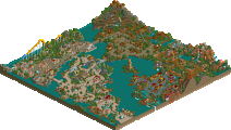
I was instantly dissapointed when gazing at the overhead view upon first opening the park. Blocky buildings look atrocious from above, all your sections mixed and contrasted horribly, and the park layout in general looked awkward.
Fortunatly though, the magic of your own brand of realism comes into effect when taking a closer look. Perhaps thats whats so pleasing about the architecture--it makes you imagine looking at it from a guests perspective (as there is'nt much to see from above), and in turn you can get immersed in the park more effectivly. Admittedly, I spent more time exploring this park than any other I can remember, perhaps just for that reason.
Anyway, each and every area seemed to capture the atmosphere and aroma it was intended to portray, everything was pretty near perfect for me. New England Waterfront included. It was what it was supposed to be- pleasantly gawdy. I honestly can't imagine the real Disney doing it much differently.
There were a few peeves I had with the park, including the poor use of signs (difficult to tell what section you were in, luckily the atmosphere allowed some sense of the general theme, but as for what the section was actually called.... well.....), the waterfalls in the middle of the bay (didn't understand those), and the crowdedness around parts of the entrance and New England sections.
As expected though, the good outshines the bad. Awesome park.
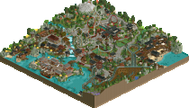
I like. The map seemed alittle wasted with so much underwater but the entire rear half of the park was insane, if anything the myserius island way the weakest of the 4 area's back there. Personally I didn't care for the enterence plaza or the hotel. The enterence just seemed too open, airy, and not very "Disney". The hotel was plenty "Disney" and grand but the shear size of it got on my nerves. As for Caribbean Cove, I like it. The archetecture was alittle too tall in places but very nice. I fail to understand how you can build blocky buildings like that and make them look so real and so good. The New England Sea Coast was nice IMO. I really liked it. My only problem here was the same as in Caribean Cove, aka, it seemed that the archetecture was so tall in places that you couldn't even tell if there is midway down there, for a guest that may be good or bad, but from an above-veiw it's always bad. The remaining 4 area's on the other side was amazing. Every theme was near-perfectly exicuted. The one spanish-like area was classic Cork, the colors, the shapes, the details. I love. And Atlantis Cove was great too. Wonderful colors and both coasters were good and Disney.
I don't think I'll do a walk through since this isn't much of a coaster park and that would make it harder to review. Really amazing park though. I don't know about the BMW to RoB's Mercedes Benz, but at the very least the Audi Quattro to that Mercedes.
ride6
Overall, the park was interesting, beautiful in some parts, and lacking in others. I just wanted to be wowed more I guess. Maybe I just don't understand the whole Disney Sea vibe thang.
Congrats on this though Corky. I can tell that you put a lot of time into it.
This was certainly worth the wait, and I can't wait to see the rest of Walt Disney Escape.
First off, even though you detailed everything so well, it was still too blocky. Way too blocky. This made the park feel even smaller than it already is. Your transition from land to land wasn't too great, either. Especially from Atlantis to Puerto Tropical. I didn't know where one ended and the other began. My last nitpick is the windows. There were way too many of those on each building. Try breaking them up next time with little details unique to each area.
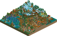
On the plus side, I loved your idea for original lands. I'm glad to see you didn't simply copy the original DisneySea for your park. That shows ingenuity. I also enjoyed Mt. Prometheus and Journey to the Center of the Earth, although I would have selected a different track other than the mine train roller coaster. One last thing, even though your buildings were blocky, they still helped create fairly good atmospheres for the areas. Good job.
And Meretrix, you may yet be wowed by a DisneySea.
Corkscrewed Offline
My style is definitely a bit controversial in that it's an experiencial style. It's more geared toward the peep's point of view rather than you, the park viewers' perspective. In that way, even though it may look bad, I'll sometimes make buildings that block the view of the paths and each other just for the sake of detail. I know that Mantis often likes to peel away buildings and delete pieces to see what hidden, and if he did that to this building, he wouldn't see anything shortcuts or cheats. What you expect behind those things are actually built into it.
Anyway, I can definitely say that park size was a disapointment even for me. I grossly underestimated how big the park was going to be, and by the time I figured it would be too small, it was too late to change anything, as the park map expanded in the other way. It should have been 150x150 or 160x160 instead of 140 squared.
Other than that, I am definitely happy with the way it turned out, and I'm glad that you have enjoyed experiencing DisneySEA Spain as well. If it didn't meet your expectations... well, aim lower.
Yes.
Nice to see you finally finish something corkscrewed, hopefully WDE might get finished now?
an interesting side note, is the fact he used probly every bad 'nono' path around, and not one (okay, someone will probly after i said this) will complain. Makes you wonder if people ought not think a bit about the way it actually looks before telling people to change to the one and only "NE style." (i'm talking about the advertising district) There's a lot of scenery around that's of high quality, but might still just look a bit strange because you aren't used to it.. and there's definitely probably a way (different?) of using it good. This is more of a general statement towards what people advertise and the feedback they get, and i'm saying it here 'coz there won't be a more splendid example than this.
Stormrider has one of the best stations i've ever seen. Aquatopia did too, but was even more interesting. The crane is of course interesting so i thought i'd add that, and the garden bistro was just beautiful. The entrance, you'll get enough comments on that, was very very nice. Red and white never looked so good
Now I know why Pyro likes your work so much (except for your ravishing good looks, obviously, and the sexual favours, too).
Fantastic. All the buildings have floors!