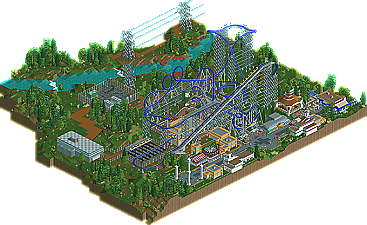
Park / Blue Lighting
-
 22-October 10
- Views 5,515
- Downloads 808
- Fans 1
- Comments 31
-

-
 65.38%(required: 65%) Design
Milo 85% Nokia 80% CedarPoint6 75% geewhzz 70% Liampie 70% robbie92 70% SSSammy 70% Wicksteed 65% BelgianGuy 60% John 60% RCTNW 60% RMM 60% 5dave 55% nin 55% turbin3 50% 65.38% -
1 fan Fans of this park
-
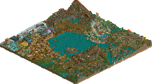
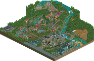
Full-Size Map
-
Download Park
808
-
Objects
211
-
Tags
Similar Parks
-
Vortex at Kings Island
-
Starpointe
-
G Force's Worlds of Fun
-
Sonoma Falls Theme Park
-
Magnum XL-200
-
Violet Gardens
tdub96 Offline
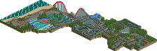
The surroundings are great, and the coaster is very realistic. Its got some classic rct feel to it.
Great work ride6, this is a good one.
-Taylor
Congrats on the design.
Architecture could be better though.. But great nontheless.
Congrats on the design though, looking forward to your next project!
I was thinking that as well, and not to mention the corkscrew bracings used were retired a while back when this "coaster" was made.
Some of it seemed messy in places, but the size of this coaster I guess made it what it is.
I'm not sure how this is a rip-off. The only thing that looks ripped-off to me is the color scheme.
Absolutely no complaints. The layout kicked ass and that's the most important thing. Excellent job man.
If this won
I thought inferno by Fizzix would've won too.
It's a shame though. Once judged no unjudged.
to those who have no idea what i'm talking about
this is inferno.
Inferno
Not to be rude or anything. I love the design. But I thought inferno was of a higher caliber.. But I'm no accolade panelist so.
Robbie92 vote.
Inferno:70%
Blue Lightning:70%
Sorry if i looked like an ass.
This ride saw it's share of controversy at the judging stage, missing by less than one-half of a percent before I spent another 4 months picking away at slowly overhauling it (don't have much, if any, time for rct these days). I don't know if that's a precedent I should advertise though... Under normal circumstances I would recommend NOT fighting the council's decision; however, I felt that the purpose of the "don't submit twice" rule was to prevent people from using the council as their personal evaluators, submitting projects over and over and over until they improved them just enough that the council caved and wasting EVERYONE's time. Not to reject a design that was VERY close. I'm grateful for the second chance.
I originally planned for this to be the first Arrow mega-looper to get a design (or at least a modern design). It was started nearly 2 years ago, before H2h5, which was the first thing that caused this to go on the back burner. Lots of personal, academic, and other complications delayed it further.
I'm just glad to finally see it released.
Ride6
I'm just pointing out the votes were incosistent. But it's a rct fansite so i should calm down.
Sorry for all the trouble.
Oh, and Ride6 is right in that my post in this explains the overall consensus rather than personal opinion. In my opinion, Inferno was more "fun" than this, but this was a higher quality overall, and therefore deserved design.
I find it hard to believe you; if you were truly sorry, you would've not posted it. But the real problem is that you feel the need to not appear like an ass to other people; your argument that the other, similar coaster should have also gained Design status isn't necessarily a bad one (as long as you don't push it to much after the powers that be have acknowledged it) and you wouldn't be mitigating any offense that people would take to your argument by adding that quote above. You're trying to please two sides at the same time and your efforts are basically canceling each other out. Don't belittle the site though, anger can be fully justified considering the amount of time some of us pour into RCT; baseball managers getting thrown out of a game are no more justified.
I do wish to comment on this actual design though, so I will make a separate post. Anybody who has the power, please do not combine these two posts. If space was such a concern then there are many other ways to cut down.
The surrounding park area felt very appropriate, as in it probably doesn't get as many guests as other parts of the main park because guests tend to not like the Arrows very much. Those power lines were done very well too, could never understand why but it always seemed like the Paramount parks had their power lines very noticeable compared to others.