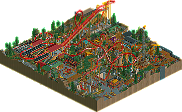
Park / Diablo

21 Comments

  • Comment System%s's Photo
  • Fizzix%s's Photo
    Yay, first comment!

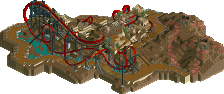
    Excellent layout, I love the interaction with the surrounding area. Good atmosphere, and a great color scheme. Congrats on the first Design, hope there's more to come! :D
  • Phatage%s's Photo
    The coaster was very solid. Pacing, element spacing and spatial orientation, flow, and overall length were all very refined and realistic. I for one can really imagine looking up at that zero-g roll through the shrub awning you created and feeling a slight chill down my spine that something is out there. The only thing about the coaster that I think would add to the atmosphere and theme was if you somehow made the 270 degree turn following the zero-g lower (maybe even flat and speedy) so it could be concealed; what this would do is make the train entering the Immelman more of a surprise to the guests on the path around it, with only the B&M roar giving warning to the Diablo's resurfacing. The lift hill placement is cool for the land slopes downward looking out from its apex, making the ride seem taller than it actually is.

    The theming didn't really convince me of a Mexican town in any aspect. It wasn't necessarily the architecture that would have made it more convincing but more the layout of the paths and buildings. The path was obviously made around the coaster, which it should be to some extent, but it would be great if you can find that sweet middle ground of having the park layout revolve around the coaster without seeming like it. I think Louis' Viper design does this pretty well if you're wondering what I mean.
  • rK_%s's Photo
    jesus christ JDP, your are seriously OCD when it comes to perfection and realism. So easy to see this in real life with minimal changes for sake of this being in rct.

    wow, great too see some more work from you!
  • Austin55%s's Photo
    Im always happy to see work from JDP, since his coaster nazi-sim is probally one of the most influential things on my own work :p

    The layout was pretty amazing, I really cant think of any of my own ways how I would change it. I didnt care all that much for the surrounding, anything really. It was all pretty weak IMO, but hell, I didnt care. The Idea behind it (Satan inducing mexican conquering pirates?) is brillaint.

    Awesome work bro, hopefully we can see you winning another accolade since you missed out on getting a silver this year :p but if its a gold every 2 years, thats cool with me I guess.

    Sidenote-One of the best writeups of the year, robbie.
  • Fisch%s's Photo
    Great layout JDP. What else could anyone have expected from you though? I'm very happy for you that you finally got your reward for your great work in rct. In some places I dislike the color scheme though. All the brown and dark green kind of clash with the coaster's colors in my opinion. Besides that lovely work, my friend. ;) Congrats!


    Oh and great logo Dave!!
  • tdub96%s's Photo
    Wow, sick design dude. Your coaster perfection is what helps inspire my work. This ride doesnt dissappoint.

    Full review later!!
  • SSSammy%s's Photo
    now, i don't know about you guys, and i mean in no way to take away from your achievement, JDP (as you can see, i voted within design, and i stand by the vote) but i didn't think the coaster was anything to write home about. i don't understand why so many people can say this is a perfect coaster by any means. i don't think it really stacks against el encierro, x, etc. the coaster didn't stand out to me, but i fully appreciated it as part of a design submission. the style of the peice was very enjoyable and i think that's what matters.

    don't let this one "hater" take it away from you though, dude, well done.
  • robbie92%s's Photo
    I think my main issue with your layouts is the aesthetic aspects of it. While you have good pacing and good realism within realistic and RCT convention, your layouts just don't look that great. Looking at El Encierro, Denali, or other legendary layouts, they look incredible as well, utilizing RCT's angles to make beautiful, flowing elements. Your layouts end up looking slightly choppy, kinda like "industrial" RCT, where it's fully functional, but not very pretty. I think if you can learn how to make your layouts as aesthetically-pleasing as they are realistic, you'll be up there with some of the best.
  • nin%s's Photo
    But see robbie, I thought the same thing but simply turning the camera gave a much more pleasing view, with flowing elements, turns, etc.

    Out of the two released today, this may be my favorite. While it may not be as technically skilled as the other, this was just very fun to look around in, gave me somewhat of a Phatage/zburns feel which I adore.
  • Wanted%s's Photo
    Loved this. Exciting to watch. Congrats.
  • geewhzz%s's Photo
    the layout was fantastic, even if the theming around it wasn't. it was clear to me long ago you know what you were doing with coasters and this proves it to me even further. i tried to capture what would most likely be my favorite part of the ride in the banner for the site, which is the small air-time kick hill leading into the nicely snug wingover.
  • Dotrobot%s's Photo
    The coaster layout is amazing but the archy was really a let down for me. It still held a great atmosphere though
  • posix%s's Photo
    I thought the layout was rather fantastic but everything else wasn't very nice to look at. The combination of colours, shapes, structures and path-ride spacings didn't work for me. It was not beautiful to look at. I would advise you to put more emphasis on this aspect of the game, as others have mentioned. I think it's important to feel the aesthetic harmony of a park.
  • tdub96%s's Photo
    In my opinion, this held one awesome atmosphere that you've really been developing. I didnt notice it much in your pre-H2H5 days, but Imaginit, Reneview Bay and HAP all had the makings of a brilliant atmosphere. The Tussauds park and I305 had it as well (a shame you lost those). You finally hit the nail on the head with this design, one hell (no pun intended) of a coaster, awesome surroundings, and great architecture. The layout was fantastic, the interactions superb. I really enjoyed this and cant wait to see what youre brewing next.

    Congrats dude :bandit:

    -Taylor
  • JDP%s's Photo
    as an overall, hearing that the architecture wasnt that good (which im used to) made me feel even better about getting design. its nice to know my coaster made design off of being a great coaster rather then its surroundings.

    @robbie: watch the coaster from the angle in the first and third screen shot (for best view results of the coaster).

    thanks for all of the comments guys, very nice. oh and sammy hate all you want its your opinion... and Curtis your my dude on this site, thanks for the comment
    -JDP
  • Fr3ak%s's Photo
    I liked the layout a lot as well but I couldn't feel the rest of the design.
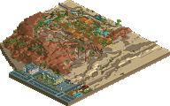
    It felt unorganized and cluttered in some way.
    Additionally I didn't get the foliage was totally confusing to me how you've been using palm trees next to the other foliage
    which seemed a lot more "european". I loved the path covering with those bushes though.
    Congrats for winning the accolade! :)
  • turbin3%s's Photo
    I agree with Fr3ak. Whilst the layout was good, the rest wasn't.

    Congrats though!
  • JDP%s's Photo
    ^thanks man. im honestly not shocked that you and belgianguy voted that low. i know both of you styles of parkmaking which shoots more for beautiful architecture rather then ride design (which is my end). but i do appreciate yall not voting anything too low and giving a fair opinion.
    -JDP
  • dr dirt%s's Photo
    Great layout man. Personally, I would've preferred the batwing compacted by a tile, but that's more of an aesthetic thing. The surroundings weren't bad, but I keep thinking you should have tried this more minimally themed. Just the essentials (station, queue, etc.) rather than expand the area to highlight your strengths a bit more. Overall, solid design though.