Park / Ka Choung

Park_1800 Ka Choung

11 Comments

  • Comment System%s's Photo
  • J K%s's Photo
    This looks really good, hope to see even more great work from you. I smell a design next time for sure.
  • RCTMASTA%s's Photo
    This looks awesome, and so close to Design too! You'll probably get it next time though, keep building! :D :nod:
  • SSSammy%s's Photo
    why on earth not? comments from voters please!
  • Dotrobot%s's Photo
    NO NO NO THIS IS NOT POSSIBLE!!_(!$*@#()$&@# _)&#!
  • BelgianGuy%s's Photo
    I think the coaster was decent although I didn't like it that much as it was a little short and the immelman looked weird tbh and some stuff was a little messy and the path layout really didn't do it from me, was a very close call for me but I didn't feel this was good enough for a 65% vote although it was very close.
  • Levis%s's Photo
    I admit it was a pretty good submission. thats why I voted it to be a design just. but there where some flaws. Imo the coaster was pretty good untill the part where it hit the water. from there if felt like a different coaster, and thats not good.
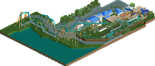
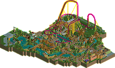
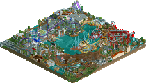
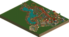
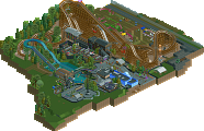
    Also the theming was quite nice altough I tought the water ride to be a bit boring. But the coaster it self almost had no theming for almost 3/4 of the ride. That just didn't seem right with all the other things so themed.
    Also I felt like some parts where added just as filler. Like the area round the twist ride, that just doesn't give the same feeling as the rest.
    Also the entrance of the coaster was dissapointing. the queue was a part underground so you cant see the ride and the exit just dropped you out somewhere between the supports. I think that could have been themed a little bit more to :) .
    Also next time try to put a little bit more effort in the park by at least check if everything is named propperly.
    oh and sometimes when i look at this park for a while it shuts down with an error trapper itiger divided by zero. Probally a ride which crashes which isn't suppost to crash.
  • Louis!%s's Photo
    So close. I felt this was just design quality and could see it as a design, hence my 65% vote.

    I felt the surounding architecture could have been stronger, however the layout and the general surroundings were really nice and IMO, worthy of design, but hey ho, next time work harder on your 'shop' architecture, this would probably increase your chances. I also wonder whether a coaster type with a larger layout would have pushed the votes up higher too.

    Anyway, great submission, shame it just missed out.
  • prodigy%s's Photo
    At Draca a lot of people mentioned the similarity to Fenrir, but there I didn't seen so much similarities and I thought that Draca deserved a design.
    Here I think the theming was very very much copied from Bayon Falls, but it was far away from the greatness of Bayon Falls. That's the main reason, why I voted 50%. Also the whole theming looked a bit random to me.
    So for me it's not a design.
  • robbie92%s's Photo
    My thoughts echo Prodigy's. The theming was extremely similar to Bayon Falls imo. However, what also hurt the submission a lot for me was the coaster itself. It was a run-of-the-mill dive machine layout. There was nothing special about it, both in layout and in detail. It was just too short/simple to do anything for me at all. Had the layout had better flow and been a good execution with details, like good accurate catwalks and a great transfer, or something along those lines, it would've been worth it. However, for me, this design was attractive, yet not that original, window-dressing for a run-of-the-mill layout, and if the coaster isn't up to design standards, it's not a design in my eyes. Disneylandian, I really enjoy your work, like your QFTB entry, but this just wasn't the same at all in terms of creativity or content.
  • jusmith%s's Photo
    I really liked this, so I'm sad this didn't win design. Some parts were a bit undefined and a bit messy (architecture and path layout) but the ideas were pretty well executed! I'm looking forward to more!
  • highroll3r%s's Photo
    looks kind of like a griffon influenced design to me, apart from its shorter and only has one inversion. from the overview i dont think 3/4 of it goes with the theming like levis said. i mean if you used the light sand instead of grass it would have blended better imo. however i do beleve this should have just hit 65%. ive seen many failed designs submitted here recently and this doesnt compare to them, its much better.