Park / Tomahawk

25 Comments

  • Comment System%s's Photo
  • verti%s's Photo
    Although it's all a bit brown, and the architecture and foliage is pretty minimal, the layout is absolutely brilliant. Well deserved!
  • BelgianGuy%s's Photo
    not enough "context" for my likings, it feels so cut off from everything because you shrunk the map WAY too close
  • chorkiel%s's Photo
    Great Logo, Great write-up.
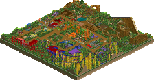
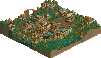
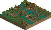
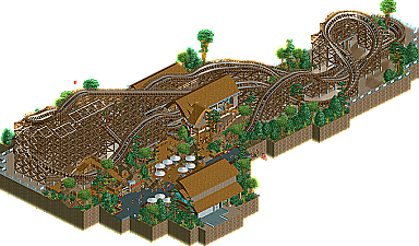
    Rest will follow tomorrow ! :kiss:
  • Liampie%s's Photo
    Posted Image

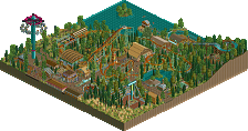
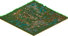
    This area was really brilliantly designed. Just a shame there wasn't more of this; as BG said, you shrunk the map way too close! The foliage could've been better too.

    Congrats SRF, keep up the good work! Give us another park sometime. :)
  • Insanity%s's Photo
    This was superb. One of the best GCI layouts I've seen in a while, as well as theming. As said earlier,the overall map was just too small. If it were enlarged, it would have gotten q much higher score.
  • Cocoa%s's Photo
    Yah, this was of quite high quality. nice archy, layout whatever. but I does piss me off when a design gets released that is just one building, a station, and a nice layout. I put so much more into my designs that they don't get finished :p maybe a few more buildings and rides would be nice. I don't want to have seen everything on the map just over the 2 minutes it takes the ride to complete its course.
  • RRP%s's Photo
    Congrats on the design. I'd have given it about a 80-85.Nice layout,small surrounding area.Everything a design needs really
  • Fizzix%s's Photo
    This is one of those rides that I could watch for hours on end. Great layout and atmosphere, but as others have said, could've used more foliage. Overall just an awesome design, great job!
  • nin%s's Photo
    As you can tell I adored this. Sure, there wasn't much there other than the layout, but people are spoiled. In this case, the coaster was so good it didn't need anything else to make the design better. What was there was absolutely fantastic, with areas such as the one posted above (by Liam) being so well made.

    I did think the archy could have been done a bit better, as while it had interesting forms execution-wise they could have been better. You now have an area of skill to work on, proceed.
  • geewhzz%s's Photo
    LOVED this.
  • K0NG%s's Photo
    As did I. The only thing that kept my score from being in the gee/robbie/walto range was what BG said. It was just cut off too closely. I just wanted to see a little bit more of it.

    And Cocoa....while I can obviously understand where you're coming from, the fact that a design like this doesn't pack as much onto the map as you or I might, it doesn't take down the quality of what's there one iota. Plus, it was finished :p
  • robbie92%s's Photo
    Totem poles as columns... :drool:
  • pierrot%s's Photo
    not a fan of plain roof. but queuing line, fantastic.
  • Cocoa%s's Photo
    ^^^I do agree that the quality is indeed excellent, don't get me wrong, that was more of a general comment on designs than a specific complaint.
  • posix%s's Photo
    I agree it has a nice atmopshere and colour harmony, but I felt it was too cramped and small.
  • Flap%s's Photo
    Sorry the only thing that really got me was the layout.
    The other stuff looks like i've seen that before in a far far past.
  • chorkiel%s's Photo
    First of all,
    Congratulations on the design !

    I liked this and all but as said before, SHRUNKEN TOO SMALL !!
    The plain roof doesn't really work for me neither.

    Gratz again and next time make it bigger ! :D
  • Xtreme97%s's Photo
    The layout was fantastic and I really enjoyed the interaction between the queue path and the coaster.

    It was, however, very compact and the coaster kind of ate up all the space. I know this has been said before, but it's an important factor, so don't cramp things too much next time.

    Congrats on your win and i hope to see more from you soon :D
  • robbie92%s's Photo
    People are confusing cut-off and cramped. As far as the actual ride and content go, it wasn't cramped at all, and there was plenty of space between elements (ie path, ride, structure) to keep it realistic and intimate. Yes, the map was cut-off close to the coaster, but that just makes it cut-off, not cramped. Hell, all around RCT maps is empty black space, so if anything, it's too open.