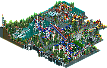
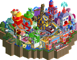
Park / Out of Space, Planet of the Battles
-
 10-October 11
- Views 5,375
- Downloads 606
- Fans 1
- Comments 63
-
 43.46%(required: 65%)
Design Submission
43.46%(required: 65%)
Design Submission
Levis 80% turbin3 70% Dimi 60% Kumba 60% CedarPoint6 55% prodigy 50% 5dave 45% Maverix 40% SSSammy 40% wheres_walto 40% robbie92 35% Phatage 30% Liampie 20% nin 20% RMM 20% 43.46% -
1 fan Fans of this park
-
Download Park
606
-
Objects
275
-
Tags

I thought this would make it.
Great Job Flap!
Hopefully next time will be better!
Other than that, it looked more as if you didn't really know whether you were going for realism or fantasy.
It looked great but it needed more defenition.
Nonetheless I think you deserved higher than this.
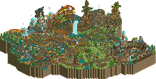
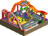
I thought the support work on the coasters was impressive. The architecture was ok, may be a little less black color; and repetition, especially with some of the building blocks. There was also a lot of glitching on the buildings which looked bad.
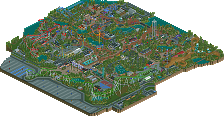
I think what also might have made this not appealing in some eyes was the theme, or lack there of. Actually now that I think of it you might have been going for a Halloween theme with the black and orange lol. If it was a space theme as the name states may be some more details to prove that would be nice.
Also, the other 4 designs in this series are in the trash can.
I was only building them if this one was getting a great score.
I make it a design cause as a park it needs to be a lot more then just a few flatrides, a lot of foliage and just 1 coaster. (Yes one coaster!)
A few points:
The orange yelow colours stayed for radio active materials.
The Glitch in the buildings and the blackhole in the water of my droptower i couldn't fix that.
Levis also told me it's not fixable.
The theme was really not space mentioned in this, but was build as a space planet.
Sorry if that's not mentioned
For now, i'm trying to work on a single inverted coaster based on Black mamba in Phantasialand, i need someone who would help me, but you get screened on Talent first.
Send me a message in private when intrested.
I didn't even have to check for the top vote to be levis. This is similar to his style except you actually tried to make it realistic
Well, i have always been a realistic builder, but i just wanted to create something awesome, which it probarly isn't
And on the point's i don't care, i just play cause i love the game and design some flatrides for real amusement companies in my real life.
But Dotrobot, Thanks for the comment.
Good job Flap. I think it did deserve a design, but it is unique anyway.
I likey these kinds of interesting submissions, and would have given it the high vote if I were a panelist, which I am sadly not, yet.
RCT2, you need a goatee, as all evil people have one, and you are the evil person here.
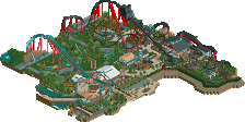
I liked it too but not enough to win a design, it seemed like you picked the colors that would clash the most, and in some cases that does work but not here. Where they are right next to each other put into such a cluttered enviroment of red/yellow/black, green/orange, red/blue.
I'm not sure really what kind of theme you were going for with those colors, they clash too much.
rct2isboss, let me tell you this. when your at a pretty below-average level in rct2 (which you are) you see screens and say "Wow! that's amazing!" And you are shocked to see other people have dislikes about it or just not like it as a whole. And then you grow up to be an average player (which where i put me as) and you start to find faults here and there in what once was that "perfect" screen. But for me as i didn't play that much consistently or consecutively, so I really had no break-through and only had a slight ascend into higher levels of rct2, but I saw a lot of amazing and great stuff, viewed all the accolades, and saw the little details and general stuff like color scheme, atmosphere, foliage that the higher levels of player would inject into their creations. And I didn't improve because like I said I didn't play that much to get the hang of intricate stuff but as a judge of a screen I could see where the screens of even the higher level players had some flaws.
and then one day I looked back through old pages of parks that I saw growing up from the below average category, and I realized how they could've been so much better and all the little differences that made such a different negative impact than the high quality-level work
this is my whole view on the situation and I probably lost you on this but that's fine. you'll probably understand what i'm talking about, but don't pull the self destructive "I don't give a fuck, I quit" because honestly as new as you are your view doesn't really matter worth shit if you're gonna say stuff like that.
Good. Fuck you. If you're throwing away your RCT disc because someone didn't get a design, you shouldn't be playing anyways. I'm not gonna give a fuck about the whole "oh well, it's because you're new" thing and just say you're suffering from secondhand-sore-loser syndrome. I found the foliage worked only in a filler sense, the layouts were awkward, and the atmosphere non-existant; that doesn't sound like a design-worthy entry to me. Obviously Flap tried hard on this, but an experience like this will only make him strive to fix any issues with his work and make it better. He'll go on to do great thins, I'm sure. You, however, throwing your disc away cuz someone else missed the design cutoff is stupid, and it means you'll probably never end up improving due to not giving a shit about doing well yourself.
Honestly, act like this, and you can leave; I sure as hell won't miss you.
FLAP: This was decent, but not quite design-worthy in my eyes. It felt clunky and there wasn't much flow overall. It was almost as if you focused solely on the supports and some of the layout. If you take park layout and composition into consideration next time, I'm sure you'll do much better.
rct2isboss: You are truly one of the most immature members of this community. To put it softly, your work is sub-par and you rarely listen to any criticism offered. You have only been here for 6 months, I don't understand how you can question the panelist when many of them have been around at NE for years and have viewed some of the greatest projects this site has ever seen. Windsweep, unlike Flap's attempt, was cohesive and for that it won the design accolade. For the record, put your online muscles away, swearing doesn't make you more intimidating, it just makes you look like a chump. I'm sure your mommy wouldn't be too pleased if she caught you dropping the F bomb. Keep that RCT2 in the trash, or donate it to the goodwill, it's better off without you. Run from your problems, but you cannot run from yourself. YDG.
And RCtisboss, if you really are A fan of Roller coaster tycoon, this is a FANSITE, just play for fun
I quite liked the park. When I first opened the park I tought I was looking as something from G-ride(gride/handyandyG) because of the colorscheme.
still there were some flaws with the park but as probally said before there is something like panel lists politics so I went a little bit higher with my vote than normal in the hope to compensate for some lower vote. but I must admit I actually tought this would score round the 60%.