Park / Vermilion

12 Comments

  • Corkscrewed%s's Photo
    Posted Image

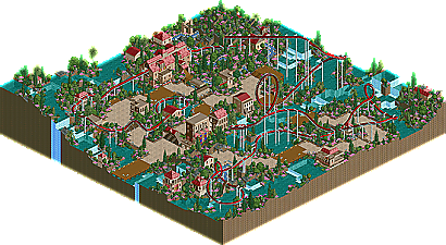
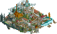
    New Element is proud to present it's latest Design, Vermilion, an RCT 2 inverted coaster creation by Loopy. You might find this coaster rather colorful. Some might even call it girly. I call it uniquely nice. And quaint enough to be an NE Design. :)

    Vermilion


    (And to those who are weirded out by the logo... I wasn't sure what to really go upon... other than the color... :lol: )
  • Maverick%s's Photo
    It looks like Loopy put a good amount of time into it. But quite honestly, I don't like it at all. Sorry L.
  • chapelz%s's Photo
    I thought it was ok but not really design quality in my mind.The foliage was a mess in my mind.
  • JKay%s's Photo
    Congrats Loopy! Its about time you got some credit for something. I enjoyed this. The coaster layout was incredibly well-done, with all the right elements in all the right places. The theming was, well, reserved or traditional to say the least, which isn't my cup of tea usually, but it did work here. I wasnt' really keen on the sparatic foliage choices and placement, and also I think the coaster could have used some custom supports. But either way, at least this gets you on the map in the RCT world (no pun) and tally another NE win for RCTF. And you said you only played LL....you big fat liar.... :)
  • Corkscrewed%s's Photo
    My Design standards aren't as high as my Spotlight standards. Though this isn't among the best, I admit. It grows on me tho... ah well. :D
  • Geoff%s's Photo
    Beautiful, solid layout.

    Nicely done Loopy. I wish you had really added more theming... like custom supports.

    Congrats.
  • artist%s's Photo
    I loved it, proberly one of the best rct2 NE designs well except for Helios.
  • Steve%s's Photo
    the layout was pretty solid. good color choices, too.

    i don't know, i guess i just like your LL stuff better than your RCT2 work.

    awesome logo, by the way.
  • jon%s's Photo
    I enjoyed it. The layout was good. Not your best I've seen from you but overall it was a nice design. Well done.
    I loved the colour!
  • X250%s's Photo
    The layout is faultless in my opinion, i like the pink flowers and the archy (in places) was very nice. Although i agree with what Dragonfly said, i think custom supports would make this a tiny bit stronger than it is now. Although it was a pleasure to look at and certainly worthy of a design.

    -X-
  • Kumba%s's Photo
    layout was only so-so imo, not that great, but not bad at all. The treeing, yeah its a mess. What I did like was the archy, it was suprisingly detailed and creative in spots. Great job on winning this Loopy, I know you release alot of stuff in the Ad, but its great to see you send something in and win.
  • cg?%s's Photo
    The layout was quite good, although it certainly could have been improved. The theming was terribly boring, but I do enjoy the lack of custom supports. Personally, I feel that custom supports are the most horribly disgusting "innovation" in the history of the game! Well that, and those stupid ice-wall "waterfalls", which were used. Really now, it's just icky, icky, icky, icky!
  • CoasterForce%s's Photo
    It was pretty good, but no better than that. It wasn't really innovative at all; just an inverted coaster, nothing else as far as theming goes. The layout was decent, a tad slow in some parts, which threw off the pacing a bit, but it did have its nice parts (mainly the corkscrew over the path). The foliage selection, as others have said, strange, and needed some work to make it look more natural.

    Looking forward to more work from you.