Park / Matador
-
 01-January 13
- Views 6,538
- Downloads 659
- Fans 0
- Comments 17
-

-
 67.31%(required: 65%) Design
In:Cities 85% chorkiel 80% Louis! 80% Coupon 75% Liampie 75% AvanineCommuter 70% Goliath123 70% Jonny93 70% robbie92 70% Arjan v l 65% CedarPoint6 55% Pacificoaster 55% pierrot 55% turbin3 55% RMM 40% 67.31% -
No fans of this park
-
Full-Size Map
-
Download Park
659
-
Objects
286
-
Tags
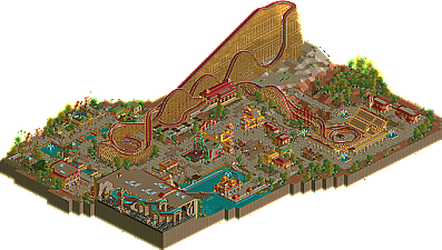
![park_2095 [NEDC] Archimedes - #1/9 (Winner)](https://www.nedesigns.com/uploads/parks/2095/aerialt1885.png)
While I do appreciate the decision to use a vertical drop rather than the steep, I can't help but think it'd have looked better with the normal (mainly because of the ugly support work directly behind the track). Until someone really gets the catwalk trim to continue on a vertical slope like that I don't think we'll ever get it to look entirely right.
Overall I like the choice of coaster as I'm a huge fan of the Intamin prefabs, but I didn't really like the out-and-back helix portion. Maybe if you had went with the more elaborate El Toro-like finish, I don't know. I just didnt think the helix added much to the layout. It was almost too simple.
I wish you had gone for bigger architecture, but I guess the small scale let the coaster truly dominate over everything. I just like more elaborate buildings so the small scale stuff seems to add little to the overall park, and these didn't seem to have much purpose, along with the fact that due to their small size, the pathways seemed to take up a ton of space making the design feel somewhat bare.
Those are my thoughts, but props for finishing this and I'm glad to see you release something again!
FK, this truly was gorgeous. I am really looking forward to see what you come up with next! Congratulations:D
Btw a guy who went by MadraDot made vertical woodie pieces that were pretty good, I don't think he ever released them but I have them if anybody wants (I don't think he's working on them anymore):
http://www.nedesigns...ndpost-p-507140
hulkpower25 Offline
Nice design.
Probably my lack of coaster knowledge got my confused about something.
Those hills had the strangest flow i.m.o.
It felt awkard to me, but maybe i'm wrong about that, since nobody mentioned it yet.
The architecture was lovely, i admire how you hide your huts, really creative.
I agree about the fact that there was too much pathing, it ruined the atmosphere a little i.m.o.
The vertical drop wasn't really appealing, but i'm not sure if it could've been done better, since i don't really hack rides.
The turnaround at the bullfighting arena is a nice touch.
That huge maze below the waterride, lol ,i wouldn't want to get stuck in there.
Overall, i've enjoyed your design.
I'm sure you've got something nice up your sleeve next time.
Oh yeah RMM, are you looking for a fight.
WTF...again.
RCTER2 Offline
It wasn't themed to Spain, so that's probably why it didn't feel like Spain.
The splash boats was good though, I enjoyed that. And the colours used throughout were very refreshing.
Happy to see this out, thanks for the team for an awesome looking page!
To sum up my thoughts, im simply damn proud of this. I won't deny it has it's faults, but put simply i had more fun building this in the past 3 months then i have had in a very long time. Its not a cohesive style, nor one i feel dominant in, but i really enjoyed piecing together something i have been working on for so many years, particularly at a time i was thinking i may never release anything again. It has its moments of brilliance, but i think its foundation in realism is what really held me back, which is why you can look for more semi-realistic and fantasy ideas in the future, which is what i think i do best!
And i'm sorry you didn't like it Trav. As one of my true long-time fans, i hope my next park will make you more happy!
FK
Airtime Offline
I liked the layout up until it dived under the brake run and headed towards the bull ring. Nice take on an El Toro style layout though.
The splash boats were great but the building was massive compared to the rest of the buildings on the map. I think if there were a few bigger buildings on the map, instead of all reasonably small buildings and one big building it would of fitted in more.
I think this would of benefited from being more compact and less path but I guess building it over long periods didn't help?
The theme was good and the buildings and little market places gave a nice atmosphere.