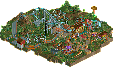
Park / Feliz Navidad
-
 21-January 13
- Views 1,767
- Downloads 432
- Fans 0
- Comments 7
-
 51.15%(required: 65%)
Design Submission
51.15%(required: 65%)
Design Submission
chorkiel 60% Jonny93 60% Arjan v l 55% Austin55 55% Dimi 55% In:Cities 55% Maverix 55% zburns999 55% BelgianGuy 50% CedarPoint6 50% prodigy 45% turbin3 45% Wanted 45% Pacificoaster 40% Airtime 35% 51.15% -
No fans of this park
-
Download Park
432
-
Objects
287
-
Tags
Similar Parks
-
NE's Scarlet Oak Amusement Park
-
Fränkisches Abenteuerland
-
Discovery Bay
-
[PT4 R4] God's Own Country
![park_2838 [PT4 R4] God's Own Country](https://www.nedesigns.com/uploads/parks/2838/aerialt2492.png)
-
[NEDC2 #3] The Cult of Santis Clausim
![park_2606 [NEDC2 #3] The Cult of Santis Clausim](https://www.nedesigns.com/uploads/parks/2606/aerialt2325.png)
-
The Boat
Would I be right to say Kumba inspired this in a lot of ways?
I think you're experienced enough to know what maybe isn't as good as it could be and what you need to do next time to get that design. I know you will.
stop copying me robbie
really its getting annoying
I beg to differ.
One of your biggest drawbacks is your architecture and use of color. Almost none of the colors you use compliment each other well and the architecture really has no solidified theme. Try to avoid recreating other members work because I believe you try to implement the style of architecture into the wrong theme; i.e. your station really has no Mexican influence as much as a medieval influence like the station of Ragnarok in Park Edda.
The coaster layout wasn't entirely terrible but something you should be aware of when building a layout is the placement of your transfer track, station, queue, etc. With these things in mind you can avoid making awkward structures like the one you have made for the transfer track.
I don't think you are too far off from becoming a good builder here so please take my criticism constructively and impress us.
But my god...those colors on the station. Please, don't ever use those colors together ever again.
This wasn't entirely bad but the colours and pointless details were dragging this down a lot. Less is more, especially in your case.
There wasn't harmony in this release.
But i'm sure you can do better.