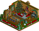
Park / [NEDC2 #2] Marrons Chauds
-
 16-January 13
- Views 7,482
- Downloads 795
- Fans 1
- Comments 19
![Park_2616 [NEDC2 #2] Marrons Chauds](https://www.nedesigns.com/uploads/parks/2616/aerialm2322.png)
-
![Park_2616_[NEDC2 #2] Marrons Chauds](https://www.nedesigns.com/uploads/parks/2616/logot.png)
-
 70.00%(required: 65%) Design
Liampie 85% Casimir 80% Airtime 75% Austin55 75% disneylhand 75% In:Cities 75% Pacificoaster 75% turbin3 75% pierrot 70% CedarPoint6 65% Jonny93 65% Maverix 65% AvanineCommuter 60% Louis! 55% Goliath123 50% 70.00% -
1 fan Fans of this park
-
Full-Size Map
-
Download Park
795
-
Objects
224
-
Tags
Similar Parks
-
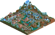
[NEDC2 #3] The Cult of Santis Clausim
![park_2606 [NEDC2 #3] The Cult of Santis Clausim](https://www.nedesigns.com/uploads/parks/2606/aerialt2325.png)
-
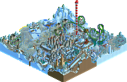
[NEDC2 #6] Frostbite
![park_2589 [NEDC2 #6] Frostbite](https://www.nedesigns.com/uploads/parks/2589/aerialt2324.png)
-
Happy Home
-
The North Pole
-
Merry Christmas!

-
The Melting North Pole
Congratz to your new design and to the second place of NEDC2.
I love it a lot. The layout was pretty cool and the diagonal brake run was a nice idea and nice to look at. Furthermore the theming was awesome (!).
Small and great!
Can't wait to see the winning coaster!! all of these entries are unique in their own right. i love it.
-Josh
Liam: I haven't touched Golden Gate Park since the last update. It's not irreversibly dead though, but probably my Dollywood-inspired park will get finished sooner.
Airtime Offline
I loved the architecture. The colours are great and gave a Christmasy vibe.
Nice touch on the concrete underneath the coaster, interesting touch that works nicely.
It's a shame this wasn't bigger maybe with a few more buildings and slightly bigger surrounding area. It could of won IMO.
Congrats on 2nd place. So looking forward to your Dollywood park in the future, it's looking stunning.
Congrats on a great submission nonetheless!
On the whole, this was a charming little release, which I felt was a bit lacking in content, combined with a small map, but it had great atmosphere and lovely architecture. It was very charming and colourful. Congrats!
I really love the architecture, it creates an atmosphere that fits with the ice theme.
The coaster's layout is gorgeous, it's so effective how it can create a thrill.
I just love everything about it but the main problem is what AvanineCommuter said, I really don't like the concrete floor, it really doesn't the part, I would prefer a few small mountains. Overall, I just adore it so much!
This layout is still super slick.