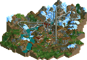
Park / [NEDC2 #4] Frozen Heights
-
 14-January 13
- Views 3,830
- Downloads 622
- Fans 1
- Comments 31
![Park_2619 [NEDC2 #4] Frozen Heights](https://www.nedesigns.com/uploads/parks/2619/aerialm2319.png)
-
 64.23%(required: 65%)
Design Submission
64.23%(required: 65%)
Design Submission
Wanted 80% Airtime 75% Liampie 75% zburns999 75% Arjan v l 70% Austin55 70% disneylhand 70% turbin3 65% chorkiel 60% Dimi 60% Maverix 60% Jonny93 55% Casimir 50% pierrot 50% prodigy 50% 64.23% -
1 fan Fans of this park
-
Download Park
622
-
Objects
215
-
Tags
![park_2614 [NEDC2 #1] Winter is Coming](https://www.nedesigns.com/uploads/parks/2614/aerialt2316.png)
![park_2849 [PT4 R5] Fox Glacier National Park](https://www.nedesigns.com/uploads/parks/2849/aerialt2502.png)
![park_3339 [H2H7 R2] Battle for New Elementia](https://www.nedesigns.com/uploads/parks/3339/aerialt2941.png)
![park_2616 [NEDC2 #2] Marrons Chauds](https://www.nedesigns.com/uploads/parks/2616/aerialt2322.png)
That station building is also admireable.
Too bad that you didn't grab a design, i thought it was well worth it.
Definately hope to see more of you.
Shame about the score. I thought it was really good. Best honorary mention since Dimi's Superhero Island, which is like two years ago. Also the highest scoring submission not winning an accolade, according to the database. At least some statistical recognition.
I strongly disagree that bucking this trend is anything that should be held against someone. There's certainly room for improvement but "not using objects x, y and z" is kind of a flimsy argument to make.
Anyway, it's nice to see new work from you, Jon. It has some old charm and the coaster is great. I hope you stick with another few rct projects because you can easily become a great player again.
The newer smaller objects were created so that we could be more detailed in our work, if he's still using old, larger objects then he won't be able to reach the level of detail which is expected in modern day works.
For example, the architecture looked quite blocky and boring to me because I'm so used to high detail, whether for right or wrong, that's the way it is and there is no sign of it slowing down when you have people such as Robbie, Nin and PC creating more and more detailed architecture then people compliment it, often hailing it as the new best thing on the site. Surely if everyone keeps saying these detailed works are the new best thing on the site then people will always strive to create even more detailed works to top those that currently hold the top spot?
I'm not saying it's a bad thing that he used old objects, I would have probably still scored this around 60% so I feel the score is accurate, but I just wonder how much better it could be if he used smaller blocks to create the level of detail that we deem 'acceptable' in the community now.
I never bought the whole "well you can do it better with rct2 so why play LL?" argument so I don't agree when talking about styles solely in rct2 as well. Sure, what robbie and nin and others are doing is great, just like what Loopy, pierrot and I are doing in LL is progressive and raises bars. But at the end of the day that doesn't have to be/shouldn't be the standard that every piece of rct work released after a certain date has to be measured against. I don't think it's a bad thing for Liampie or Ride6 to build in more retro styles and I think there's a lot of great work that can be done in the styles. Change for changes sake is silly.
I'm not saying you have to love this or it has to be your favorite thing, but I do express concern/dislike at some of the thinking being displayed here. I don't think should be the general attitude of the community. Just look at the flip side of all the high detail: lack of completed projects (nin, robbie, Pacfic, pierrot; tons of great screens but not so many finished projects and generally sacrifices have to be made anyway to account for object limits). The modern styles get plenty of attention anyway.
In my eyes this sort of stuff should be encouraged as opposed to being disliked on principle.
I liked the design of the station but felt the glacier land objects would have looked much more natural, even if it's clearly an artificial structure. The brown and teal building by the coaster's exit needed something else going on with it. I loved the carousel, although it kind of messed with what I felt the atmosphere was supposed to be. Looking at one part of the map I think "frigid mountain air", looking at another I think "generic entrance plaza", and there are hints of alpine in the coaster's station. The entrance hut on the scrambler should probably also have been hidden, but it doesn't really mess with the aesthetic as much as I would normally think it should.
In terms of Frostbite's layout, I liked the flow from inversion to inversion, and I loved the way it wrapped around the paths, but I think the finale might have been a bit large given the scale and its place in the layout, and the immleman was taken extremely slowly.
I would like to hear from more judges. I feel like I'm missing something in this design, although my vote would probably have been aligned with Dimi/Maverix/chorkiel.
I have no qualms with people releasing work that uses older objects, as I already said, but to expect it to do as well and beat works which have obviously got a lot more detail in is a little ridiculous if you ask me. LL is a very different game to Rct2 so I don't really understand why you're bringing that into it, LL has a completely different feel when you look at a project so doesn't really apply here.
Well I think that's a silly thing to say, how can you expect progress in anything in life if you're not constantly striving to better yourself and you're instead trying to emulate the past? Obviously work like this can be and should be released, but it shouldn't be expected that it should be getting the high scores and winning accolades every time. It's not change for changes sake, it's progress.
Yeah we do get less completed projects now, but lets be honest, there have have always been people who get shit done and there have always been people that just never finish anything. Even like 6 years ago in 2007, we were complaining about the lack of releases compared to like 2004. I'm not so sure if it's just down to the 'Increased detail means less parks' as everyone seems to think, try to consider the fact that the majority of the community who were around have grown up and moved on with their lives. You've also got to consider that this game is now what, 12 or 13 years old? LL even older. A game does have a shelf life, as sad as it is to say, and between growing up, new games, and just finding other hobbies, people's Rct time will decrease more and more. I know I don't play Rct anywhere near as much as I used to, I open it up maybe once a month to actually build. Not because of the detail, but because I spend my time doing other things. I mean obviously the higher detail level does have an effect, but it's not quite as clear cut as people make out I don't think.
Saying something 'should' be this way and something actually being that way are very different though. We've come to expect the high detail now, whether it's right or wrong, and there is no going back. There's no point bitching about it. I just wanna say, I didn't intend for any of this to sound aggressive either, so please don't take it that way.
-My point isn't about "hindering progress" of the community in any way, like you seem to be interpreting it. Plenty of people are building with high detail and raising bars and being successful doing that. I'm not sure why you can't seem to get into the mindset that there's room for both approaches to the game and not every release has to top the previous. There is also a ceiling to how far the game can be stretched and quite frankly, the community has been bumping its head on it for quite some time now.
-So what you're saying is that high detail might possibly have an effect on completed projects, obviously, but it's hard to measure and maybe not at all. Also, other factors might possibly be at play here, such as how old the game is, but then again maybe not? I think the vagueness speaks for itself, there.
-Not sure how you latched onto my usage of the word "should" in that last sentence. It smacks of finding a straw man to set on fire. Nevertheless, I stand behind it and say that work like this should be encouraged. Earlier you accuse me of black and white thinking on high detail as a cause for low completion but then here you use the phrase "no turning back". Sounds pretty black and white to me, and I disagree. Nor am I calling for any sort of reversal of attitude, merely a more accepting one.
Whatever. Don't care. I built this because I wanted to play again and the deadline gave me a target to work towards (and even then I needed an extension). I still play a bit on open-ended projects but I get a lot more obsessive about them (largely because of this whole "modern standard" bullshit. It's physically impossible to finish a solo before it's "out of date" when you're in college) and without a deadline I probably only build when I "feel like it" - which is maybe once per week at most.
This gave me an opportunity to play fast, loose, and routinely. The level of detail (or lack thereof) is due in-part to a mix of my under-familiarity with all the tiny detailing objects (which I believe are available in this bench), but more attributed to the speed at which this project had to be completed. It didn't help that I stalled out on the project when the site was down for a couple days and finished up in one 7-hour marathon session. I could give you a list of a dozen or so major improvements I would want to make if I had another week... And they probably wouldn't effect my score anyway.
I'm quite satisfied with finishing in the top 3rd of the contestants. It was nice just to play fast and loose again.
Ride6
You have the 'Mala' touch. I like to call it 'minimalistic chaos' - less focus on architecture, and an extreme focus on elevation changes, coaster interaction with the surroundings, and sick layouts. It's my favorite style and always will be.
This was the winner of the contest for me-
1. Frozen Heights - Ride6
2. Unreleased entry
3. Unreleased entry
4. Christmas in Rovaniemi - Arjan v l
5. Frostbite - Maverix
6. Unreleased entry
7. Ring A Ding Dong! - RCTER2
8. The Legend of Snowhead - muuuh
9. Gotham Christmas Story - Casimir
10. Disney's Kind-of Scary Very Merry Christmas Party - In:Cities
11. Christmas Village - 6crazy6king6
12. The Grinch - Corkscrewey
In my eyes this should have got a design, the sad thing being that 8 of the panelists think so too, more that don't. However the way the votes average out is just the way it happens. The layout in some places was a bit weird, but there was brilliant flow and the overall aesthetics and landscape interaction was fantastic.
Well deserved 4th place. I hope you grace us with more work (RCT2 or LL) in the near future!