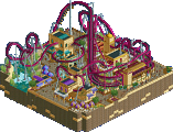
Park / Aurora
-
 02-March 13
- Views 2,195
- Downloads 436
- Fans 0
- Comments 14
-
 56.92%(required: 65%)
Design Submission
56.92%(required: 65%)
Design Submission
In:Cities 80% Wanted 80% Arjan v l 65% Maverix 65% Pacificoaster 60% zburns999 60% Airtime 55% disneylandian192 55% nin 55% BelgianGuy 50% Jonny93 50% Loopy 50% Phatage 50% 5dave 45% pierrot 25% 56.92% -
No fans of this park
-
Download Park
436
-
Objects
269
-
Tags
Similar Parks
-
Aero's Wormwood
-
Southwinds
-
Cocoas Unfinished Parks 2013
-
Flight Of Horus
-
Happy Valley Hangzhou
-
Busch Gardens Asia
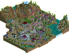
Thanks In:Cities.
The purple grass felt strange to me.
The last piece of the coaster just before the end brake section missed a lot of supports, you might have done better lowering the ground there and add supports.
The supportive ride wasn't peepable... too bad.
And peeps would also have been beneficial for the design, no peeps... less atmosphere.
The red rooves also didn't fit in with the rest of the colours i.m.o.
And for realism, i would've used the spiral stairs from Kumba at the mcbr.
The landscaping is smooth, i really liked that, as well as the choice for foliage.
The rustic waterfalls... it just had a lovely natural feel to it, very enjoyable.
The ride design was okay, but there wasn't much interaction.
Also that terrace with the blue parasols is suited in a lovely spot.
Overall, i really enjoyed the design, but it just missed that extra sparkle i.m.o.
I hope you score better next time.
I don't get the peepable thing lately... Why is it suddenly considered a prerequisite for a park? A few years ago that notion would have been ridiculous. Peeps just mess everything up. And I don't have the hex editing skills to make the ride entrances and exits work. So I can either build giant bricks to hide the huts, or have open stations with defined queues, but no peeps... either one seems to land you hate.
Nowadays it seems to be of importance and not only to me.
Too bad you couldn't use parkdat, i didn't realize that.
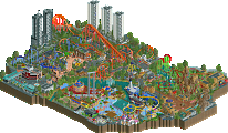
I liked the heavy use of diagonals. Loved the very last section before the brakes. Buildings look interesting. But most of all, the landscaping. It was truly gorgeous. Awesome little creeks you got goin' there! In fact, the landscaping is so good I wish you'd interact more iwth it. : ( I also love your colours. Especially the colour of the tracks against the green of the grass underneath.
While I agree about strangely coloured plants (I dig that stuff too), you're not selling that enough as a theme. If you want to convince something is intentional, you gotta "sell" it. What about surrounding the station with a higher density of purple plants to imply a theme for the ride? Just take that idea you had - which I think is cool by the way - and really do it to the max. I think people might be less confused by the odd colour choice then....
Work on your architecture and interactions, I think that can push your submissions into accolade regions again.
The only thing I really didn't 'get' was this industrial station. I figured that you'd keep te architecture all connected somehow, and for the most part it did all relate, but the station was just off. I felt like this could could've used more architecture like what was scattered around. I'll agree with Liam about the interaction bit too as this was a setback.
Overall though, this was still great! Keep building. Now that you're back it's be cool to see you become great at this game.
Thanks for the comments guys. I know I have to work on interaction. And architecture. Those both usually occur to me so late in the build process that I tend to ignore them completely until there's nothing left to do. I know it's screwing me.