Park / Nyoka
-
 31-March 13
- Views 6,090
- Downloads 630
- Fans 0
- Comments 13
-

-
 71.15%(required: 65%)
 Design

Kumba 85% Austin55 80% Wanted 80% Arjan v l 75% geewhzz 75% robbie92 75% Airtime 70% Fizzix 70% Jonny93 70% Louis! 70% Pacificoaster 70% zburns999 70% Goliath123 65% tyandor 55% pierrot 45% 71.15% -
 No fans of this park
-
 Full-Size Map
-
 Download Park
630
-
 Objects
261
-
 Tags
Tags
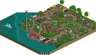
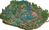
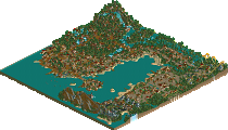
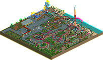
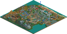
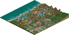
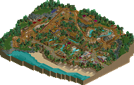
Very nice design, lovely use of colors.
Maybe a bit too much Liampie trees, i would love to see less of those (sorry Liam).
So foliage could've been somewhat better...
But on the whole... a lovely eye pleasing design.
Everything is nicely detailed, atmospheric and just pleasing to look at.
Keep it up Maverix, a well deserved score.
Really awesome design man, and I think you may be my new favorite parkmaker after pacificoaster
Gratz
In all seriousness, this was a major step up, Mav. Can't wait to see that uber-themed project you showed in Fiesta.
*And he made his own logo too!
I have to disagree here. Iron was better, just not complete. Personally I didn't think this was a design. First of all the coaster is a textbook B&M, so zero points for originality. Second of all I think the architecture was quite generic and not noteworthy. What it does have going for it, and I figure that's why people voted design for it, is that it has flow. Something not everyone can achieve. While standard, everything does fit.
Personally I am going to start rewarding originality more with my votes. If it's not a woodie or a B&M you already won 10% extra in my book.
Id just like to add anyone down voting on originality due to the manufacturer type, should consider the fact that there is a very limited number of current/past manufacturer with large scale good rides and lots of reference layouts. Which is why we see so many b&m/cci/gci designs. Combine that with the RCT element limitations of some manufacturers. Id much rather see the above than 100's of arrow suspended/hypers or intamin megalite clones
Overall, nice and well-deserved design, though not the most exciting thing ever. I don't know how all you guys have the patience to keep making B&Ms. Don't you ever get bored?
Misery =]