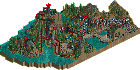
Park / The Necromancer
-
 14-May 13
- Views 6,774
- Downloads 734
- Fans 4
- Comments 19
-

-
 69.62%(required: 65%) Design
AvanineCommuter 85% Kumba 85% robbie92 80% Liampie 75% Louis! 75% 5dave 70% Airtime 70% Maverix 70% Phatage 70% CedarPoint6 65% Pacificoaster 65% Steve 65% wheres_walto 60% turbin3 55% tyandor 50% 69.62% -
4 fans Fans of this park
-
Full-Size Map
-
Download Park
734
-
Objects
240
-
Tags
Similar Parks
-
Scientifica
-
San Avaiki
-
[MM2014 Final] Cavumus
![park_3229 [MM2014 Final] Cavumus](https://www.nedesigns.com/uploads/parks/3229/aerialt2949.png)
-
[H2H8 R1] Dig Site 4
![park_4084 [H2H8 R1] Dig Site 4](https://www.nedesigns.com/uploads/parks/4084/aerialt3816.png)
-
[H2H7 R2] Bermuda: The Lost Colony
![park_3334 [H2H7 R2] Bermuda: The Lost Colony](https://www.nedesigns.com/uploads/parks/3334/aerialt2938.png)
-
Forest Frontiers
Very nice design, very unique and exciting.
Loved the buildings being integrated into the mountains, as well as the landscaping.
The mushrooms in the cave part, a nice touch.
Cool design.
I do like it but seeing as you chose to use colour it does seem a little monochromic from a certain point of view
but otherwise pretty nice. I couldn't open the readme coz I don't have word on this computer, so maybe you said important things there (btw, people should make more readmes in notepad
anyway, nice work and congrats
I can't open in game, so let me first preface the rest of this with the caveat that I can't see what's inside the buildings. The monochrome scheme works for me on the coaster, even if a little bit overboard with the red flanges and black footers. But that you continued that to the rest of the map just muddles everything. That's probably my biggest complaint about the whole thing. On the macro level, it's awesome, but on the micro level, the details get to be a bit repetative.
The coaster colours are totally fine, it's the fact that they're the same colour as the architecture which really kills any atmosphere you had going. Honestly, if the architecture was different colours, even if black is still the main colour, it would improve your atmospheres ten times over. It's a shame because it's such a small thing, but i've thought it about previous works of yours as well.
I really appreciate the unconventional layout, use of vertical drops and hills which you almost never see, and the scale of the whole thing. It's a nice land, straight out of your head. It just doesn't immerse me due to the monochromatic nature of the overview.
Check it out!
I plan to do this with future accolades as well.
Airtime Offline
I have no idea what the Necromancer is but nice name.
I'm glad you added the extra colours around certain buildings, they add a lot and separate the buildings a little whilst still keeping the theme dark and consistent.
Congrats on another design FK!
necromancer is a magic that involves dead people.
+ Impressive landscaping
+ Love the foliage
+ Very original
+ Good atmosphere, reminded me of Monstrocity in places. I'd even call it a Heaven's Kitchen vibe.
+- Architecture was good on the mountain, didn't feel the rest.
- You could've done much more with the surroundings, I mean the paths and stuff.
- The colour scheme should've been more complex
----------------
75%
Well done FK.
love this
Woah bump. Thanks Mulder! It feels like a different lifetime when I made this, lol
Great bump! One of the first parks I downloaded when I joined NE. Wonderful design and very creative architecture built in to the cliffs.
This is real nice, love the little pops of red that bind it together.