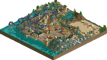
Park / The Eternal Empire
-
 11-February 15
- Views 3,668
- Downloads 727
- Fans 3
- Comments 19
-

-
 66.88%(required: 60%) Silver
][ntamin22 85% Liampie 75% posix 75% 5dave 70% csw 65% geewhzz 65% Ling 65% Jonny93 60% pierrot 60% inthemanual 55% 66.88% -
3 fans Fans of this park
-
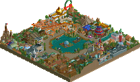
Full-Size Map
-
Download Park
727
-
Tags
nice work! always good to see new LL stuff!
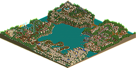
this park was pretty good. some pleasant stuff. decent architecture, especially in that area with the red coaster. It sometimes lacked atmosphere, possibly due a barrenness throughout, and atmosphere is really the main thing LL is great for so I feel like occasionally there's some real missed opportunities. I think the lake may have been too big, it just highlighted how little of the map actually has interesting content... it all just sort of blends together too much.
That said, nice work all over, I'd give it a silver.
LLLL
I liked this a lot.
The park had a very nice atmosphere though in some places it was a little bit bare as Cocoa mentioned. This isn't necessarily a bad thing aestetically but there were areas that were a little light on content.
I think my favorite area was the Moroccan area by the floorless (I viewed this in game last night but am not just going off the overview so forgive me for forgetting names). The pacing on this coaster was excellent, the layout was fun and there were some great sightlines from the path. I enjoyed the architecture in this area as well. Great job.
The entrance area had a real throwback LL style. The woodie fit in very nicely and the large paths, desert colors and canvas awnings worked really well here.
Conquista was nice as well. I really enjoyed the coaster layout and pacing and appreciated the fact that you tweaked it a little to smooth out the brake run. Any time someone pulls off a creative B&M layout without being unrealistic I'm impressed because you basically have to create a landscape that forces them to be creative to make the creativity believable since in real life BM has no originiality whatsoever.
Very nice park... 65% from me.
Thanks for releasing this so fast Liam and the nice logo.
Cocoa: I can see where you're coming from. Well, the water is actually meant to represent the sea so it would be big.
Coasterbill: Thanks. It's good to see you like my layouts especially when I basically just make them up from my head.
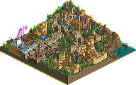
Persia
This is my second favourite area in this park. The entrance could've used some more room, but it works in all its simplicty. That goes for the whole area. It's simple, but it works! Everything flows so well, not just the coaster. The architecture was a little bit TOO repetitive in places, but the shapes and compositions were great, especially the coaster's station. One of the best coaster stations in recent years, easily! The defensive wall along the map edge added a lot too. You must definitely to add some more architectural features like that. Lastly, that last bridge over the coaster's first drop is so, so elegant! HUGE atmosphere.
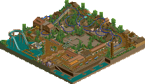
Spain
The weakest area by far, mainly due to density issues. The extreme distinction between green areas and architecture clumps killed the atmosphere here. The architecture and coaster had some cool bits, but nothing to save this area. The colours of the theming, coaster and foliage clashed so that didn't help either. It's definitely not terrible as a whole, but still definitely a step down from the rest of the park. A poorly done bridge gets us to the next area that is more interesting...
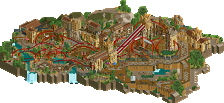
Mesoamerica
This is possibly the most authentic looking classic LL since Ozone. Though it still has some of the density issues Spain had, in places, it has that organized chaos feel I love so much in classic LL. Unexpected texture, colour and object choices, stuff on the paths, that kind of shit. Also, what you did what I could never do was getting that irregular stepped architecture around the temple complex to look right. It looks right. Something I liked less about this area is how high up it was. It didn't seem to serve a purpose and looked weird, unlogical and unnatural...
Morocco
My favourite area in the park, I'm a sucker for pastel colours and this is one of the best pastel colour things since Musette, which is the best pastel coloured RCT creation since RCT. Lovely colours. Sovereign is a piece of art. Wonderful layout, actually uses the cliffs present, cool name, great station again, and of course beautiful colours. Could've been better if there was more theming around the coaster (density issues!), it was so barren! Speaking of landscaping, I wouldn't have guessed this was Morroco. Although I'm not an expert on Morocco, this seems too lush. Minor problem though, it's only an insignificant label.
Overall: watch out for 2x2ism, work on your landscape-architecture integration and keep building. I can't decide between 70% for the technical skills and 75% for the beauty, but fuck it I'm voting 75%.
edit: Forgot to say, the landscape-architecture mix/density was PERFECT around War Elephant.
65% from me. A very solid park, nothing groundbreaking, but pleasant to look at nonetheless. Spain was my favorite area, I loved the foliage and color combinations there. I think you need to work on transitions between areas (which is something I have trouble with, as well), because almost all of the separate areas were connected by bridge, and lacked some flow between them. Overall good release, I don't know how you're cranking them out so fast.
some places were mesmerized me.
Liam: Thank you for the in depth comment. Some of your compliments made be blush. In terms of my landscape architecture density, I wanted the buildings to be connected as they're meant to represent living space. But I'll try to get it better next time.
csw: I guess the flow problem is because all the areas were separated by rivers. And when you have a lot of time, you can get a lot of work done.
pierrot: Wow thanks!
Oh wow, the reminiscence when looking at this almost overwhelmed me.
Amazing work. Loved it. Mesoamerica being the strongest and most beautiful for me.
A few things.
You have a water problem. Putting everything against a cliff doesn't help too much. The height elevations were too much overall, making this even more problematic. I think you need to refine and sophisticate your style while simplifying it at the same time. Maybe inject a little bit more realism into your projects. This also goes for your layouts which aren't the forte of this park. You have the aesthetics down, I'd work a bit on the deeper macro level of your parkmaking.
Really want to highlight your landscaping and theming. The main ride stations were brilliant. This is hard to do but works really well overall. I would put more attention to all attractions and features of your park. I felt there was a lack of shops and restaurants to explore, or non-coaster / non-ride attractions that make things a bit more interesting. You could show some more creativity here.
But again, really great overall. I have no idea how you can be building 2001-2002 style so effortlessly in 2015...
Glad you put me in the park by the way. Seriously can't wait to see more soon.
Poke, your time machine worked!
"MFG"
This has so many aspects of great LL design. It's a great park. I'll take a proper look soon and be here with a proper review.
Keep up the good LL work though!
I love how a lot of stuff feels "larger than life" in the park. The height changes are absolutely enormous when you step back and take a look at the individual zones in context and the buildings are all tall and the station buildings are huge. It's a great effect and I love all of the areas. Mesoamerica felt the messiest and at times it was hard to tell where that was accidental, intentional, or merely a lack of a way to do it better. Foliage choices all across the park were stellar. Ride layouts felt a bit... standard, somehow? Nothing bad but nothing stands out. I did like the use of land tunnels to cover the path from rides passing overhead, however - felt very "semi-realism" in the spirit of old NE spotlights.
The only thing really holding it back is the giant expanse of water. It takes up almost as much of your map as your park does. That said, this is easily mid- to high-silver, so I'm going to have to give it a 65% and a hearty recommendation to anyone that has LL and can view it in-game. Great work, Poke.
It totally did!
I suspect I'm going to be the high vote on this.
posix: Thank you. I'm working on a design so that should help me focus on more individual features.
Louis: Hope I get to read that soon.
Ling: Thanks. Yeah, the water is a bit of an issue.
][ntamin: I'm excited to see it. Let's hope more people vote.
It's really a shame these LL parks take so long to get voted on. More people really need LL.
congrats poke! another solid park from you that got an accolade. i expect gold from you after h2h
Congrats!
PBJ Offline
that woodie is sexy! <3