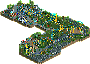
Park / SuperSonic
-
 28-June 15
- Views 5,649
- Downloads 603
- Fans 2
- Comments 31
-
 66.25%(required: 65%) Design
Faas 80% FredD 75% Poke 70% Stoksy 70% inthemanual 65% Liampie 65% RCT2day 65% 5dave 60% geewhzz 60% Ling 60% 66.25% -
Description
SuperSonic - A fast and intense hyper coaster.
I took a lot of inspiration by Carrowinds upcoming Fury 325 but changed some key features. -
2 fans Fans of this park
-
Full-Size Map
-
Download Park
603
-
Objects
1
-
Tags
Overall, quite a nice design, definitely worthy of accolade in my opinion, I'll give it a 75%.
Best design we've seen in ages. Hands down.
Congratulations. I'm in love.
Shame for the BBS, could have been a nice design...
"MFG"
Look at the little Fury, it's so cute. lol
Can't wait to check this out in game.
Awesome man!
The layout was super cool, as were the supports, solid job there!
The architecture is executed to perfection, with small details in just the right places and the right amounts.
The landscaping and foliage was also perfect. Minimalistic and sterile, but in a very, very good way. I have never seen bare patches of grass look this good. More people should do this.
I would also like to urge everyone that uses steel roofs everywhere to take this as a perfect example of how to use them (in small amounts, and on buildings that actually have steel roofs in real life).
And just when you think that it's all a bit too sterile and clean, there are the cool little details like the billboards and the little ice cream.
The only complaint I have is that you could have swapped some space you devoted to roads and parking lots to actual park stuff, including maybe one more supporting ride.
Keep up the good work!
Architecture: clean and detailed, I like it. Cold and generic for the most part, though. I loved the I-scream building. A cone sculpture has been done hundreds of times, but yours might be the best yet!
Foliage: wasn't a fan, but it didn't hurt the design.
Map layout: I like how much tiles there were around the coaster, it definitely had enough room to come to life. I think the map was cut off at some awkward places though, like halfway through the entrance and the path that's supposed to lead us to the coaster. This map's biggest flaw.
Overall it's very good though, obviously took a lot of skill. 65%
I'm a little torn here. The layout is brilliant but the pacing is just too slow and something this long really needs an MCBR. The supports are good but some of the footers are mis-colored. You have some beautiful structures, but not enough of the because the map cuts off right next to the layout almost all the way around, which leaves the ride lacking in context. Except you did build a bunch of the parking lot, which has nice parts (like the bridges and ramps - felt very Cedar Fair) but is just such an empty thing to dedicate so much of your small map to. You also have a random piece of steeplechase track under the lift. These feel like weird nitpicks but what is there just isn't substantial enough, I feel.
It was a solid design, well done. The layout was good and the parking lot was executed well. It was generic and quite boring though and honestly there wasn't much to see. The whole layout of the map was quite awkward; I didn't like the path that connected the entrance and the SuperSonic area. The architecture was skilful however it was quite generic and sterile and I didn't really see the point of having the interiors, it was forced and didn't look right to me.
Overall, it's good technically and you have a lot of skill, just work on theming and originality.
Congrats on the design! This is the first time ever I am the highest voting judge, and it is also the first time Fred isn't! I guess I broke two traditions single handedly!
Didn't have a chance to vote on this Would've been high like Faas.
I have no idea how this only just got the 65% needed for design.
Whow! The attention to detailis amazing here, especially at the Corner /Truck1 store.
Just kidding. I've been excited for this one since i saw the first screens of it and i'm gonna explore it a bit more now.
I'll give more thoughts later
now waiting for the usual dissenting argument and metadiscussion about the panel in general
i'm not as much of a retard to know that the panel voting will always be subjective to a degree, but i also feel that if you know your vote will be low because you don't like something stylistically then you should refrain from voting on a piece
it's not like there's a shortage of rct2 panelists anymore
(if i'm being an accusatory dick by all means shove my foot in my mouth)
If you refrain from voting because you don't like something, then you're preventing an accurate representation of the whole site's opinion on it.
I'm pretty sure the vote discrepancy on this stems from people either appreciating what is there, or being disappointed at what isn't. I personally thought that what is there is executed really well, just that this is a bit sterile. I can imagine a few things that would have helped this out a lot: filling in the gap, a more natural park history, some more color, life, and shade. I appreciate what's there, as it's executed really well, which is why I voted for design, but nothing stood out as particularly well done, exciting, or lively, which is why it was just barely design.
If I'm understanding how the voting works, it takes the first 10 people vote ad gives a percentage based on that. Then it still can be inaccurage in the sense that the majority of people who disliked it simply voted first and faster than the other people who liked it. It isn't really an accurate representation if its only limited to 10 people without a time limit and exclude others simply because they were too late to vote... That is if what I'm saying how it works is accurate, if I'm wrong, then nevermind.
Magnum didn't even get Design