Park / JAWS
-
 15-August 15
-
Reddit Contest [Jaws]
- Views 3,579
- Downloads 574
- Fans 1
- Comments 17
-
 66.25%(required: 65%) Design
geewhzz 75% Poke 75% Maverix 70% tyandor 70% disneylandian192 65% Faas 65% FredD 65% 5dave 60% csw 60% Ling 60% 66.25% -
Description
Reddit July contest submission.
-
1 fan Fans of this park
-
Full-Size Map
-
Download Park
574
-
Objects
1
-
Tags
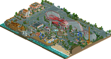
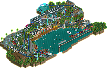
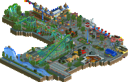
![park_3324 [H2H7 R1] Circus Circus & Adventuredome Atlantic City](https://www.nedesigns.com/uploads/parks/3324/aerialt2970.png)
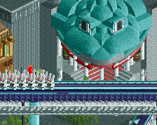
Like it a lot. You did great with the bench, fun details throughout. The caught shark was great.
+Solid theme execution
+Nice custom flats.
+Architecture was nice throughout.
= Water music is always a good idea but I think trying to get the Jaws theme would've made it a lot better.
= Layout was decent but I think it could've done with another helix towards the end.
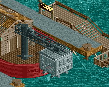
- The dock is a mess.
- Boats were iffy
- This is a nitpick, but how is a giant palm tree going to grow on a pier with nothing but 3 feet of concrete and the harbor beneath it?
This was a pretty well done park, definitely felt like a modern take on an old bench, which was cool. I enjoyed the layout and the surroundings, but kind of like Bonnie and Clyde, the planning wasn't the best. You could probably take the individual elements of this (arcade, waterfront, dock etc..) and re-organize them around the same layout and get a much better result.
Knowing the rules of the contest however I realize you had very little time to fully plan this out, so its understandable. Overall, lots of cool stuff just very oddly put together. Rating: 60%
Loved this! You did a fantastic job with the bench. Had nice activity and life throughout, and some excellent details- the shark, the boats, the way you did the curved walls, all around fun and well executed. I agree that the park layout was a tad strange but it still make for a wonderful little park.
70% from me.
I love the details, particularly the hanging shark carcass. The boardwalk area was great. Shark Tours definitely meanders around that (way too fucking big by almost a factor of two) shark body too much, and the dock, as stated, is a mess and kind of an eyesore, but all of the architecture is pleasant and the foliage flits between masterful and just okay.
What didn't grab me so much is the coaster itself - the choice of a hypercoaster seems highly counterintuitive for something about sharks. There is no interaction with the water or any cues from the movie(s) involved directly, I'm definitely thinking a flying coaster or dive coaster would be the more obvious choice here. The chairswing was a bit underwhelming and the food court on the far side of the map is just kinda... there. The #boatflow is on point, however.
Great details here, but I just don't like the coaster enough to put it into Design territory. And I do wish you had had more competition over on Reddit, but we're putting together some more "familiar" stuff to try to get some of the newbies and less experienced players back into playing and posting work.
I liked this a lot. Architecture is really good and breaks away from the things you usually see around here, which is awesome. Could have been a bit better content and interaction wise.
I thought this was really good.
Pros
- The architecture. Some clever use of the base objects and I actually thought the trackitecture was done well.
- The details. The hanging shark was executed really good.
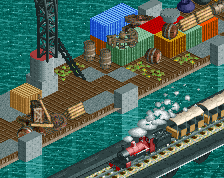
- I thought the boats were done pretty well.
- The custom flat was executed good.
- I liked the layout and that element by the boats was really cool and original.
Cons
- As much as I thought the architecture was good, some of it was inconsistent thematically.
- I thought the the boat ride had too many boats in my opinion.
- I thought you could have done more with the arcade as it looks pretty boring and drab.
- Yeah, the path layout was a bit awkward.
Overall, some of your best work in my opinion.
I think this literally just won design the moment I wanted to vote. I gave 65% but it's not in the panelist breakdown. Anyhow, congrats. Solid work.
Don't like the supports over the building. No one would plan it like this, so for realistic creations it doesn't make sense and looks odd.
Not sure I agree with the rating here, not to be a dick but I really didn't think this was worthy of Design. Great concept, good content, but poorly planned and composed. Nevertheless, pretty good for a quick build for a Reddit contest!
I think the composition is great, but the planning is a little lacking. I'm pretty sure part of it is due to implementing some of the changes I suggested, which obviously changed this a lot from whatever you had initially planned, but I think they improved the park a lot by providing the feeling that this was connected to a bigger park.
I was on the fence about this one. On one hand, the architecture was pretty neat, you've definitely got a talent for building. But I felt it was just missing something to get over the hump of design. When I compare it with other recent designs it doesn't quite match up to me.
Congrats on the accolade though.
I certainly felt that this was borderline; could have gone either way.
Some of the planning comments are probably fair, I can say that the entire area by the swinger was added after the ride itself and surroundings were finished so if one of the problems with planning was with respect to that; that's why. The roof supports by the waterfront are certainly valid, I can agree with that and probably should have done them on the other side. Same critique applies to the supports by the midway/food areas; I will certainly take that into consideration next time.
The area by the entrance to the coaster queue was originally a plaza/dead end and therefore the arcade would I think have worked a little better. However, the addition of the extra area at the back needed a suitable access path and opening up the arcade seemed to be the best approach.
If I were to have changed anything planning-wise [from the original one] I'd have swapped the position of the boats with the buildings on that side. In my opinion the position of the dock [too messy, definitely] is fine with respect to the train but it looked out of place where it was because of the surroundings. I do like the position of the waterfront personally, although I would definitely reconsider how I did the support work there.
@csw: I imagine that the palm tree would have been transported fully grown and the clock base would be some sort of pot for the tree.
Thanks for all the feedback! I have one more unplanned park in the works [Extinction, but its had excellent feedback so far]. Anything after that should be better planned out.
Has someone subscribed to make a logo for this? I would love to if no one else is.
^I don't remember if I requested a logo or not, but if it's okay to do so then I'd love that.
I love this. Posix is totally right about the support placement but besides that it's very nice work. Love the hanging shark and the shark themed doorway. The dock is very nice also.
65% from me, not that that matters at all. Great stuff!