Park / Archipelago
-
 13-September 15
-
Archipelago
- Views 6,321
- Downloads 660
- Fans 3
- Comments 35
-
 81.25%(required: 70%) Gold
chorkiel 85% yes inthemanual 85% yes Liampie 85% yes posix 85% no 5dave 80% no Cocoa 80% yes Louis! 80% yes ][ntamin22 80% no csw 75% no pierrot 60% no 81.25% 50.00% -
3 fans Fans of this park
-
Full-Size Map
-
Download Park
660
-
Tags
Similar Parks
-
Viracocha
-
Valkyries Ride
-
Adriatic Adventures
-
Chronicles of Arransia
-
Attractiepark Duinenzicht
-
EverQuest: Waters of the Past
Player, LL
Fantastic park. Really fantastic.
Of course I had to reinstall win10 yesterday and thus I don't have an LL copy.
Some really top notch work in here, the Sahara/bazaar section was some of the best LL in a long time. Just wish the rest of the park had that level of care and attention. Definitely has a classic feel to it, but I dont know if that benefited the park. Personally I would have liked something a little more forward moving rather than a throwback or attempt to re-imagine and older style.
Still a good park probably a 70% from me, that if everything was like the Bazaar it would have been an easy 85%.
Player, RCT2 (CSO ONLY)
wow, amazing work. I'll give each area a rundown.
entrance-
solid, classy work. especially the ticket gates and admission area is very well done, classic NE feeling work. perhaps the area is in places a tad sterile and overdone, but overall a solid entrance.
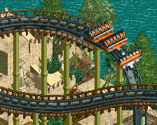
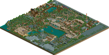
egypt- definitely the best area in the park. full of life, colors, awesome landscaping. I especially liked the section with the diver- that was an excellent layout, amazingly integrated with the scenery and with a really unique, exciting atmosphere. this is probably the area where it felt the most original and exciting to me.
atlantis- I'll admit, atlantis areas usually make me sign. so overdone! and I can never figure out why- adding a splash of blue to roman themeing just seems so boring and overdone to me. so you have to really impress me to make me like an atlantis theme. I think the main area was a bit busy- some good work, the stadium was well done, but a bit eh. the b&m had a lovely setting, however- I much preferred the lush foliage and focus on landscaping here to the busier city-section of the area.
jungle- also a pretty solid area. A quite well-done version of a classic theme. some really solid foliage and landscaping- I actuallky think this is where you excel, and where you emphasize this skill, it really showed.
logging- this area was my second favorite. some really unique and cool stuff, and an awesome atmosphere.
If the whole park had been as good as this area and the egypt one, it would be no question a spotlight from me. as it is, I'll think about it, give it a few more visits. not really sure atm. i'll probably vote 75 or 80 now to move it along to accolade voting though
I'm an Atlantean Warrior! Sick!
Great park Poke, expect a review in the next day or so.
Of course right this week my computer broke down. I'll download, vote and review asap.
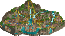
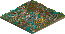
Overview is incredibly pretty.
Going to check this out
I'm still waffling on my vote, but I will try to get some feedback up soon.
I'm excited to see all the reviews this park will get eventually.
This is basically my swan song in LL, don't think I'll ever play it seriously again. The amount of time that goes into these parks versus the amount of attention they receive just isn't worth it anymore.
edit by Liampie: 3.
Edit by Tim: 2
Well, if it is your last LL park, it's a great way to go out. My favorite area was probably Atlantis. I know you love building huge structures, and I think Poseidon's Castle is the best one you've ever done.
Everything else was pretty well done, too. I think it was just lacking a few details that would've bumped the score even higher. The foliage felt weak in a few places, and unfortunately, I care a lot about foliage If you could've kept up the level of detail that there is in the bazaar in the corner throughout the whole park this would probably be a spotlight.
I'm also glad to see you expand your building techniques. You used rapids track and tracktitecture in general very well. Sad to see you say you'll never return to LL, but I bet you will some day. With the talent you have, you'll be back.
Gold from me.
I really enjoyed exploring this park and all the attention to fun details around the park made me sure that I'll still have little things to find whenever I decide to open this park again.
The rides were fun and there was more than enough variation in rides to keep me interested. Architecture was although traditional often still renewing or interesting.
Good stuff.
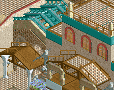
Vermillion Avenue:
Great to see posix's fav ticket takers back in action! This area was really elegant. The flower colours, paths and the open-ness of the area reminds me of the entrance area in Isole Calabria - which is a good thing of course! The level of detailing is good but sometimes I found the awnings a bit inconsistent (I would have stuck with just the mine train track rather than woodie) and many of the signs you've made from single rail coaster unfortunately just look like odd bits of single rail coaster. You might have found more convincing solutions by stacking scenery pieces or using ride cars or something. I like the placement of the railway station with the small plaza in front. The railway is very cleverly laid out, acting as an inner ring and reaching all the areas in quite a short distance. You've also managed to keep it mostly flat and open air which is something I struggled with in my park - I had to use some awkward hills and long tunnels to make it work. I love all the bridges too, the wooden track works really well and good incorporation with the footbridges. Back to this area anyway - Caballera was a simple but great layout. The interactions were very well placed and it felt like the perfect pacing and length for an arrow coaster. The break run/ladder was a great detail. Colours were on point too.
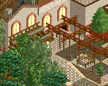
Khaki Bazaar:
Great lively atmosphere in this area. That said I'm not sure I like this area as much as others, just a bit too chaotic for my tastes. I get that's what you were going for but would have liked to see you create a busy area whilst keeping clarity. Right now the land and architecture sort of blends together because of the sand textures and again maybe theres a few too many track types for the awnings. I did think the square around the fountain with the stalls and clothes lines was executed brilliantly though.
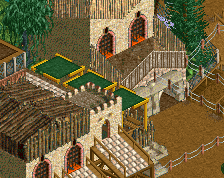
Khaki Desert:
I like how you've got 'sub-themes' in this park. It's a nice way of giving more depth and variety to themes and something I don't think I've seen before. Good job with the dark-ride. Natelox inspired perhaps? You've managed to make a potentially massive and blocky structure blend in really well and look good so kudos for that. Infact I love all the big structures in this area. The restaurant is great with the terrace out front and archways at the back. You can easily imagine sitting there high up above the river. The Virginia reel awnings are working well here too. Horus is sick! I'm not sure I like how the queue sticks out into the path creating a bottleneck, I'd have brought it in a few tiles. Generally I prefer this area to the bazaar, the architecture seems to have more purpose and I like the ruined buildings you've mixed in. Probably helps that there's a cool roller coaster here too!
Poseidon's Kingdom:
I like how you've laid this area out with a huge stadium as the centrepiece. I'm afraid I found the stadium awnings to be a bit ugly though. I think you could have found a more elegant solution here with coaster track. The yellow queue pieces look especially awkward. The set was really cool though. One of the strengths of this area was the paths, you managed to add a lot of detail and interest without them being messy. The flowers, foliage and rocks that bordered them were great too. The architecture was decent but again I think more consistency with the awnings and detailing plus a more harmonious colour scheme would have really lifted it. I get that you're going for variety but 2 or 3 well paired colours would have been more impactful. I actually think you did this excellently with Poseidon's palace. The yellow, ice blue and gold is unique and works really well. It would have been nice to see this scheme carried over onto more of the architecture in the area.
Poseidon's Paradise:
Trident was a cool layout, if a tad awkward in places (the big underground turn before loop and the s-bend after it). The elements were well placed though and I liked the imposing scale of it. I particularly liked the zero g and diagonal break run placement. Fantastic colours and the lift supports were very original too. I love the landscaping and foliage in this area. I actually wish you'd used more of these dramatic cliffs elsewhere in the park, to divide areas for example. They look so good here anyway! Did feel a little empty though, maybe the area needed an extra ride or two?
Panthera Jungle:
One of the stronger areas in my opinion, possibly my favourite. This is where your eclectic mix of textures in the architecture is working well! The density of the foliage worked well here too and the purple flowers were a unique choice (I feel like with jungle themes we nearly always see yellow or red flowers). The spots of crazy paving looked great and were a clever way to accent the plazas in front of the main rides. Tigris falls was cool, the drop looked really good and was well themed. I only wish it might have been a bit longer interacted with the wooden coaster some more. The Guardian was just awesome, wouldn't change a thing about this coaster, it's surroundings or the station.
The Ironworks:
Parts of this area I loved and some parts I feel you could have gone further with the theming. In general it felt a bit too verdant for an area called ironworks and I think you could have dialled back on the trees, and all the browns/wooden textures. The area around the wild mouse was great though, good use of the big reverse freefall pipes and the mini railway track roof is unique and works well. The grey path is a good contrast to the browns in the architecture and I wish you'd used it for the rest of the area. Nevertheless the rest of the area is equally atmospheric and you've got a good variety of textures and details. Contraption was ace, unique for an SLC yet believable. Some of the surrounding scenery and buildings could have done with a bit more clarity purpose, however I like how tight the coaster passes through everything, quite Nemesis-esque in places. Good placement of elements too, It's cool how the cobra roll is visible from across the river.
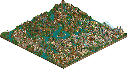
Overall it definitely feels like your most accomplished park yet. It's certainly the most full of content. The macro/overview is impressive and the park flows really well because you don't have a giant lake in the middle isolating the areas. I feel like you could have been more creative with some of the area transitions, rather than using rivers and bridges every time. Would have loved to see more of that impressive rock work like you have around Trident.
You've ramped up the texture and details and the parks got a much livelier atmosphere than your previous releases. I do feel it lacked some of the cohesiveness of The Eternal Empire, a park which had very strong colour schemes and a lot of clarity in the architecture. It's a shame some of that was lost in this park, but it's very difficult to get the balance of variety and cohesion right.
I'd give this park 75%. I think a spotlight park pushes boundaries more and has new ideas and a sense of inventiveness that this park lacked a little. It's clear you're experimenting more with your architecture, keep going in this direction whilst maintaining clarity and purpose. Be braver with themes and ride layouts too. Anyway, I hope you find the inspiration and motivation again at some point to make more great LL parks. Thanks for building and sharing them with us!
I ended up voting yes for spotlight. In my head it was extremely close... on the one hand, it's not perfect... but on the other, its better than a lot of spotlights imo. I decided yes because it would probably make you happier so I might as well not be stingy sounds like a dumb reason but when its on the line you have to call it based on something eh
#vote4poke
Here is the review me and Zach did on stream last week:
https://www.youtube.com/watch?v=2qdUaXhq2Kc&list=PLiJXzspriNSxsS-6eIVxCItMf22R2w7W9&index=1
https://www.youtube.com/watch?v=Fo2y-79dNdI&index=2&list=PLiJXzspriNSxsS-6eIVxCItMf22R2w7W9
I apologize if I wast to harsh or negative, I do like the park (gave it a 75). However the review was a review as a spotlight, not just a standard park, hence the high standards.
Kind of sad that this is your last LL park Poke, you definitely have lots of potential in this game. I wish you wouldn't care so much about reviews and reception and just build for fun, but at the same time I can't really blame you.