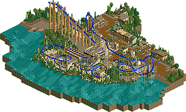
Park / Fury of Seth
-
 23-October 15
- Views 2,153
- Downloads 464
- Fans 0
- Comments 12
-
 52.50%(required: 65%)
Design Submission
52.50%(required: 65%)
Design Submission
Chocotopian 65% Poke 65% alex 55% disneylandian192 55% Liampie 55% Jonny93 50% Sulakke 50% csw 45% Kumba 45% Austin55 35% 52.50% -
Description
An inverted roller coaster inspired by real coasters like Montu and Talon. Surrounded in an egyptian themed zone, all NCSO. This is just a small work I did after years without playing RCT.
-
No fans of this park
-
Download Park
464
-
Objects
1
-
Tags
Similar Parks
-
Extinction
-
Captain, I think we have travelled in time
-
[H2H7 R4] The Wild West
![park_3367 [H2H7 R4] The Wild West](https://www.nedesigns.com/uploads/parks/3367/aerialt3772.png)
-
Busch Gardens Europe
-
[H2H7 R3] Meizhou Rising
![park_3350 [H2H7 R3] Meizhou Rising](https://www.nedesigns.com/uploads/parks/3350/aerialt3056.png)
-
Star Wars
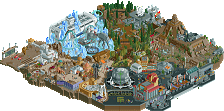
I really liked this design. The basic layout of the coaster is pretty smooth, most elements come in at a decent speed, with the barrel roll being a touch fast. Peeps get a decent look at some of the key elements on the ride, especially the loop and cobra roll, though some path interaction would have made it better. And the color choices fit in really well. The coaster pops very well with the blue, and the mix of sand colored buildings, with touches of blue and the darker path is great. Overall a great mix of colors.
Areas that could have been stronger, maybe a bit of foliage on the edges of the wet sand area below the coaster to blend the current foliage, maybe just some shrubs and ruins in some places. Buildings had some nice touches, could have used more detailing, but not a major weakness. It would have been great to add peeps and open the coaster before releasing the design.
I take it you released this just for fun, maybe just getting back into the game. But honestly I enjoyed it and you should get something else cooking soon to keep your momentum!
pleasant work! the layout is pretty damn good and I like the setting of the coaster too. I would have liked to see more stuff- flat rides, buildings with purpose (and that aren't 2x2), maybe some action and exciting stuff. but I like it.
I know the name Seth is ancient, but it still sounds like the opposite of scary to me
The Layout was great, the cobra roll is a bit slow and the corcscrews a bit fast, but otherwise pretty good!
I actually liked the architecture, it was simple but well made.
I agree with bigshootergill on the foliage though and as Cocoa said, I´d liked to see some more stuff on the map.
Overall good work!
MCI
Overall a nice little design, just wish there was more content and the layout was a little more refined.
https://www.youtube.com/watch?v=tTLwVvaYE_w
Buildings were nice, layout was decent. Next time, at least open the ride before submitting!
Sorry, I forgot that haha and thanks for the comments
This had a very nice old school feel to it. Basic buildings, egyptian theme, no peeps. Screams old school. I really enjoyed the layout. Its footprint was great. My biggest piece of feedback is better pacing. The speed was great going into the loop and in line (which I would have preferred to see in the other direction) but quickly died in the cobra. The foliage that was there was nice and pleasant. Not stellar by modern standards, but this would have been a memorable design 7-8 years ago. A great comeback to the community though and I'm looking forward to more from you!
Not bad, but there was a lack of real activity. I only looked at it for like 5 minutes, because I got bored with it. The layout was excellent, as was the interaction with the surrounding area (buildings, foliage, etc). Try to add my life into your parks with other rides, peeps, something unique.
+Overall composition is really nice and well thought out. Placement of cobra roll is spot on next to that waterfront path section for example.
+Layout great in general. Some really good path interactions around the ride entrance. Last corkscrew and helixes were a bit iffy.
+Really strong foliage I thought. Worked really well in outlining and highlighting certain areas of the layout too.
-Architecture had a decent level of detail and mixture of textures but the forms were just too simple and blocky, many buildings just being 2x2 cubes. Most of the buildings lacked identity and purpose too.
-Lacking in content. Needed a couple of flat rides or some restaurants or just any other places of interest other than the coaster.
Overall it's nice but I think the layout would've needed to be that bit more special to make up for the lack of other content. It was good but like the rest of the submission just a tad plain.
A neat design. I thought the coaster had a great overall look in terms of size, shape and colour, and that it interacted well with the waterside, the path and itself. The pacing was so-so for me, with the loop working well, but the cobra not so much, as others have mentioned. I did like the way it maintained its speed right up to the end though without meandering off or, conversely, braking sharply and losing potential.
The foliage was pleasant and I liked the way you didn't hold back with it as some do with a desert/Egyptian theme (making it all seem rather dry and limited in terms of selection). Instead, the foliage was lush, varied and added some lovely colours, without looking out of place.
The surrounding area did its job well. The way you suggested that this was a section of a park was clear and efficiently done through the path choices, and the whole waterfront location was believable. The buildings, despite being very basic and similar in shape, looked quite good, I thought. They complimented the scene without distracting from the main attraction, and had enough added details to keep them from all looking like the same structure.
However, despite all these positive points, I'm afraid I wasn't wowed by this coaster, as what's there seemed quite safe to me. Had there been a unique or defining feature (like a complex interaction or a centrepiece perhaps), I feel this would have pushed this design much further. It's all very well done, but didn't display much in the way of being distinctive.
I think this is an example of a design down to its bare bones. The architecture is pretty forgettable and the theme is overdone but for me this was good enough. Just needs more life and those finishing touches like peeps and shops to add that extra detail.