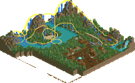
Park / Legend of the Loch
-
 13-January 16
-
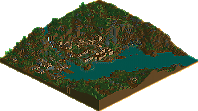
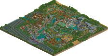
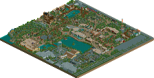
Legend of the Loch
- Views 3,208
- Downloads 546
- Fans 4
- Comments 12
-
 66.88%(required: 65%) Design
Kumba 90% Poke 75% chorkiel 70% Liampie 70% nin 70% alex 65% pierrot 65% Cocoa 60% csw 60% Chocotopian 40% 66.88% -
Description
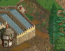
Lovecraftian Horror in the Highlands, or the story of how I'm finally done with that QFTBX layout
-
4 fans Fans of this park
-
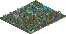
Full-Size Map
-
Download Park
546
-
Tags
Similar Parks
-
Zippo's Wacky World of Wonders
-
CCCP
-
Attractiepark Duinenzicht
-
Anaconda
-
Six Flags Worlds of Discovery
-
Pretorei Park
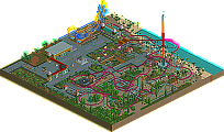
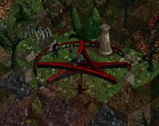
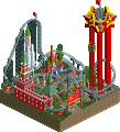
What a surprise. Haven't checked it in-game yet, but it looks good from the overview. The hidden monster is cool and the layout looks great.
Obviously the thing is meant to be a bit drab and barren, but I do wish the coaster had a better color scheme than it does. Maybe like the darker purple or something, something sinister yet better than a pale green.
Really liked it. Layout is great and the whole thing oozes atmosphere. I agree with nin on the color scheme though.
The monster is brilliant and the small village around the coaster lookskind of boring, but in a good way. If that makes any sense...
Great Work!
Woah, this atmosphere is so creepy, yet gives a really satisfying feeling. The coaster is great as is the pacing. I did not expect the looping trains, but I guess it makes sense after seeing the layout. The foilage at the top of the mountain is really good.
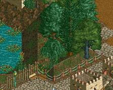
Gotta love those sheeps at the little shed.
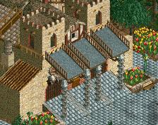
I actually liked this less than kestrel. Maybe because it didn't really feel scottish outside of the name and landscaping (which was absolutely the best part of this). I also really liked the small details around the large map, they really helped make it. But I didn't like the broken up paths, haphazard buildings and stuff in the main town. It just didn't really work together IMO, but I get what you were going for. Anyways kudos on going back and finishing old shit.
I found this really interesting; it had such a unique aesthetic and the landscaping and foliage were quite pleasurable to look at. The rain was also a great touch to really emphasise that atmosphere and mood. Although, I wasn't a big fan of the cult and the pentagram stuff as it doesn't really do much for me.
Gave this 70%. Overall this was executed really well, but it wasn't really special. The 70 was entirely given for the good looks.
Sorry, ][ntamin22, but I really couldn't get into this. I found the coaster's layout to be an odd mix of tightness and sprawling, with the elongated shallow slopes adding some strange angles to it. And I agree that the colour didn't add much to it either. Some of the surrounding buildings were nice, with original little details, but I felt that most of it blended into everything else, with path looking like land, roofs looking like path etc.
The landscaping was very well done though, with a lot of believe-ability. The sheep were a neat little touch (even if their shepherd/mechanic had gone walkabouts!) and the pentagram area was a humourous bit. Of course, the monster was very cool too and, indeed, a great use for that object.
Perhaps this crossed the line of your usual messy style into plain chaotic. Seems a bit to haphazardous and sloppy even for my tastes. The coaster kind of just seems like it was slapped down and with little interaction with the architecture. I overall did enjoy the little touches like the cows and the sculpture. The landscaping was quite nice as well and gave the map a very fresh feeling.
Worthy of a 55-60% IMO, definitely liked Canyon Raptor more than this. Seemed there was a little more effort put into that and the messy style worked a lot better that in did here.
Hope we can see full scale work form you soon, very much looking forward to you multi-map project.
90% from me. I loved it.
The setting is perfect and full scale. The coaster layout is awesome too. The game supports on most of it was okay, but could have limited them. You had details everywhere, loved that. The building style was quite simple, but very creative in some spots and in the simple spots I can see why it was done. Would have liked to seen peeps, or actually just about 2x the moving staff could have given the atmosphere a bump.
This is up there with Tempest, Fire Dragon and Adelaar for being one of the best LL NE Designs I have seen.
Still... a 67% community score is wrong. If this misses officially making NE Design I think it's proof that there is a flaw in the system.
Well done ][! Glad it won.