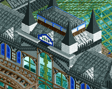
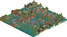
Park / Easkerton Towers
-
 07-May 16
-
Easkerton Towers
- Views 6,094
- Downloads 762
- Fans 8
- Comments 27
-
 67.50%(required: 60%) Silver
Chocotopian 75% Cocoa 75% Poke 75% Sulakke 70% alex 65% csw 65% posix 65% Stoksy 65% Louis! 60% nin 60% 67.50% -
Description
UPDATE: with the current state of OpenRCT2, the "vanilla only" option is no longer needed, it works fine both in the vanilla and Open version now.
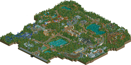
Visit the beautiful Easkerton Towers with its landmark castle, gardens and rides!
With many thanks to Lagom, for advise and help with the hacks! -
8 fans Fans of this park
-
Full-Size Map
-
Download Park
762
-
Objects
1
-
Tags
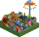
![park_3371 [H2H7 R5] Universal Studios](https://www.nedesigns.com/uploads/parks/3371/aerialt3057.png)
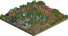
Fun park!
I really like the atmosphere you created all over the park.
The theming is really nice, I really like your style.
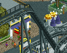
Only complaints there are the TARDIS Station and the Pinball Party Station. Those big round things on the walls dont really appeal to me.
The ride selection was great! Some kickass rides like Melancholia paired with a lot of family friendly rides. The layouts for Melancholia, Pinball Party and Phoenix are great, really like those. TARDIS and Robin Hood are not on the same level, though. Didn´t like them at all. TARDIS is way to slow in some places and the middle section of Robin Hood (after the 540° Turn) just feels stupid to me. Same goes for Rooftop Riders. While I love side friction coasters, this one just did nothing for me and the placement at the edge of the park isn´t really helping either.
The Rapids and the LogFlume are looking great, although the big drop could have used a longer straight afterwards to slow the boat down.
I guess that sounded a bit negative after all, but I really like this park! So many cool ideas and themes all over the place. (Wallace & Gromit's, Platform 13, Sherlock Holmes, the placement of sonic shooter...)
High silver for me, maybe gold. Im not sure yet.
Again, great Park Jappy! Hope to see more from you in the future
Definitely your best work yet. Lots of great areas and tons of atmosphere, scale was on point and it felt really quite believable. One thing I'd suggest though is make sure when your using the foliage filler object, to place it down before the trees, this way it doesn't give off that floating look. Foliage was top notch though outside of that, overall great work. Probably a 75 or so from me, I'll try to provide a full review soonish.
@MCI
Glad you like it! I know TARDIS was a bit slow in the second half, but when Scoop saw it in his stream he said the speed was fine. Oh, and for the round things on the station:
I was trying to achieve the look of the TARDIS interior, which has those round things on the walls.
@G Force
That's one hell of a compliment! I'll try to remember the tip about the foliage, and I look forward to the review.
Am I correct in thinking that this is heavily inspired by Alton Towers?
Inspired yes, but not necessarily based off. I wanted to work with the same concept, a British castle and gardens, and fill it with my own ideas and interpretations of Alton Towers rides.
The park felt really Jappy. I like that fun style. In combination with Alton Towers, you came up with a nice park.
The biggest problem for me were the coaster lay-outs. Especially TARDIS looked awkward to me. I don't like the very wide turns and the coaster felt somewhat secluded from the visitors views. I like the theme, although I'm not familiar with Doctor Who, but it fits the park concept well, I think. Like MCI mentioned, Robin Hood wasn't great either. I like that diagonal turn above the lift hill, but the rest of the layout was sloppy. The atmosphere of that area was really good, though. Rooftop Riders was okay, but not really special. Pinball and Phoenix were good layouts and I think you captured the wicked feel of The Smiler well and that's pretty hard to do!
The castle was a bit blocky, mainly because of the empty roofs that caused a lot of blank squares. The feel of the area was nice.
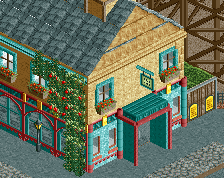
The car ride felt a bit simple. You could have done more with that. I always like gardens in theme parks. This one is no exception, although I think it would have been better if it would have been somewhere in the middle of the park. The Mexican architecture was really nice. Somehow I thought it didn't really fit the rest of the park, but it's not a big problem. The buildings around the rapids were too small. You have that problem more often, but it hurt the area a lot in this case. The ride itself was pretty good. I wonder how you came up with the name of the rapids as it doesn't mean anything? I think you should learn to make entrance/exit huts invisible. It is not that hard and it would have made the kids area a lot better. The British architecture was well done and so was the log flume! And I loved all the little games throughout the park.
All in all a nice park and you've taken a giant step in the good direction. I am looking forward to your next project!
Voted 70%
Thanks for your review!
Layouts are not my strongest point, I agree. Improving in that area really is one of my main priorities at the moment.
In terms of invisible entrance/exits, what hack do you suggest? The one with the piece of track, landblock and raising/lowering the land doesn't work for me, believe me, I've tried. Winhacking or hex editing is complete wizardry for me, so not much is left I assume?
Jappy:
If you download the newest version of 8cars 1.302 and 1.32 it should work, something changed in the 8cars download about a year ago which allowed the invisible huts hack to be done on newer versions of Windows.
And what version should I use for the hack? 1.302 or 1.32?
Everything should be done with 1.302 except the ride menu --> "invisible" step. If it doesn't work for you I can try to help you out sometime in the near future.
Fun park with good scale and good layouts. Enjoyed looking at this.
Stylistically still some room for improvement, but it'll come automatically if you keep an eye on it in your future projects.
Nice release Jappy. As Sulakke said it's another step in the right direction. I think an Alton Towers style park suited your approach to park making very well because of how wooded, natural and sprawling it is.
Pros:
-Melancholia - Chaotic in the best way and very fun to watch. All the movement in the theming added a lot.
-Rapids was wonderful. Short but sweet. All the theming was well done as were the waterfalls and infrastructure stuff like the lift.
-Mexican area in general was really charming. Architecture was some of your best and the atmosphere was warm and inviting. Sombrero shaped parasols? Fantastic.
-The castle is stunning! Really good job. I'd love to see all your architecture with this much cohesion (not random textures layered vertically) and attention to form (not blocky, a compound of several shapes).
-There are some great sculptures in this park; The phone box/Tardis, the Dalek and Wallace's trousers.
-The swinging coaster looked good, the upward spiral over the path was a nice moment. Perhaps throwing in a right-hand turn somewhere could've been nice but that's just nitpicky
Cons:
-I wasn't a huge fan of T.A.R.D.I.S or Robin Hood. Both felt a bit lacking in defining features and seemed to be quite meandering. Having said that the swooping s-curve over the path on T.A.R.D.I.S is a rather nice interaction.
-Side friction coaster wasn't as flowing as it could be either. These rides are so limited in terms of elements that they rely on creating nice looking shapes. I don't think you quite did that here, too many sharp turns and little bumps. See the one in Spellbrook shore for a good example of #sidefrictionflow
-Generally still too many 1x1 and 1x2 forms in the architecture which look very rudimentary alongside your (much much stronger!) bigger architecture in the london and mexico areas.
I'm leaning towards a high silver vote here. This is my favourite park of yours so far. Keep pushing your architecture skills because they're definitely getting better with each release. Layouts need a bit more flow and logic to them to reach the next level too. You seemed to make this park amazingly fast anyway.. well done!
yeah I really liked this park. It was full of a surprising amount of fun stuff, lots of little details and it came together very well. had a good british vibe, lots of good architecture, nice ride selection, felt very fun overall. I wasn't really expecting much from this one but I think you really did quite a good job here, surprised me for sure.
Glad to see it ingame, clearly your best work yet. Of course this deserves a proper review from me
You improved, your archy is getting better. I like the entrance a lot. It's clear where you got your inspiration from and you chose one of the better parks to do so. The total concept of a huge castle domain in a green valley is succesfully translated in RCT. It has some great atmosphere, I could see myself wandering around there. Foliage is one of my weakest spots, so I don't know if I can say a lot about it, but I liked it. I like very dense and green forest parks.
The coasters. Overall OK. This is a point you can still improve a lot. Tardis was OK but nothing more, but I do recognize flying coasters are a bitch to build right and let it flow. The cornering is a bit weird for me. I do love the placement of the brakesection. Think that's a lovely view from the path over there.
Phoenix is good. Bit disappointed you went for a Dreamcatcher-ish layout instead of more Vampire-ish but that's okay. The spinning coasters was great, very realistic and looks like a very fun coaster to ride.
Robin Hood was a bit meh. I think you've could do way better with it. A park like this needs a woodie. I appreciate you didn't go for the typical GCI we see a lot but the layout looks a bit boring and plain. If I were you, I'd go for something like Beast: a terrain woodie rushing over the hilly landscape and trough the forest. Think that would have fit in much better.
I also like you've built a side friction coaster. Love and honor the classics! Sweet choice. And then, Melancholia... Clearly the top ride of the park and one of the sickest layouts seen in RCT. So much coaster track on such a small surface. You've catched the Smiler feeling very well and respect for creating such a bad ass layout and even more respect for supporting it! That must have been one hell of a job...
Other things I liked:
- The valley. A resting point from the park. It's a shame I didn't visit the valley of AT but I'm planning to next visit.
- The castle. Just the right amount of detailing imo.
- Log flume, nice lay-out and very nice implementation.
- Platform 13
- The little details: Wallace & Gromit trousers, the sombrero parasols, the name of the rapid river (shame non-Dutch talking viewers won't get it ), dancing fountains, the English telephone cell,...
Thing that you could improve on:
- The paths. It's something I find a bit disturbing, your path patterns. I really don't like the aba pattern in specific, I think you should stick to one path type (per area) and chose a fitting second path type but use that second one more subtle. Sometimes I felt the combination was off, like in the Dr Who zone. I felt the grey crazy path would have been a better choice than the brown crazy path. And the area of the log flume: I also dislike the combination of the brown path with the grey crazy path. I think you can definitely on paths. And it will make your parks look way better
- There is some good archy in the park, but also some buildings that could more love. Like the Melancholica station. Imo you could do more with it. The shape is a bit weird and I think it could have been more detailed. As Alex said, try to use more shapes and buildings than 2x2 shapes.
- Invisible entrance huts are so easy with OpenRCT. I'd suggest you use that since the majority has OpenRCT and it saves much time.
I liked it, curious to see what accolade it will get. I think high silver or gold. I rated 75%. Looking forward to see more from you!
I'm never going to like your foliage selection if it continues like this haha; the yellow/green GW tree that you use (similar leaf colour to the oak) is really unpleasant when contrasted with the lusher greens used for the rest of the surrounding trees. Another problem I have is how much the foliage screams filler-content. For example, the entrance is actually really cool - love the glass roofing - but there's like two buildings and near-forested areas nearby which aren't particularly pleasant or interesting to look at imo. Nothing wrong with some nature of course, but (and to be fair you did try here) it was nowhere near manicured enough for me.
The stuff by Platform 13 (loved the cutaway), would have been perfect for the entrance. Mostly architecture, some nice rides, space for shops/stalls, an old-fashioned coaster, and even a train station.
Melancholica was cool, but I still think should have been lowered (along with the land) at least another 4 units. Nice take on Sherwood Forest (archery was great), but the coaster didn't do anything for me. There were some great theming elements on the flume (eg the station) but it just did not go at all with the surroundings. A bit like MCI, there are times when I think you use too much grass where another ground texture would look a lot better.
I didn't like how Pinball Party interacted soo much with the path; it would be a lot better had the path actually framed that particular coaster instead of seemingly being placed right underneath it. The kids area + Wallace and Gromit was sweet though, no complaints there. Mexico was a step in the right direction architecture-wise, but again the foliage is exactly the same. It's a different themed area, why not *also* use different foliage to reflect that theme? The lakeside walk was pleasant but didn't really feel necessary for me.
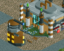
The Doctor Who section was a cool idea, but I still think that the crazy-paving path did not work at all. Maybe you could have tried the black-grating path or something else a little more futuristic/dark. Shame that the coaster is quite weak; you probably could have done a lot more with the TARDIS/futuristic theme rather than just being above a whole lot of grass.
The actual castle/tower that the park is seemingly named after was sweet though, and I actually wouldn't have minded if you did more with it - perhaps fleshing out the grounds a little more, separating it from the actual park with fewer access paths so a more iconic entrance could be built, etc.
Good stuff. 65%
Very impressive. I've always been a fan of Hall of the Mountain King, so that was a good start!
What I liked about this park was its mixture of clarity and exploration. Some areas were clean, open and looked great from a distance, while other areas required searching deeper for the little details dotted along the way - particularly fitting for the woodland paths, which is exactly how the guest would've experienced them. Also, the train has to be one of best I've seen in a long time, much for the same reason. The way it wandered through the thick forests, giving glimpses of rides and the occasional backlot area, to then open up alongside the lake or a large pathway... wonderful stuff. That part where it travels diagonally, parallel with the path and with Robin Hood racing behind the trees, was absolutely beautiful!
A lot of the rides were very well done. Melancholia was superb, with its cramped, chaotic craziness and great use of moving scenery to add to the mayhem. A very fitting tribute to Smiler. I thought that Pinball Party was cool too, and actually liked the way it overhung the path so much, adding thrills for both the riders and the spectators alike. Gold River Adventure and El Rio Soupme Balledjos were both strong water rides with good theming also. As for the remaining coasters - T.A.R.D.I.S, Phoenix, Robin Hood and Rooftop riders - I thought they were ok. They were by no means bad, but they just didn't hold my attention for long. What did impress me more were the darkrides, mostly due to the theming around them. The Thrill-O-Matic, Platform 13, Merlin's Magic Castle (damn that was a cute building) and several others were great, and most weren't even traditional darkrides! I was impressed with your decision to theme in this way as opposed to, say, dropping a haunted house in the forest, throwing in some gravestones and calling it quits.
I liked the themes you chose, with the exception of the Doctor Who area. The others all felt very true to this style of park, but Doctor Who felt too merchandise-y/commercial-y, if you get what I mean. The Wallace and Gromit ride worked fine as a lone brand (as Alton Towers itself often takes on), but a whole zone dedicated to a TV show rather than a time period or location... it just felt a bit out of place to me. That's probably the only negative thing I have to say about the park though.
As some minor points, I really liked the buildings in the Viva Palombia area. Despite being 2x2 for the most part, they were bright, cheerful, decorated beautifully and really sold the theme. In this case, I appreciated the way you created attractive buildings without needing complex structures. Other favourite parts were the simplistic boat stations/docks, the basketball sideshow and the little postboxes
Overall, you've built in a style that I really enjoy. The loose connection to Alton Towers is evident but certainly not a restraint, and you've adapted it very well. Certainly gold-worthy in my opinion, and with further development of your coasters (well, not ones like Melancholia - that was awesome!) I could see your work being outstanding very soon. Thanks for sharing such a lovely park.
This was seriously enjoyable, Jappy. You spaced out everything so nicely!
Thanks everyone for the feedback and nice comments! And I'm happy to see it got a pretty good score. It deserves a good silver. I'll get that gold with my next project though!
Congrats with the silver It's a good score, it would be either high silver or just gold and this score reflects my thought on it well. You'll get the gold later