Park / Pilgrim
-
 26-January 17
- Views 1,861
- Downloads 404
- Fans 0
- Comments 9
-

-
 50.45%(required: 65%)
Design Submission
50.45%(required: 65%)
Design Submission
Liampie 60% RWE 55% bigshootergill 50% Coasterbill 50% CoasterCreator9 50% Cocoa 50% G Force 50% Jaguar 50% Scoop 50% trav 50% Xeccah 50% ][ntamin22 50% posix 45% 50.45% -
No fans of this park
-
Full-Size Map
-
Download Park
404
-
Objects
54
-
Tags
Similar Parks
-
Legend of the Lake
-
[Disaster Micro] Sharkfin Cove
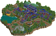
![park_3833 [Disaster Micro] Sharkfin Cove](https://www.nedesigns.com/uploads/parks/3833/aerialt3494.png)
-
Thoughts Before The Falls
-
Keverdal Kingdom
-
Wraith - A Park Snippet
-
Metalworks
That logo is awesome haha
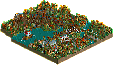
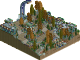
I think this was pretty solid and shows potential.
The layout was good and flowed well, but overall didn't seem to inspired.
The archy at times was also nice, but did feel a bit uninspired as well. The break housing and stations are probably the biggest offenders, neither really felt colonial in terms of archy and didn't fit with the style of the others buildings on the map.
That being said, something about the map and colors just worked, I think with a bit more time and effort, this could have been design worthy material, the concept and colors are great for RCT. You've definitely gotten better over the last few months, hope that we can see some more released from you in the future, 50% from me.
This is not bad at all, could have been a design with a little bit more effort, i guess! 55% for me...
The layout is okay, i think. Not something special, but it works.
The architecture also was not bad, some buildings were weird like the station, but some others were actually pretty lovely and cute, i really like the little church! I also enjoyed the ship!
The foliage is a little bit weird here and there, feels like you randomly placed the same trees and bushes everywhere... you should think about giving it a little bit more sense and structure!
Overall i agree that you've really improved yourself, i'm looking forward to see what you'll produce next!
I think the town area needed more room to breathe, and I was disappointed that although the other buildings seemed to follow a new england style the station wasn't particularly notable. Would have been a good opportunity to explore some shaker or calvinist architecture, maybe a church.
I think the town archy and boat were the highlights here- pretty nice. the orange foliage gave everything a nice vibe but I think your actual tree selection wasn't great and everything seemed randomly plopped- some more careful foliage placement (including undergrowth) would have been great. agree about the station being lacking in comparison to the town. otherwise, my main gripe is that the layout sort of meanders far away and then isn't particularly interesting- I'd love if it interacted with more stuff, like the town, or a fort, or even some interesting landscaping. the layout being average sort of brings it down I think.
Thank you for the reviews everyone! Most of your critiques seemed to line up with my personal thoughts of this creation which seems like a good sign. The station and transfer housing were the last two buildings I built so they do seem pretty uninspired. I agree with My goal for this entry was to jump my scores from 30 to 50 so I am very pleased with its results.
Very nice, the tree colors were bold but they work, the foliage around the town was a bit messy though and seemed to make it look a little sloppy. The architecture itself is nice but i wish the area could breathe a little more.
As for the coaster, I liked it. There's nothing particularly wrong with it but it doesn't blow me away either. Overall this was very nice, there's room for improvement but your skill is quite apparent and on it's own, it's very nice.
Thanks for the feedback. I'm curious what to improve on in the foliage by town. I'm very inexperienced at foliage but that was the area of foliage I put the most concentration into. Any additional criticism would be appreciated!