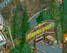
Park / Steppenwolf
-
 11-April 17
-
Steppenwolf
- Views 4,980
- Downloads 575
- Fans 7
- Comments 27
-
 79.38%(required: 65%) Design
Kumba 90% Austin55 85% G Force 85% bigshootergill 80% CoasterCreator9 80% Cocoa 80% Faas 75% Steve 75% trav 75% ][ntamin22 70% 79.38% -
Description
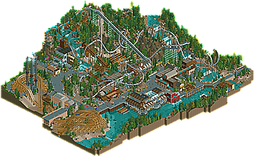
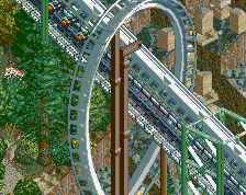
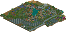
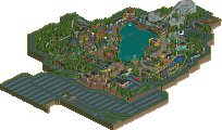
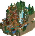
Experience the beast of Greyback Mountain.
Inspired by coasters like Banshee, Alpengeist, and Raptor, Steppenwolf is a refreshing blend of modern and classic B&M inverts. Set in an unnamed northwest American park, the coaster is perched along a mountainside and heavily interacts with the surrounding landscape.
Steppenwolf took me 2.5 years to finish, but I'm extremely proud of it. This is a design that continues to push the limits of NCSO, thanks in large part to the new features of OpenRCT2. Spend some time looking at the little details all around the park. -
7 fans Fans of this park
-
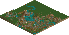
Full-Size Map
-
Download Park
575
-
Objects
1
-
Tags
Similar Parks
-
Baker Lake Amusement Park
-
[H2H6] R5 - The Replacements - New Fantasyland
![park_2434 [H2H6] R5 - The Replacements - New Fantasyland](https://www.nedesigns.com/uploads/parks/2434/aerialt2181.png)
-
Baker Lake Amusement Park
-
[H2H7 R4] The Wild West
![park_3367 [H2H7 R4] The Wild West](https://www.nedesigns.com/uploads/parks/3367/aerialt3772.png)
-
Forest Frontiers
-
Ouest
Hooo boy, that's a rough final score. Consider this the traditional "sorry I'm the low vote, here's detailed feedback" post.
There's a lot to love here and the creativity is outstanding, but I found some of the execution a little lacking. I was borderline 70/75 and finally landed on "solid with bits that are wildly impressive, but flawed. "
really cool:
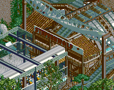
- waterfall drop into (and the incredible path view of) the cobra
- climbing wall
- seamlessly integrated volcano terrain, dynamic landscaping
- functioning partial rides
- many textural and object use tricks
- log flume interaction and water effects
- detail of station and transfer stuff
- crazy ole mcguffer
- drop tower top
- waterfront buildings and the flying saucer wall particularly
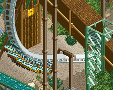
- unlike a lot of inverts the ending actually seems to have direction and purpose, rather than someone just trying to get back to the station after the first 2-3 inversions
So clearly this is a fundamentally very solid park, easily design-worthy; what happened for me is that a list of small hangups piled up and I found I couldn't look around for long without catching something else that made me pause and frown a little.
could be better:
- brick house/bridge is honestly just an eyesore. There's only a handful of buildings on the map and this whole corner just fell flat.
- rather than a gift shop, coaster exits into a restaurant? unorthodox.
- "water wheel inn" is ironically the only building that isn't connected to a water wheel.
- log flume drops straight into the station? That seemed weird.
- while a nice touch and a cool ride idea, the river rafting seemed out of place with the waterfront building pilings taking up most of the river and a boat dock nearby. It wasn't clear to me how the rafts fit into the theme park environment of the rest of the map.
- in spite of some really awesome NCSO texture and architecture solutions, the buildings are pretty samey. This is a soft criticism because there's often a lot of merit to keeping buildings in a area "feeling" like they belong together, but in this case I was disappointed that there wasn't more variation.
-MCBR is a little wonky. Probably forgivable because the layout is otherwise awesome.
- the supports seemed half-baked. Places where there are custom ones they look solid enough, which left me wondering why the whole ride wasn't custom-supported. I think what you were going for was "the default supports look good enough in some spots, so they stay," but it was another small factor for me to see that inconsistency - particularly in the footers - and be taken out of just soaking in the goodness for a few seconds.
- foliage is plopped in all the "right" places, but I feel like more care could have been taken in choosing the mix - there's easily 10 different trees going on and it's a little distracting - and what parts of it were appropriate for what situations, rather than using the same jumble everywhere. I get that it's the NCSO thing to use egyptian statue bases and gravestones and barrels just sprinkled around as ground cover, but I felt that they weren't used in a way that guided me as a viewer to look at cool stuff, they were just applied universally as background noise.
So, there we are.
This is absolutely beautiful and easily one of the best things I've ever seen done with the NCSO format. Holy shit. If anything this score is low.
You guys aren't helping me get over this just missing the 80% mark...
I think it's the closest a design has ever come to 80% without going over.
What you miss is a powerful aesthetic and interesting atmosphere. Your design choices are quite clever and intruiging, your trackitecture works, mostly, and all the rides and shops seems to make lots of sense. But the colours don't create any warmth, the foliage or landscaping isn't very pleasant (ie the usage of volcano object looks interesting and ugly at the same time), and there just isn't enough beauty to see.
Look at 5dave's or RRP's releases. Compared to them, your stuff looks pretty grey and technical. And I don't want to be mean by saying this at all, I just think it's what's keeping you away from higher scores.
What really had me interested in this were the building forms. A lot of the work down by the river especially was just fantastic. Great architectural forms. Stacking the saucers ride for striping on the one building was a great idea.
The coaster was reasonably good, though as others have said, your midcourse is too short. You have an older school B&M design, though that roll over the station is something you'd see more in their newer work than the traditional older stuff. But there's a lot of flow in the layout and it does bring the whole area together. I like the log flume as well. Especially because you actually put the big drop at the end which is something I see missed pretty often these days which always surprises me. One realistic note for the future, though, is that your station ought to be around a corner because the wave from the drop needs somewhere to go so it won't upset the boats as they enter unload.
Goliath sign as rockwork was another cool touch and a clever little addition. I think that's what I enjoy about this mostly is that there's a lot of cool little details that I've either not seen or can't recall seeing lately.
I hope you'll continue to build and improve on this. As some have said, I think you can probably improve the coloration next time around. Personally I don't think this was lacking in atmosphere at all... but I do think warmer colors as accents (dark reds, oranges) would help you out. Actually just making the coaster non-white made a big difference as I was playing with it. In my opinion, you don't do anything wrong with the colors here as I like it a lot, but I do get where some are coming from. Keep up the good work, though, because you've got a lot of potential for the future.
Sorry it's taken me so long to get around to providing feedback on this, and I'm similarly sorry my non-voting has seemingly resulted in you missing out on parkmaker :/
Cold is certainly a word which comes to mind when viewing your work. I have no idea why, whether it's because of your tarmac usage or just building colours, but for some reason I've just never felt a really warm, inviting atmosphere from your work. Technically flawless, from the climbing wall to the phenomenal waterfront archy, to the volcano landscaping at element positioning. I think maybe shogo might have brought this up (separate to your work, it was just a general comment) about focus on infrastructure. I reckon that's maybe where your work falls short of consistent 80+ where infrastructure takes too much priority over aesthetics (infrastructure might not be the right word, but it seems the most accurate for what I'm trying to say). See eg the brick house, just cold aesthetically and overall uninviting, blends in with the light dirt landscape yet takes up a relatively significant portion of the park.
Other than the flume doing a bit too much and getting overly busy (again, kind of goes back to the infrastructure point) everything else is utterly fantastic. Layout did brilliant things, short MCBR aside, the swooping zero-g over the station is gorgeous. Similarly some of the technical buildings like the rock climbing and redwood cafe are beautifully constructed.
It's a brilliant piece of at least 80% quality RCT, very unlucky to miss out on parkmaker imo.
https://www.youtube.com/watch?v=kMp10Z4Y-bI
https://www.youtube....ch?v=kMp10Z4Y-b