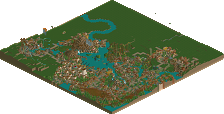
Park / [NEDC4 4/15] - Wildfire
-
 27-April 17
- Views 3,438
- Downloads 515
- Fans 0
- Comments 18
![Park_3796 [NEDC4 4/15] - Wildfire](https://www.nedesigns.com/uploads/parks/3796/aerialm3454.png)
-
 76.25%(required: 65%) Design
Steve 85% alex 80% bigshootergill 80% CoasterCreator9 80% trav 80% chorkiel 75% posix 75% Stoksy 75% Coasterbill 65% Faas 65% 76.25% -
Description
A Silver Dollar City inspired Floorless coaster for NEDC4, featuring Fireman's Landing a new family focused area for the 2014 season.
-
No fans of this park
-
Full-Size Map
-
Download Park
515
-
Objects
1
-
Tags
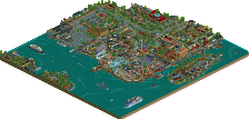
![park_4121 [H2H8 R4] North Fork Mountain Park](https://www.nedesigns.com/uploads/parks/4121/aerialt3862.png)
This was all around good stuff. Nothing ground breaking, but definitely incredibly skilled and atmospheric. To be honest it's a significant improvement over anything in WoF, which won Spotlight. I expected it to be higher.
The one thing holding it back for me was how the coaster was kind of just there, if that makes sense. The only interaction it had was a viewing platform from the cobra roll and a bit of the queue. Otherwise it was strangely separated. Realism or not, was just a bit odd. I really enjoyed the landscape though and that elevated this a lot. Not to mention the architecture and overall atmosphere is your best yet.
Just bringing comments over from voting:
Viewing area. Queue entrance. Nailed 'em.
This was classic G Force, and I've always been quite a strong supporter of your style with the one critique that you don't use enough multi-storey buildings. This certainly satisfied that and as a result I was a big fan of this.
The main kind of 'colonial' plaza was really bustling, both literally with peeps and in the sense of object usage and framing. I loved this about the area, although my one critique may be a possible overuse of those white wooden overhangs. Other than that, this was really top notch stuff Russ!!
You also managed to incorporate some really lovely, subtle height variations as you transitioned into a different area. The water trough kind of connected the coaster to the transition area and I think this helped prevent the possibility of bland pathing and an obvious 'this is a transition not an important area' feel you could have had without it.
Then you get to the viewing area and toilets. Shades of Xophe's design from years ago, and I think it's executed brilliantly. Could just as easily be an area in a nature reserve and I think that's what makes it so brilliant despite its simplicity. I wish more could have been done with actual coaster theming (and this is really why I don't think your entry is quite at Steve/Shogo-level) but as for creating a believable environment with realistic and 'I wish I was there' touches I think you've done excellently well!
Incredibly productive work Russ, til Eastwinds
I think the highest praise I can give this entry is that it truly excels at making it super, super easy for me to imagine walking around in the space. As Steve put it, nothing groundbreaking, but what that really means here is there's a collage of backcountry/frontiertown IRL park elements that are so recognizable it feels like you've been here before.
It seems like you’ve finally carved out your own style here and your work no longer looks like Pacificoaster-lite. I shouldn’t like a generic theme as much as I like this but everything is built in such a clean, appealing and readable way. The architecture is built to an impressive scale without looking clumsy. The large trees help with keeping them in proportion too and generally the foliage is top notch. One drawback was that i found too many ‘highlights’ in backstage areas like the yellow posts for example - they drew my eye away from the appealing peep-facing sections. Anyway.. it's all really high quality, clean, well composed stuff as we’ve come to expect from you. Very nice job. 80%
yeah this is one of my favorite of yours so far. I liked it a lot more than WOF, which hasn't really stuck around in my esteem as much after multiple viewings (although westwinds has, weird), but I found I liked this one more every time. it feels like good herschend realism, although I think the paths did feel a little overpowering. I especially liked the two buildings on the water in the black path area. they were really top quality, and the whole entrance structure/queue area was excellent from a realistic sense. I could absolutely see that in real life. I think the coaster surroundings, while maybe accurate to the real one in silver dollar city, didn't really do it for me. in the real one, I can forgive the sand and cleared trees because you look out over this amazing landscape. but I don't get that here- it just looks like a coaster in a really big, empty pit. anyway, all up a great park. definitely deserved to be top 5.
Voted 80%
+ I think you took a step out of your comfort zone. While this is still clean, it shows a certain ruggedness your building style needs, the way you built the landscape, use the shrubs, rocks, trees.
+ Your archy is always clean, but varied and unique, as it was with this map, but you even pushed yourself into a new style with paid off handsomely
+ You did a superb job at creating a lovely atmosphere here, it feels like it would be a fun place to visit and check out in real life
- I wish you will continue to build like this in the future, it was missing from your past work
Good to see an actual themed area from you!
I always loved Western/Americana stuff and this is no exception. I echo both bsg and Stoksy: glad to see multistory buildings and some ruggedness. It's something different than the brushed, clean Cedar Fair building we usually get from you. The coaster itself, though well supported and having a nice station, was surprisingly bare. I can't really complain about that, as it would probably be like this in real life but still...
Hope to see traces of this in your next project, as this is definitly my favorite work of you so far because it isn't like your usual stuff.
I will make it short because I agree with pretty much everyone here: that's awesome, so clean and satisfying to watch. Pure realism how we like it. 90%
Nice to see how you developed your style. I had a good time looking at your entry and discover all the details, you really put some more life into your building. Just a little disappointed as the coaster surroundings were quite bare and there wasn't really much interaction. Great design anyway!
Same old same old. I do appreciate that you chose something with a more defined theme though. expect a video review later.
Same old same old? This is very developed aesthetics-wise compared to his last, largely CF inspired works. There's still a few things, namely coaster integration, that I'd like to see russ take out of "his comfort zone", but from what I know he is highly aware of that.
wow some of these structures and the path layout itself are defo an improvement from ur past 2 parks. feels totally real. definitely some canyoneer influence with the viewing area. 2 weak points: the row of archy to the left (tho its some of ur best, its still ur weak point tbh), and the lack of ride integration. like any way to integrate the ride with anything, you decided not to. herschend parks kind of have an excuse for that due to the landscaping, but that in a way is a type of integration. thats the one thing holding it back from being a truly great design
I liked this. Everything to be said about it of any consequence has been said; but I think this was a nice step in a different style for you, and that's a good thing.
You're definitely improving, which is great since you were already excellent.
The structures do capture the Herschend feel pretty well. It's a lot of brown, but that's accurate. And you'r color accents really help. On the Fireman's Landing area, it would have been great if you could toss in some window sills and a few things to give a little bit of dimension to the flat facades. Not that they look bad by any means-- but in your future work that's really going to make it stand out.
I think maybe the biggest hindrance here is something you didn't have a lot of control over... there's really no terrain changes. That's a lot of what makes the Herschend parks as nice as they are. But you had a flat coaster to work with and there's not a whole lot you can do with it.
Looking forward to seeing more of this realistic, but more highly themed work out of you. This kind of style would be great as a full park.
We already knew you are a gifted player. Your previous CF'esque parks were from a high technical level and very clean, though I said before I'd love to see a more themed park from you. And you delivered with this, and it's just so great! It is as technical great and clean as your other parks, but the theming takes it up another level.
I really can feel the SDC feel here. I think your color use is good, this kind of theme tends to be brownish but you found a good balance. I liked how the station was a bit hidden away behind the trees and the queues entrance building, great touch!
Biggest weak point, as said multiple times before, is the less of interaction. Of course it's realistic, SDC's Wildfire has also almost no interaction and is not really visible from the paths. But that one is built on a hill side, a more interesting landscape. I know from own hand it was difficult with the given lay-out to integrate it in a landscape but more interaction would be nice.
Love to see more work like this from you!
Sorry for the low vote, I don't think we'll ever really understand each other RCT-wise.
This didn't really do a lot for me. The star of a design submission should be the coaster in my eyes, and here it looked like you did your best to make it the least interesting aspect of this submission. It's just sitting on a plain field as shielded of from the rest as possible.
The architecture was solid, but nothing really groundbreaking.
I did really like the plaza in front of the buildings though, a lot of fun little details and aesthetically pleasing parts there.
Congrats on the design!
Yes, I realize now how dull the area around the coaster is. While building it just never really occured to me, and near the end I focused more on the actual parks stuff than the coaster for whatever reason. Im glad that the reception of the rest of the map seems to he positive though, I really enjoyed building it and think it's some of my best and favorite of my own work. It might even inspire me to expand on this style into a full-scale park in the future, really think that there is some opportunity in this park style that hasn't been touched on in the past.
But anyways, thanks for the design... And despite the drawbacks I think this still is some if my best work and hopefully a sign of more things to come.... Can't make any promises though.
I'll hopefully get to replying on the other entries in the near future... Maybe with a series of video reviews...
Great to see you've taking a little different approach in terms of your style with this one. The architecture and the theming in general were quite good, nothing ground breaking though, as mentioned above.
What i didn't liked about that one, and that is kind of a problem for a design, is ther coaster itself. It doesn't interact at all with the cool rest of the park and have more stuff under and next to it, than just bare sand.
Overall still a great entry though, and congrats on design!
75%