Park / [NEDC4 12/15] Shimmeria Subway
-
 21-April 17
- Views 3,500
- Downloads 467
- Fans 0
- Comments 25
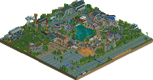
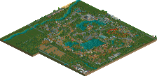
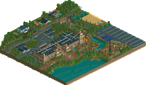
![Park_3797 [NEDC4 12/15] Shimmeria Subway](https://www.nedesigns.com/uploads/parks/3797/aerialm3430.png)
-
 59.38%(required: 65%)
Design Submission
59.38%(required: 65%)
Design Submission
CoasterCreator9 70% bigshootergill 65% posix 65% alex 60% Faas 60% trav 60% Coasterbill 55% Steve 55% Stoksy 55% chorkiel 50% 59.38% -
Description
Join Walibi and his friends on the craziest, wackiest, most mysterious subway ride in the musical country of Shimmeria! All aboard!
-
No fans of this park
-
Full-Size Map
-
Download Park
467
-
Objects
1
-
Tags
Despite the boringness, the overall composition is really great.
Overall composition is indeed great. I think that out of all contestants, the realism oriented ones at least, you got the most out of the coaster layout in terms of sight lines. If you come from the left (on the overview above), the loop and lifthill looks like a massive wall of steel. From the right, the loop over the path is an excellent landmark even though it looks a bit tacky where the loop actually crosses the path. The cobra roll is an excellent beacon for the rest of the park that you cut away. Ideally you would've used the area around the corks and under the lift for a queue area too. That backstage road shouldn't have been backstage. Great place for a seating area on a dead end. Maybe a queue entrance. But whatever! This works too. I always appreciate non-park surroundings and what you did certainly added something I'd say, but the buildings were cut off so awkwardly. In real lift these buildings are pretty big but you reduced every one of them to a super thin spaghetti string. Map should've been expanded by three tiles or so so.
Lastly... Somehow the overall composition is so much better than your usual solo parks. I'm kinda sad this isn't the start to a full scale solo park. Maybe you should be more like Lagom. Go full Walibi after this zoo thing.
70% (rounded up)
Listen to Liam Jappy! I think it is your best work we've seen from you.
Never go full Walibi.
This is definitely great walibi theming. I really liked it overall. The problem this is having for me, and why it's not design-worthy in my opinion, is that it doesn't really shows of the things/details realism rct needs for me to shine, like one can't really enjoy the look of all the technical stuff and the backstage areas. The brown roofs are also really ruining it.
I definitely got the artmosphere, but i not quite enjoyed it that much, like i enjoy your other stuff. But definitely a nice little experiment from you, and an entry worth looking at!
60%
I was really bummed with the score on this one, as it was probably one of my favorites of the contest. You really nailed the surroundings and make the coaster feel very much a part of the map, which I think a lot of us struggled with. The colors were nice and I liked the stations and some of the other structures, just felt very theme-park like and that you really know your Walibi. Glad you also attempted to make the surroundings relatively accurate to real life, I enjoying trying to figure out exactly how the coaster would fit in the park. Glad to see the exterior park details as well, something that was unique to your entry.
My problems were mainly in some of the texture choice and foliage. The brown roofs and flat texture just kind of makes it feel a bit flat I guess. I think this also was lacking a bit of that Jappy atmosphere we usually get with your past projects. Foliage wise it just felt a bit sloppy and like you didn't really put much time into it, which isn't a huge problem but kind of kept it from breaking to the next level in my mind.
Gets a 70% from me, despite the criticism I think this just came together really well and with some more time and detail it could have been something very nice.