Park / [NEDC4 2/15] - Interstellar
-
 30-April 17
- Views 3,623
- Downloads 555
- Fans 1
- Comments 19
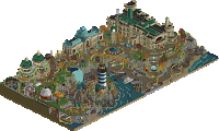
![Park_3806 [NEDC4 2/15] - Interstellar](https://www.nedesigns.com/uploads/parks/3806/aerialm3455.png)
-
 78.75%(required: 65%) Design
bigshootergill 90% posix 90% alex 85% Stoksy 85% Steve 80% CoasterCreator9 75% trav 75% chorkiel 70% Coasterbill 70% Faas 70% 78.75% -
Description
"TO WHOM IT MAY CONCERN: WE HAVE MADE SPACE TRAVEL POSSIBLE"
-
1 fan Fans of this park
-
Full-Size Map
-
Download Park
555
-
Objects
1
-
Tags
Voted 90%
+ Fantastic to have another release from you with such high detail
+ So many details to catch that you popped into this design, like the worm-holes for the transport rides (very cool), the orbiting carousel, the rocket-ship building, very clever use of trackitecture,
+ This has such funky elements to it, from water falls, to planets and stars, space battles, phenomenal architecture!!!, odd mixture of bushes and foliage, twinkling stars, cool skyways
+ I loved this design, my favorite of the contest, but I almost feel at a loss for words as to how to describe it, just fantastic!
- I hate speedy moving staff!
- We need more of your work on this site!
Woah. A little chaotic in places (mainly the way the rocks/foliage meet the black space) but otherwise brilliant. Making the loop invisible was an interesting choice, visually the layout suffers a little IMO. However it does fit the narrative really well and the coaster train looks cool not being on rails. Great architecture both in the earth side and the other-planet side. Slight glitchiness/messiness sometimes but nowhere near as obnoxious as port of entry. I didn’t like the curved road lines too much. Very clear Turtle and Avenine influences which I loved to see. Wonderful colours throughout.. Liampie’s new palms actually look great in pink. Very inventive. I thought you were going to win tbh. 85%
looks like a much better version of that old design i did
Just bringing over my comments from voting:
Shogo actually finishing something? Is this real life? I made a couple comments to you about how this entry reminded me of FK, but maybe there's a hint of La Reve there as well. I've personally always been quite a consistent fan of your architecture despite people's comments about how it's 'messy'. I was glad to see you take on board some of the criticism in your screens by limiting the texture and object overload through less detailed pathing - it helped a lot!
Unfortunately with high quality entries I find some nitpicky things to critique rather than focusing largely on the overall brilliance of the design. Couple of things I should probably bring up are the pink trees and what I assume is a space station. The pink trees were weird as fuck, no idea why they were there. Although the texture of the leaves in pink was actually quite pleasant it just added nothing while simultaneously distracting me from appreciating the rather lovely muted colours of the ground-level architecture. My problem with the 'space station' was how textureless it was. This usually isn't a problem (nin's micro madness entry is a perfect example of this) but a combination of a relatively flat/simplistic form and contrast with well-textured and interesting ground level stuff.
Some highlights: most of the architecture, especially the railway station and solar carousel structure, also the facade for Journey to Earth (although it would have been nice if this layout was a little longer) <3. I also appreciated you making the loop invisible so as to help the coaster actually blend quite nicely into the environment - it actually gave the legitimate impression of the space station being quite high-up and made the transition into the MCBR seem to gain more height than it actually did.
Great job Shogo, a bit reminiscent of your R1 Micro Madness entry in skill and relative style and I really hope you do more!
I chucked this one an 85, which was the highest score I doled out in this contest (also gave it to ghoul). everything in the 'earth' side of the park was absolutely fantastic. amazing, refined, and held back (for you) architecture, with awesome interaction, unique textures, great landscape interaction, etc. just really felt alive and awesome, and I love that you weren't afraid to put weird fantasy-ish shit like the spacey stuff on blacktiles. you really captured that worlds-fair jules-verne vibe without feeling too crowded or overdone.
I was a lot less sold on the alien world. I like the concept, but firstly the areas felt really close to each other physically, so that they sort of mucked each other up and didn't really feel separate and alien. I guess i like the foliage, but the archy was meh, sort of like a pseudo-middle-eastern thing that didn't really feel so alien to me. the whole area just didn't really do anything or feel alive, it sort of just sat there for the coaster to go to. I did really like the space ship that the coaster goes through. I reckon you could have pushed a more avatar-y pandora sort of vibe and it would have been more exciting for me. I'm not really sure actually. its hard to really sell an 'alien world' convincingly tbh.
anyway it stands to the strength of the main area that I voted it so high. good shit, looking forward to you seeing you apply your considerable technical skills in more refined and controlled ways.
Clear winner in my eyes. Two themes in one with obviously the most effort invested, both technically and conceptually. I was very impressed.
Like cocoa, the space side of this just didn't strike me as much as the other. Not to say it was bad, because it's still skilled. I just felt like after seeing the greatness of the Earth half it just let me down slightly I guess. Not too much, though, you still get high marks from me!
What should our tie breaker be? RCT Deathmatch?
I just want to point out that the final scores of this and Ghoul do not match. Does this mean Shotguns was #2 and Steve was #3?
It should, the scores match up so there was definitely a mathematical error. The score generated by the site seems to be correct.
This was a great surprise. Mostly just because you finished something-- especially at this level of theming. I'm really impressed. Fantasy is not my strong suit nor my preference, but it doesn't mean I can't appreciate the effort and the quality of work here. The composition is just wonderful. Even if the space side *may* be a little weaker, I love the pink and peach tones bringing that whole side together.
Chaotic may be your strong suit though that can easily go from a hit to a miss. I think it's a hit here. Lots of colors, lots of styles, but they all came together pretty well and nothing feels particularly of of place in it.
Of all the entries, your seems to have the most *stuff* in it. And not to say the others weren't good, but there are a bunch of details here I'm sure I've missed and will need to track down in subsequent viewings. I hope you'll continue to do work like this moving forward because you obviously have a ton of skill-- you just need to be able to drag e a project across the finish line. Keep up the great work!
I have to say I'm a bit disappointed viewing the park in-game. It is a bit too fantasy for me likings, not the stuff I like to watch in rct. But of course, that's my taste. If everyone would have the same taste, the world would be a boring place.
The archy is amazing. Safe to say the best archy from the contest?! It contained some clever and fun details/ideas: the Einstein monorail, the planets, the use of rapids as UFO's, solar carroussel...
Some things I didn't like or understand, like the pink rocks and pink trees. Or the supporting of the coaster. I get it's fantasy and you have more poetic freedom, but it seemed weird to me it was half supported. Some original supports were visible to where custom supports were built?! But that may be an OpenRCT problem.
Sorry, I'm not really a fan. This is clearly a high level work, just not my cup of thea. I hope I didn't sound too harsh.
I really wanted to love this submission, but it was a bit too confusing and cramped for my liking. It felt like a difficult task to check out and try to understand everything that was going on.
Great architecture though (the 'river rapids' station was my favourite) and really cool ideas with for example the loops.
Great design! But next time I would personally like it more if you spaced things out a bit more, and make everything a bit more easy on the eyes.
You definitely showed a lot of skills overhere. Architecture and foliage are quite nice and well done. Great to see that it is not that overdetailed than previous work of yours.
The big problem about that entry is that i don't get the concept in general. While other space parks we've seen overhere always shined with creativity and cool interesting composition, this one just confuses me.
So all the stuff that is there is quite nice, but it just doesn't work together in my eyes. It just feels like you've randomly combined differend theming ideas, which ruins this totally for me.
Would still consider this a design though, and it's also definitely an entry to must watch in terms of personal skill.
65%
NIce Work BTW im new here
Thanks for the submission Zach
https://www.youtube.com/watch?v=VP3f5HU6iOw
https://www.youtube....h?v=VP3f5HU6iOw
wtf why have I never seen this before haha. So good