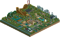
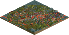
Park / [NEDC4 14/15] Warlock
-
 21-April 17
- Views 2,748
- Downloads 418
- Fans 0
- Comments 20
![Park_3810 [NEDC4 14/15] Warlock](https://www.nedesigns.com/uploads/parks/3810/aerialm3431.png)
-
Description
Beware the Warlock's Curse
-
No fans of this park
-
Full-Size Map
-
Download Park
418
-
Objects
1
-
Tags
![park_3807 [NEDC4 15/15] Table with Umbrella](https://www.nedesigns.com/uploads/parks/3807/aerialt3426.png)
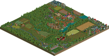
not terrible but not particularly interesting either. I didn't really like how the path was quite blocky and square and surrounded the map, it sort of trivialized the nice atmosphere and vibe that the coaster lives in. most of the archy was a bit too simplistic and blocky with no real purpose (or even entries to the buildings). give each part of the park real meaning would be my main piece of advice- don't just plop buildings or scenery for no reason
Just bringing my comments over from voting:
This was at least a relatively interesting setting. It did not do anything for me though. I appreciated the attempt at a custom flat, and having the pre-drop as part of a haunted mansion was quite a cool idea. Unfortunately, execution was lacking especially in aesthetic, architecture, and foliage. The mass-use of the brick and untextured roofs brought down any appeal you might have gotten through form.
Nice attempt, not design quality, some redeeming features like use of elevation changes but execution of ideas was relatively poor.
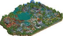
Love the cobra support. I thought it was a very cool solution to the problem.
Voted 50%
+ I like how you created two levels to your map, giving it that dark feel
+ Also you built some cool custom flats
+ Great coaster layout!
- Archy really need some work, it felt way too plain
Obviously you have a ton more ability than this, I guess the time crunch got the better of you
I like the environment you've placed the coaster in, landscaping is good. The foliage looks improvident and placed without an idea behind is. I do like the fire at the custom top spin, neat.
Archy is a bit too blocky and way too bare and lack details. The path types you used don't fit the theme well in my opinion, would've chosen a darker one.
The supporting of the coaster is not good. Those corkscrews are hideously supported. Sorry man, don't want to be harsh. This submissions shows you have cool ideas but the execution of them are not great (yet).
Path needed improvement, suffered from the same thing as my design.
However, I quite liked this! It did feel very unfinished or very unrefined though, hence my low score. With some more work put into it, this could have easily been 65%+
Everything was too blocky and dark for my liking. Also, why were all the walls blank?
This could have benefited from some more time and attention.
Not bad - everything’s a little bit too blocky, especially the raised path and the two main structures. If you could’ve broken these up with smaller elements (wooden walkways/overhangs coming off the path and more, smaller turrets jutting out from the structures for example) it could’ve really boosted it. 40%
I can most more in depth in a bit, but a lot of my criticisms have already been said by other members. I guess I just found them much more glaring than others. Rattler, do not let me discourage you. I have no doubt that you still have much more to show us and improvement along the way. Keep going!
Pretty cool entry. I like all the path elevations. Also the indoor part of the coaster was neat. It looks like you had fun while building this. Good work.
i think that's more of a consequence of iron rattler not selling his creativity yet in order to emulate parks to become better.
very unrefined. feels lazily made. color scheme doesn't work. path layout and general composition are rough and leave a lot to be desired.
While the path flow could be better and the buildings were quite blocky, you finished an entry. The atmosphere you created was the thing I enjoyed most.
Pretty cool work, Iron! It's obviously rushed and has a lot of rough edges, but it seems that the feel you were going for is there regardless. And it feels good! Very atmospheric. The castle-like structure has a lot of potential and could be amazing with a face lift. I appreciated the height elevation too. I personally thought it was rather obvious that a cliff/elevated landscape would fit in the background of this coaster, but the way you did it was not so obvious! Keep building!
45%
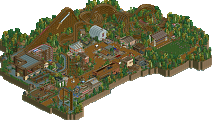
Thanks for all the feedback guys. My goal for this entry was to try and surround the coaster with varying elevation and make a dark castle/ swamp entry. Unfortunately real life got in the way and I ended up having to do about half of the entry in the last day. As a result the entry suffered especially architecturally. Though there are some parts of this entry I am pretty proud of overall I think it's a step back from my last work. While I hoped for a better result, I think the panel got my score and placement very accurately.
The positives for this entry for me are it's always fun to participate in contests and get a large amount of feedback from elite players. Thanks to the admins for running this contest!
This was definitely not bad at all. You're ideas in general and the architecture felt like something good, to go on with. With a little bit more time and a little bit more eye for details this could definitely have been in the design-worthy region. As it is now, most of the walls felt pretty plain though. I agree that especially the castle would have a lot of potential with a little bit more effort.
Overall, great you participated, looking forward to see your future submissions!
50%
I'm glad you submitted an entry, shame it was a bit rushed but it seems like you had some nice stuff going on. I hope you keep working at it and improving, definitely like some of the things you been able to put together thus far.
Ended up going with a 45, just didn't hit the mark for me. Thanks for competing!