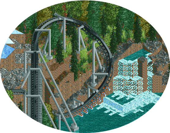
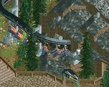
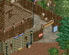
Everything about this is very exciting, my only issue would be the rock formations and waterfall. A little too jagged and artificial.
I would look at making more organic forms, a little more differentiation to avoid real big flat walls, and some more diagonal integration. For the waterfall, i would see if you can simplify it to use the ice-ground texture to make it appear more raging and thick (phrasing). With the ground background it doesn't look like that water could produce all those rapids.
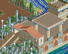
Really love the positioning of the first drop though, not sure if I'd have the turn banked but I'm not much of a realism expert so perhaps it would be banked in real life.
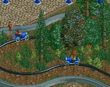
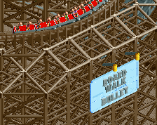
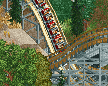
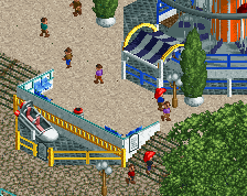
Are you still working on the Boardwalk Bullet, or did you lose inspiration with that?
Nice first drop, I don't know if it's really necessary to bank the first turn. The transition between that and the following part doesn't look very good, but it's hard to see from this angle if that turn needs to be banked or not...
I also agree with FK about the waterfalls. Looks a bit too blocky and uninteresting for me. Add some 1K ruins, make the waterfall bigger in length so you can create smaller but more (and different) waterfalls.
 14-August 14
Everything about this is very exciting, my only issue would be the rock formations and waterfall. A little too jagged and artificial.
I would look at making more organic forms, a little more differentiation to avoid real big flat walls, and some more diagonal integration. For the waterfall, i would see if you can simplify it to use the ice-ground texture to make it appear more raging and thick (phrasing). With the ground background it doesn't look like that water could produce all those rapids.
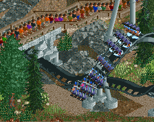
Good work though, like the look of this
^Pretty much agree with everything that Fk said.
Really love the positioning of the first drop though, not sure if I'd have the turn banked but I'm not much of a realism expert so perhaps it would be banked in real life.
Are you still working on the Boardwalk Bullet, or did you lose inspiration with that?
Nice first drop, I don't know if it's really necessary to bank the first turn. The transition between that and the following part doesn't look very good, but it's hard to see from this angle if that turn needs to be banked or not...
I also agree with FK about the waterfalls. Looks a bit too blocky and uninteresting for me. Add some 1K ruins, make the waterfall bigger in length so you can create smaller but more (and different) waterfalls.
65%
Giving the waterfall a source too would also help this screen. I'd echo everything else the guys above me have said. Looks great.
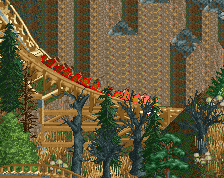
That is one awesome looking drop... so good.
I agree about the waterfall though.
Definitely look at that waterfall again... some wall texture seems off for what you are doing... otherwise promising...