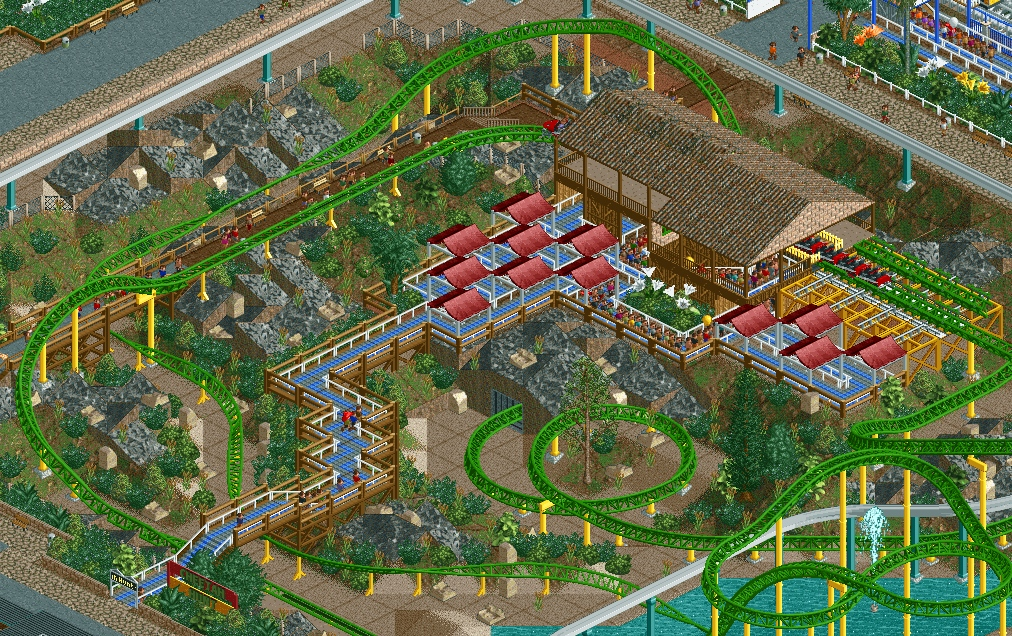
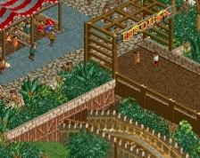
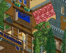
I think it's very cool! Lovely interactions. Not sold on the colours though... Green and red is terrible together.
And I haven't said this before, but it applies to all of your screens: you need more large trees! Everything is so open... Large trees, thicker patches, or preferably no patches at all but just one giant forest instead. Frame your rides and areas with foliage and landscaping, not a path grid.
It looks very pretty. Great job. I think the green looks good with the red or you could change it to an aqua blue to match the path. Agree with Liampie about the plants and trees.
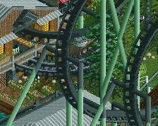
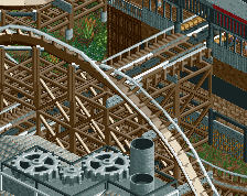
I'm not sure why this is in the 30s. It could do with some more foliage and more organic surroundings but the layout looks fun and the queue and station are lovely and simplistic.
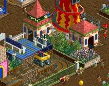
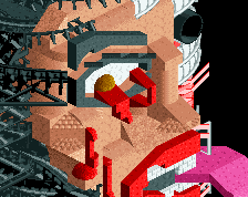
Brilliant work here, I do agree tho not so much with the colouring but just the layout of the canvas on top of the queue line there... You should group them together on "dubbo straights" and also bigger trees and overall tree cover in 'certain' areas will add to the mystique of the ride.... for a ride called cheetah hunt im not getting that "hunt" blah blah...and from a peeps POV you can see the whole ride so that doesnt apply... More trees strategically placed and this will be great
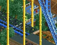
Agreed, this should have a higher %! Very nice interactive queue and great coaster composition, there is a lot of interactivity and I am really enjoying the simplicity of the buildings. Landscaping is pretty nice as is IMO.
Only thing I don't like are the two oversized white flowers by the station and that lone pine tree in an otherwise tropical setting.
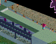
Maybe you could fix up the fencing along the queue as well, it is looking a little unnecessarily messy atm.
It's good. I definitely agree with the guys above. Also, maybe it's just me, I wouldn't name the ride after the coaster it's inspired by. Get more original.
 06-September 14
And I haven't said this before, but it applies to all of your screens: you need more large trees! Everything is so open... Large trees, thicker patches, or preferably no patches at all but just one giant forest instead. Frame your rides and areas with foliage and landscaping, not a path grid.
It looks very pretty. Great job. I think the green looks good with the red or you could change it to an aqua blue to match the path. Agree with Liampie about the plants and trees.
I'm not sure why this is in the 30s. It could do with some more foliage and more organic surroundings but the layout looks fun and the queue and station are lovely and simplistic.
that looks amazing, why such low ratings?
Brilliant work here, I do agree tho not so much with the colouring but just the layout of the canvas on top of the queue line there... You should group them together on "dubbo straights" and also bigger trees and overall tree cover in 'certain' areas will add to the mystique of the ride.... for a ride called cheetah hunt im not getting that "hunt" blah blah...and from a peeps POV you can see the whole ride so that doesnt apply... More trees strategically placed and this will be great
This is fantastic.
Agreed, this should have a higher %! Very nice interactive queue and great coaster composition, there is a lot of interactivity and I am really enjoying the simplicity of the buildings. Landscaping is pretty nice as is IMO.
Only thing I don't like are the two oversized white flowers by the station and that lone pine tree in an otherwise tropical setting.
Maybe you could fix up the fencing along the queue as well, it is looking a little unnecessarily messy atm.
I'll echo those above. This is fantastic.
It's good. I definitely agree with the guys above. Also, maybe it's just me, I wouldn't name the ride after the coaster it's inspired by. Get more original.
^ I agree. Think of a new name and change the colors perhaps.