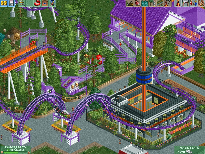
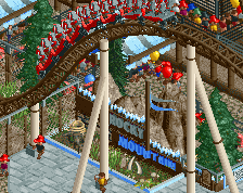
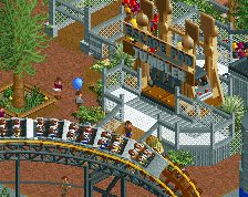
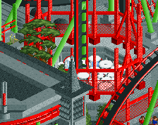
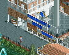
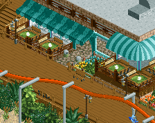
Screenshot / Dynamo - Nowton Thrill park
-
 06-September 14
-
Nowton Thrill Park
-
2 of 34
- Views 2,109
- Fans 0
- Comments 6
Community Forum Software by IP.Board
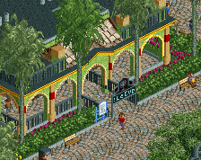
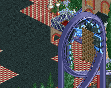
Too much purple. Other than those awkward right-angles in the queue line I think it's looks quite good. Some nice use of curves in the fence.
There's just something about it that seems really unrefined, would love to see this look a lot cleaner. [I think it's especially the foliage - there's a little too much going on].
Pretty solid screen if you ask me!
i think its pretty nice. everybody seems to do these corkscrew trackitecture things lately. I really like that little white structure, with the crazy spiral eyes!
changed the colour a bit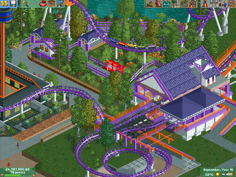
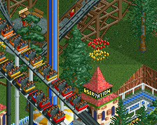
I like it. It feels very theme-park-ish. Not quite like a kiddie area, just lots of bright colors and inviting architecture and foliage. The asymmetric storage track roof is a bit strange but should be an easy/quick fix.