I think you really have what ur going for here, if i'm correct, which is an "older" looking part of the park, but its also somehow still very fresh. top notch.
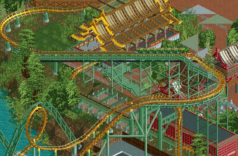
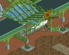
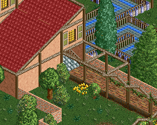
There is a floating green mesh tile infront of the tree just under the chain hill by the line.
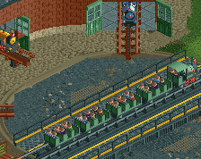
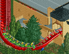
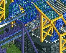
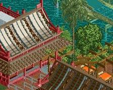
This screen has some cool shit, but it also has a few problems in my opinion. The station has an awesome roof but under the roof it looks like a mess to me, at least I find it confusing. The foliage has too much weird custom objects, they don't blend with eachother nor with the surroundings. There have been occassions were they looked fine, but that's not the case here. As a realism-skeptic, I must admit that the fat overhanging supports are totally hot, but I'm not a fan of the looping supports, however I can see why you would keep them. Roadlines don't work for the lifthill box supports, they're thin, flat and therefore nearly invisible against a similarly colour background --> confusing. Lastly I think the triangle queue covers don't fit in and the colours are terrible.
Liam, those aren't dolphin's, they are snakes, by your's truly. You know, your post basically comes across as you trying your hardest to tear this screen down.
I'm sorry. I've been trying to point out some good stuff like the station roof, the supports other than the boxes and the snail statues, and I also subtly commended Robbie for making shitty objects work in other areas. I voted 70% for this screen because it shows a lot of skill, but for robbie and BGA this is subpar.
I'm gonna call bullshit. It's not fair to ANYONE to vote something low and rip it apart because its "subpar" for their usual work. voting can't be "objective" to the person, otherwise there is NO LEGITIMACY to the voting system. The ENTIRE point is to place screens on a scale, from the BEST to the WORST. If we vote things as "bad for this player" or "good for this player" then the system is no longer a scale for all screens. The system will then place screens that are "good for one player" but subpar compared to the community higher than screens that are amazing for the community but "bad for that player".
70% is not low. 70% means gold, blockbuster, super runner-up and on NE3 it even meant spotlight candidate...
I didn't vote 70% because it's subpar, I voted 70% and 70% is subpar. I fully agree with your view on the voting system, it's one scale for all except maybe there's a LL/RCT2 distinction.
If you have spare wall object slots, the beam object on my objects page could be a good replacement for the roadlines. give it a 3rd dimension and make them a little more distinguishable from what's behind them.
And the foliage is a bit too much of the same shade of green, especially in the part right behind the loop.
i feel like your missing the point/context here liam when referring to this screen as subpar to what he's capable of. he's making this area older, grittier than most of the park on purpose, and he's showing restraint by doing so. i'm sure he could've done things prettier, but he didn't to convey some sort of realism/history that in most parks is lost.
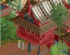
being said this is one of my favorite screens of this project. station is ace and though being a bit muted and "rusty" (due to age i'm assuming) it adds something to the enjoyment for me, like with your chairlift station. all parks have parts where the theming or feel is just perfect; not all parks are disney.
Liam, you both called a 70% score great, and called it subpar.
The community consistently votes almost 20% higher than you on a screen like this. It just seems odd that you regularly rate this kind of work SIGNIFICANTLY lower than anybody else.
In all honesty, it looks like you are trying to "keep Robbie's ego in check" by nitpicking tiny details, things that wouldn't bother you in other builder's parks.
@Shotguns: I get that. If you read my comment, I do not make demands about extravagant theming or complain about ugly dumpsters or airconditiong in focus. No, I'm merely pointing out some things that could've been translated into RCT better. Alright, I'll give you the triangle covers. But that's all.
@FK: I just looked up the definition of the word 'subpar' just to make sure and it means 'below average', as I intended it. If the average is high, subpar can still mean great.
It's true that the community usually votes higher on Robbie's screens than me. But I'm not the only one who noticed that any Rob screen, whatever it shows, automatically gets a 90%+ score. Rob is one of the best parkmakers of our time, but sometimes the votes are just ridiculous... The same goes for some other parkmakers as well though, screens in general tend to get really high votes. Sometimes it seems like people are voting on a 60-100 scale and 70 is suddenly low/bad. Anyway, sometimes I like a parkmaker's style less than the majority, or just as often the other way around, which is called preference.
Maybe I'm subconsciously trying to counter the extremely high voting of today's NE (see BG's rant), but this is definitely not personal.
Though I admit my first post was a bit blunt, I think it's stupid that I get called out for saying something is on gold level...
with the whole point of something being intentionally underwhelming, i can't see how you can dock it for being that while still being great at the same time.
There's two things that can be underwhelming: - What is portrayed - The execution
Making an old park is totally unrelated to bad custom objects, objects with flat (no) textures, confusing details or glitches. I've voted 90% on ugly parks before, but never on something that had sloppy execution, which this screen has in places. I'm done with the discussion unless someone brings up a good point.
Liam, I'm not saying you are not allowed to have preferences, it just doesn't seem fair to Robbie to specifically score his worker low then you normally would because he made it, and others do have a preference for his work. It's fine to argue what the score should be, but it should NOT be your and anybody's goal to "bring the score down". That means you are, in essence, trying to invalidate other peoples preference for his work.
I'm not trying to be mean, I've just noticed that Robbie consistently gets over-analytical, super nitpicky, and even rude comments on his work, that very often appears to be someone trying to bring him down a notch and tear apart his screens. It's fine to genuinely discuss and critique a players work, but when we are trying to "bring down their ego" or adjust scores that we judge "too high", it discourages them from posting screens. I don't want to see someone as valued a players as Robbie discouraged from being part of the community because they know there work will be picked apart.
The super analytical, nitpicky comments are because that's all people can give on a lot of these. Additionally, I don't think Liam is trying to "lower the bar" on Rob's scores. at least, he didn't say he did. Maybe he doesn't like it as much, maybe he just doesn't like it as a screen.
Screens should be voted on as screens, and not as complete areas, or parks. There's elements of photography in capturing the right area, at the right moments, and cropping your screen to show what you want shown, while also making it look good. So, 70% does not necessarily mean it's blockbuster worthy, it just means it's a good screen. People should rate screens and parks differently because they are different things. A lot of people vote Rob's screens high. I believe that these people like to see finished areas with high levels of detail, like Rob's screens almost always are. That's what makes a screen good to this crowd, and is why his screens get voted so highly. Layouts, even if they're excellent, get shit ratings, because they're unfinished and undetailed. All this boils down to, is that everyone should vote consistently. The name attached to a screen does not matter, the content does. A 60% screen by Pacificoaster should look like the same quality as a 60% screen by gdb, if enough votes have been cast.
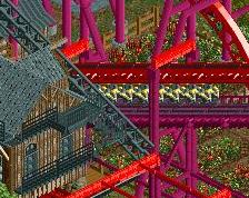
Busch Gardens Asia's Arrow Dynamics looper, Naga is the park's grandfather of thrills, speeding passengers through its iconic double loops and 540* helix since 1978.
 21-September 14
your the king of supports
This screen is just the sex
I think you really have what ur going for here, if i'm correct, which is an "older" looking part of the park, but its also somehow still very fresh. top notch.
There is a floating green mesh tile infront of the tree just under the chain hill by the line.
Dolphin statues are great.
Liam, those aren't dolphin's, they are snakes, by your's truly. You know, your post basically comes across as you trying your hardest to tear this screen down.
I'm gonna call bullshit. It's not fair to ANYONE to vote something low and rip it apart because its "subpar" for their usual work. voting can't be "objective" to the person, otherwise there is NO LEGITIMACY to the voting system. The ENTIRE point is to place screens on a scale, from the BEST to the WORST. If we vote things as "bad for this player" or "good for this player" then the system is no longer a scale for all screens. The system will then place screens that are "good for one player" but subpar compared to the community higher than screens that are amazing for the community but "bad for that player".
I didn't vote 70% because it's subpar, I voted 70% and 70% is subpar. I fully agree with your view on the voting system, it's one scale for all except maybe there's a LL/RCT2 distinction.
If you have spare wall object slots, the beam object on my objects page could be a good replacement for the roadlines. give it a 3rd dimension and make them a little more distinguishable from what's behind them.
And the foliage is a bit too much of the same shade of green, especially in the part right behind the loop.
The rest is excellent. I love the station.
Liam, you both called a 70% score great, and called it subpar.
The community consistently votes almost 20% higher than you on a screen like this. It just seems odd that you regularly rate this kind of work SIGNIFICANTLY lower than anybody else.
In all honesty, it looks like you are trying to "keep Robbie's ego in check" by nitpicking tiny details, things that wouldn't bother you in other builder's parks.
@FK: I just looked up the definition of the word 'subpar' just to make sure and it means 'below average', as I intended it. If the average is high, subpar can still mean great.
It's true that the community usually votes higher on Robbie's screens than me. But I'm not the only one who noticed that any Rob screen, whatever it shows, automatically gets a 90%+ score. Rob is one of the best parkmakers of our time, but sometimes the votes are just ridiculous... The same goes for some other parkmakers as well though, screens in general tend to get really high votes. Sometimes it seems like people are voting on a 60-100 scale and 70 is suddenly low/bad. Anyway, sometimes I like a parkmaker's style less than the majority, or just as often the other way around, which is called preference.
Maybe I'm subconsciously trying to counter the extremely high voting of today's NE (see BG's rant), but this is definitely not personal.
Though I admit my first post was a bit blunt, I think it's stupid that I get called out for saying something is on gold level...
with the whole point of something being intentionally underwhelming, i can't see how you can dock it for being that while still being great at the same time.
- What is portrayed
- The execution
Making an old park is totally unrelated to bad custom objects, objects with flat (no) textures, confusing details or glitches. I've voted 90% on ugly parks before, but never on something that had sloppy execution, which this screen has in places. I'm done with the discussion unless someone brings up a good point.
I'm not trying to be mean, I've just noticed that Robbie consistently gets over-analytical, super nitpicky, and even rude comments on his work, that very often appears to be someone trying to bring him down a notch and tear apart his screens. It's fine to genuinely discuss and critique a players work, but when we are trying to "bring down their ego" or adjust scores that we judge "too high", it discourages them from posting screens. I don't want to see someone as valued a players as Robbie discouraged from being part of the community because they know there work will be picked apart.
The super analytical, nitpicky comments are because that's all people can give on a lot of these. Additionally, I don't think Liam is trying to "lower the bar" on Rob's scores. at least, he didn't say he did. Maybe he doesn't like it as much, maybe he just doesn't like it as a screen.
Screens should be voted on as screens, and not as complete areas, or parks. There's elements of photography in capturing the right area, at the right moments, and cropping your screen to show what you want shown, while also making it look good. So, 70% does not necessarily mean it's blockbuster worthy, it just means it's a good screen. People should rate screens and parks differently because they are different things. A lot of people vote Rob's screens high. I believe that these people like to see finished areas with high levels of detail, like Rob's screens almost always are. That's what makes a screen good to this crowd, and is why his screens get voted so highly. Layouts, even if they're excellent, get shit ratings, because they're unfinished and undetailed. All this boils down to, is that everyone should vote consistently. The name attached to a screen does not matter, the content does. A 60% screen by Pacificoaster should look like the same quality as a 60% screen by gdb, if enough votes have been cast.
the turn into the drop is the best part, just so flowing looking.
iconic double loops? more like should be iconic interlocking loops.
I agree with Liam, this is fucking awful. Especially so, considering Robbie built it.
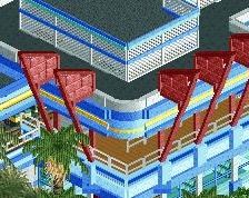
Looking at this again, the most offputting thing to me is the green stairs leading into the station. They look cheap and tacky.