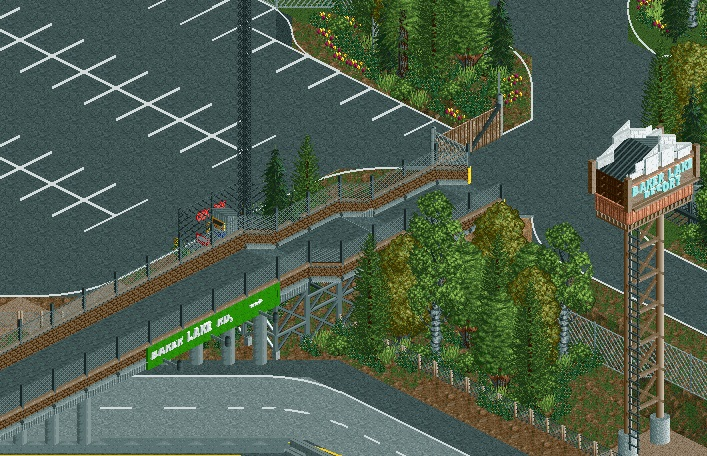
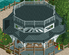
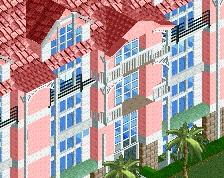
the form of things here seems okay, but everything is just so glitchy and disjointed. Really needs to be cleaned up.
Considering composition, this doesn't seem to fit with the rest of the park. Everything else is so clean and optimized, it seems unusual a park with a gorgeous, meticulous entrance building would have this as it's road entrance. I would say try to gear the style of this area more towards to the front of the actual park entrance.
I agree with both above that it's really messy. Taking the time to make sure the forms and textures are crisper and more refined would help you get your ideas across way more effectively imo.
 27-September 14
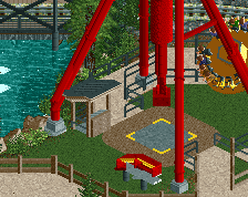

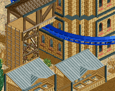
the form of things here seems okay, but everything is just so glitchy and disjointed. Really needs to be cleaned up.
Considering composition, this doesn't seem to fit with the rest of the park. Everything else is so clean and optimized, it seems unusual a park with a gorgeous, meticulous entrance building would have this as it's road entrance. I would say try to gear the style of this area more towards to the front of the actual park entrance.
It's a bridge for the staff entrance. The parking entrance is around a corner or something.
agree about the glitchiness. retro sign is cool, but looks precariously supported.
I agree with both above that it's really messy. Taking the time to make sure the forms and textures are crisper and more refined would help you get your ideas across way more effectively imo.
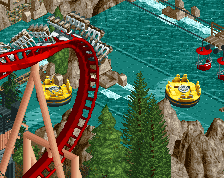
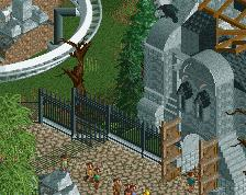
Good but about 20 points behind GLL