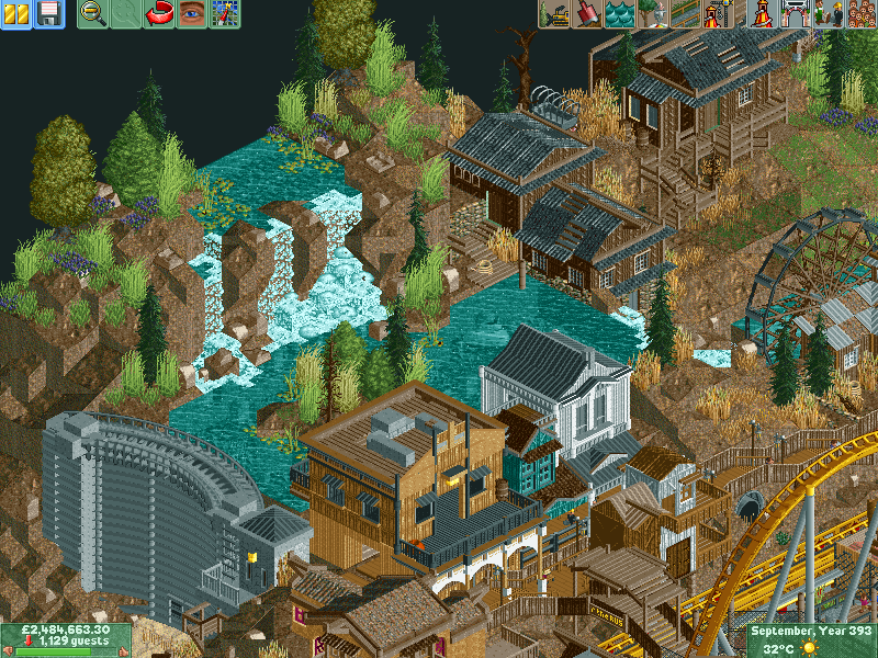
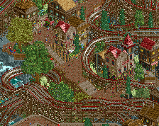
Architecture is really good, but something just feels off in the screen with the landscape shape. Maybe it's an odd angle to view it at. I might try using monorail tracks instead of the wooden tracks for your dam as well.
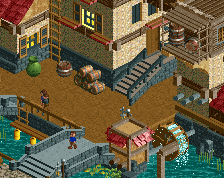
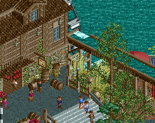
You're missing some water by the dam and the water wheel. Other than that, pretty great screen. You've been able to beat the brown so to speak with the white and teal buildings, and they have some nice contrasting textures as well.
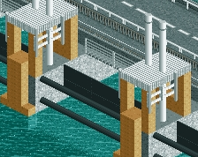
I personally don't really mind the use of wooden track for the top of the dam; it makes sense for the top to be thicker than the rest because people travel across that to get to the other side. The issue is perhaps that the dam just ends on that side; I imagine that the cliff should continue slightly past the end of the dam and then taper off downwards.
Also, in my opinion the path by the buildings should maybe be one tile wider. This is just something that I prefer as a viewer but I'm usually not a huge fan of one-tile wide paths because it makes everything a little too cramped for me. However, given that buildings are only on one side you could probably get away with it.
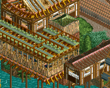
You're falling into the same trap as K0NG. I know that the wood textures really fit the theme you're going for, but when you have so much texture in such a small place, there's literally no breathing space, making it look much more chaotic than it needs to. Take a step back and use a few more textures. Even just changing the blue building to a brick type texture would do wonders for the screen in my opinion.
@Navalin: Not sure what exactly you mean by shape looking weird... If your talking about the right hand side of the screen maybe it looks a little strange but thats actually a drop of about 20-30 feet Not sure, Thanks for the comment.
@Stoksy: Didnt even notice that. I will look into expanding the hillside there. With the single wide path being there is because this is actually the exit path for the coaster and is a 1-way street No entry unless you leave the ride. The buildings there are souvenir and food buildings and toilets just incase the peeps need a change of underwear after the ride lol so 1 tile path is all thats needed. Cheers.
@Flowdiskord: Cheers.
@Trav: I get what your saying and may put that into practice to see what it looks like. Cheers.
@Coasterbill: I just had to do it lol. Couldnt let the oppurtunity pass me by
A lot going on in this screen, I needed these two weeks to properly put my opinion into words.
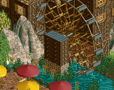
Every element is executed beautifully. Magnificent waterfall, interesting varied architecture, cool dam and a fucking submarine. However not everything falls into place when I look at the screen as a whole. Main problem of this is the foliage landscaping. I LOVE the teal building, it's a perfect colour accent in that otherwise very brown area. The water in the background is very distracting though. The water prevents that area to come into focus... And it doesn't really look right anyway. Some bits tell me that you're going for an arid landscape, while some other bits seem very wet. The left half of the screen is a different landscape than the right. It's two different worlds stitched together. A strip of land behind the buildings would help, both because of the colours/textures as well as reducing the amount of whater. Another thing you could do was balance the colours more. Add a few splashes of colours in the brown area (dark purple because it reappears in the flowers) and tone down the colours in the waterfall area. I'd go with darker foliage. More pine, and less of that mustard coloured tree as well. More brown grasses, less vivid greens. Oh, and about that teal building: you could go with another colour to prevent it from blending with the water.
In short: add and detract colours to tie the whole thing together.
Ok cheers, Very interesting comment there... You are defo right about the foliage that is gonna change its been on the to do list for a while. Ohh and btw that isnt a submarine lol.... The readme will make it clearer. Also there is a strip of land behind the buildings just can't see it because ya know the buildings Will add patches of colour around the place to brighten it up a bit, Cheers.
This natural river was diverted due to the greed of human kind... Money talks, Rich men wanted to be even richer, Hence the dam was constructed to gain undisturbed access to the gold mine and to ultimately 'bleed it dry' of its resources.
 30-September 14
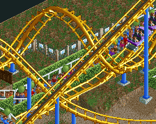
Architecture is really good, but something just feels off in the screen with the landscape shape. Maybe it's an odd angle to view it at. I might try using monorail tracks instead of the wooden tracks for your dam as well.
You're missing some water by the dam and the water wheel. Other than that, pretty great screen. You've been able to beat the brown so to speak with the white and teal buildings, and they have some nice contrasting textures as well.
I personally don't really mind the use of wooden track for the top of the dam; it makes sense for the top to be thicker than the rest because people travel across that to get to the other side. The issue is perhaps that the dam just ends on that side; I imagine that the cliff should continue slightly past the end of the dam and then taper off downwards.
Also, in my opinion the path by the buildings should maybe be one tile wider. This is just something that I prefer as a viewer but I'm usually not a huge fan of one-tile wide paths because it makes everything a little too cramped for me. However, given that buildings are only on one side you could probably get away with it.
dam thats a cool dam. And a shitty pun
You're falling into the same trap as K0NG. I know that the wood textures really fit the theme you're going for, but when you have so much texture in such a small place, there's literally no breathing space, making it look much more chaotic than it needs to. Take a step back and use a few more textures. Even just changing the blue building to a brick type texture would do wonders for the screen in my opinion.
So badly want to vote this 100/100 just for the Beavis and Butthead do America reference but I'll restrain myself.
Great screen though.
@Navalin: Not sure what exactly you mean by shape looking weird... If your talking about the right hand side of the screen maybe it looks a little strange but thats actually a drop of about 20-30 feet Not sure, Thanks for the comment.
@Stoksy: Didnt even notice that. I will look into expanding the hillside there. With the single wide path being there is because this is actually the exit path for the coaster and is a 1-way street No entry unless you leave the ride. The buildings there are souvenir and food buildings and toilets just incase the peeps need a change of underwear after the ride lol so 1 tile path is all thats needed. Cheers.
@Flowdiskord: Cheers.
@Trav: I get what your saying and may put that into practice to see what it looks like. Cheers.
@Coasterbill: I just had to do it lol. Couldnt let the oppurtunity pass me by
Every element is executed beautifully. Magnificent waterfall, interesting varied architecture, cool dam and a fucking submarine. However not everything falls into place when I look at the screen as a whole. Main problem of this is the foliage landscaping. I LOVE the teal building, it's a perfect colour accent in that otherwise very brown area. The water in the background is very distracting though. The water prevents that area to come into focus... And it doesn't really look right anyway. Some bits tell me that you're going for an arid landscape, while some other bits seem very wet. The left half of the screen is a different landscape than the right. It's two different worlds stitched together. A strip of land behind the buildings would help, both because of the colours/textures as well as reducing the amount of whater. Another thing you could do was balance the colours more. Add a few splashes of colours in the brown area (dark purple because it reappears in the flowers) and tone down the colours in the waterfall area. I'd go with darker foliage. More pine, and less of that mustard coloured tree as well. More brown grasses, less vivid greens. Oh, and about that teal building: you could go with another colour to prevent it from blending with the water.
In short: add and detract colours to tie the whole thing together.
70-75% with potential.
Ok cheers, Very interesting comment there... You are defo right about the foliage that is gonna change its been on the to do list for a while. Ohh and btw that isnt a submarine lol.... The readme will make it clearer. Also there is a strip of land behind the buildings just can't see it because ya know the buildings Will add patches of colour around the place to brighten it up a bit, Cheers.