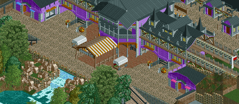
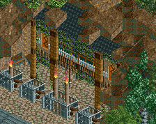
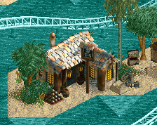
The colours, as has already been said about the entrance previously, are phenomenal. Really inviting, and definitely break the traditional colours that we've been seeing recently.
I do think however, that it looks a bit too cramped. In that you've only got two tiles where people can see the "goodbye" sign which I think makes it a little redundant. I would personally either move the path back a few tiles [where the lake/water feature is] or just completely get rid of the goodbye canvas and put the sign on the purple building.
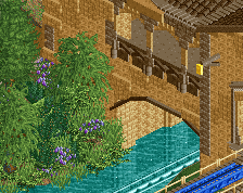
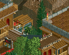
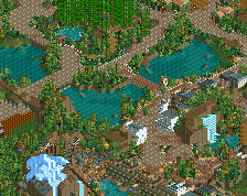
The 'Goodbye' sign can be seen all the way down the Main Street:
I've blacked that side out so I don't actually show any of the Main Street facades, but I hope this gives a bit more of an idea of how the entrance area is set out; you walk through the big building which is set above the Main Street, so you look down upon it. The stairs are by the waterfall, you can just about see them in both pictures. But yeah, the 'Goodbye' can be seen all the way down the street.
Okay then; makes more sense now. I'd still maybe push the path out 1 tile, [even if it's just a balcony of sorts] but that's just personal preference. Also, probably worth adding in some diagonal brick path just to make that transition from brick to crazy paving a little smoother [although I'd imagine you're probably going to do that anyway haha].
Still seems redundant. I don't walk down Main Street, USA to see a "goodbye" on the back of the train station. Departures are a bit more subtle than that.
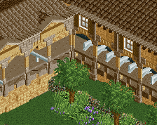
The foliage is a little lackluster. And you should lower those trees that are floating on oddly-shaped land via MOM. I also do not like the idea of a giant "goodbye" sign that is visible across the entire entrance area. Just seems weird.
I agree with nin, but the structure and details are really nice on that entrance. I know it would be a bitch to change, but I can't help but think the the dark purple would look so much more badass.
Seems like not many like the sign, but I personally like it so it's staying. The canvas it sits on is the only way out, the other turn styles are entrance only, so everyone would have to pass under the sign to leave, giving them a chance to look directly at it.
Maybe it's just a British thing then, but I cannot think of any actual larger theme parks in Britain that don't have something saying 'Goodbye!', 'See You Next Time!' or 'Have A Safe Journey!' over the exit.
Towers has it on the railings by the exit. Thorpe has it literally on the exit building. Flamingo Land also has it on the exit building. Chessington thanks people for joining in on the adventure. In fact the only one I can think of that specifically doesn't is Blackpool and that's only because the exit that did say it has been closed.
It seems weird to me that American parks wouldn't have anything thanking them for their custom as they leave!
The sign itself isn't weird, but having its visibility restricted to two tiles, OR having it be visible all the way down the main street are both weird options. You'd expect the sign to be visible primarily to people leaving the park, not just anyone who walks backwards on main street.
The sign itself isn't weird, but having its visibility restricted to two tiles, OR having it be visible all the way down the main street are both weird options. You'd expect the sign to be visible primarily to people leaving the park, not just anyone who walks backwards on main street.
But if people who are leaving literally have to walk underneath it then surely it is visible to people leaving the park?
It seems weird to me that American parks wouldn't have anything thanking them for their custom as they leave!
We do have the signs, but the nature of the RCT 3D sign object is that it makes everything more conspicuous, which fits in some cases, though not necessarily in this one. It's a good idea, but it reads off way more strongly than it should.
I think it's fine. Exactly like theme parks are over here. Really in your face about saying goodbye. To the point that you can read it when you are miles away.
I agree actually, Just because it might be viewed by people walking back along the mainstreet that dont actually want to leave. Doesnt mean they are robots and think "Oh I must leave now,I have seen the sign it is time to leave". Its a nice area man, No complaints no nitpicks.
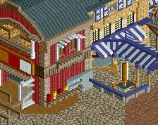
Yeah, I don't think there's any problem with the sign. Really like all the little stalls you've got dotted around, and I too am getting the Alton Towers feel, which is great as I've always liked that English main street style. Nice work.
 13-October 14
Hopefully this means the park is still going!
The colours, as has already been said about the entrance previously, are phenomenal. Really inviting, and definitely break the traditional colours that we've been seeing recently.
I do think however, that it looks a bit too cramped. In that you've only got two tiles where people can see the "goodbye" sign which I think makes it a little redundant. I would personally either move the path back a few tiles [where the lake/water feature is] or just completely get rid of the goodbye canvas and put the sign on the purple building.
The 'Goodbye' sign can be seen all the way down the Main Street:
I've blacked that side out so I don't actually show any of the Main Street facades, but I hope this gives a bit more of an idea of how the entrance area is set out; you walk through the big building which is set above the Main Street, so you look down upon it. The stairs are by the waterfall, you can just about see them in both pictures. But yeah, the 'Goodbye' can be seen all the way down the street.
Okay then; makes more sense now. I'd still maybe push the path out 1 tile, [even if it's just a balcony of sorts] but that's just personal preference. Also, probably worth adding in some diagonal brick path just to make that transition from brick to crazy paving a little smoother [although I'd imagine you're probably going to do that anyway haha].
Still seems redundant. I don't walk down Main Street, USA to see a "goodbye" on the back of the train station. Departures are a bit more subtle than that.
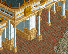
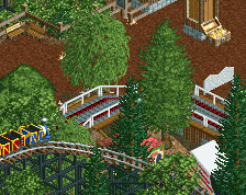
very Towers-esque, so well done on that as I know that is what you are going for.
Nice work
Foliage could use some work. And I would get rid of the "goodbye" sign. But the architecture and overall atmosphere is topnotch so well done.
The foliage is a little lackluster. And you should lower those trees that are floating on oddly-shaped land via MOM. I also do not like the idea of a giant "goodbye" sign that is visible across the entire entrance area. Just seems weird.
I agree with nin, but the structure and details are really nice on that entrance. I know it would be a bitch to change, but I can't help but think the the dark purple would look so much more badass.
Seems like not many like the sign, but I personally like it so it's staying. The canvas it sits on is the only way out, the other turn styles are entrance only, so everyone would have to pass under the sign to leave, giving them a chance to look directly at it.
Maybe it's just a British thing then, but I cannot think of any actual larger theme parks in Britain that don't have something saying 'Goodbye!', 'See You Next Time!' or 'Have A Safe Journey!' over the exit.
Towers has it on the railings by the exit. Thorpe has it literally on the exit building. Flamingo Land also has it on the exit building. Chessington thanks people for joining in on the adventure. In fact the only one I can think of that specifically doesn't is Blackpool and that's only because the exit that did say it has been closed.
It seems weird to me that American parks wouldn't have anything thanking them for their custom as they leave!
The sign itself isn't weird, but having its visibility restricted to two tiles, OR having it be visible all the way down the main street are both weird options. You'd expect the sign to be visible primarily to people leaving the park, not just anyone who walks backwards on main street.
But if people who are leaving literally have to walk underneath it then surely it is visible to people leaving the park?
We do have the signs, but the nature of the RCT 3D sign object is that it makes everything more conspicuous, which fits in some cases, though not necessarily in this one. It's a good idea, but it reads off way more strongly than it should.
I think it's fine. Exactly like theme parks are over here. Really in your face about saying goodbye. To the point that you can read it when you are miles away.
Very nice.
I agree actually, Just because it might be viewed by people walking back along the mainstreet that dont actually want to leave. Doesnt mean they are robots and think "Oh I must leave now,I have seen the sign it is time to leave". Its a nice area man, No complaints no nitpicks.
Yeah, I don't think there's any problem with the sign. Really like all the little stalls you've got dotted around, and I too am getting the Alton Towers feel, which is great as I've always liked that English main street style. Nice work.