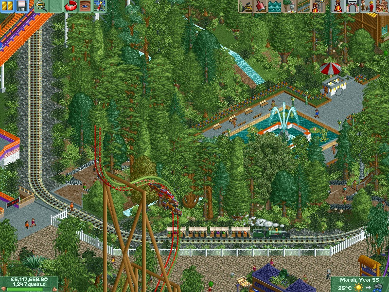
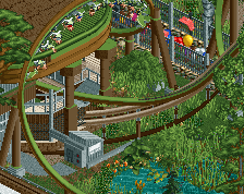
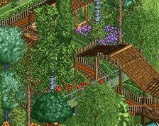
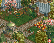
Looks good, maybe actually a bit too dense without going down to shrubs by the paths around the fountain. Also, you should add these screens to a project page.
You've failed the tree colours completely. Half of them need to be darkish-blue green, tree trunks need to be in different colours et cetera. Also, what's with the ice cream stand? It's oversized as f**k. That wheel alone is the size of the average monstertruck wheel. There's no way a peep can even look above the counter...
And use the same fence, dont combine the two because the other one is diagonal! Please. It looks hideous.
I just can't help it, i really don't like your work. I feel like it's cluttered, has weird colours and theming, and i feel like it's overtextured yet overly untextured at some parts.
Well Wouter I'll give you credit... at least you didn't back up your obnoxious response with an obnoxious 2 1/2% vote. Many of your critiques were constructive at least but look for some positives too because this screen has a ton of positives.
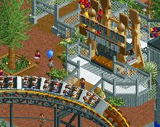
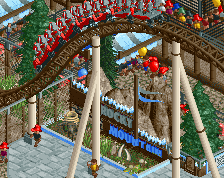
I actually like this a lot, I like the vibrant colors and the crazy coaster layouts and concepts... it's refreshing when everyone is trying to build in the same basic style (with a few exceptions like FK who's completely insane in a good way and Fizzix who posted that awesome suspended on a swamp).
I have to say, I really like it. That railroad looks great and I love the fact, that you built an open space for the peeps to relax and enjoy some icecream. its just classic and not a 4000 object building. you may want to thin out some trees, they are really dense in that spot, but other than that I think its great!
I love this, the atmosphere is really great imo. Also wouter stop being such a dick. Having an opinion is fine but you don't have to be such a dick about it. I also have to totally disagree with you on the scale of the ice cream stand, while true that it may be a bit oversized it's comparable to scales in many other parks, it's also pretty hard to add a lot of detail to it if you make it much smaller. It may be a bit big but it's not really something that really much of a problem in my eyes. Also for the tree colours, I think they look fine. Nothing wrong with them at all, it's stupid to say that a tree should be a certain colour, a tree can be any colour you want, as long as it looks good in the surrounding which it does in this case.
Also that one peep in the orange shirt looks like he wants be hit by a train haha
 23-October 14
Looks good, maybe actually a bit too dense without going down to shrubs by the paths around the fountain. Also, you should add these screens to a project page.
You've failed the tree colours completely. Half of them need to be darkish-blue green, tree trunks need to be in different colours et cetera. Also, what's with the ice cream stand? It's oversized as f**k. That wheel alone is the size of the average monstertruck wheel. There's no way a peep can even look above the counter...
And use the same fence, dont combine the two because the other one is diagonal! Please. It looks hideous.
I just can't help it, i really don't like your work. I feel like it's cluttered, has weird colours and theming, and i feel like it's overtextured yet overly untextured at some parts.
Well Wouter I'll give you credit... at least you didn't back up your obnoxious response with an obnoxious 2 1/2% vote. Many of your critiques were constructive at least but look for some positives too because this screen has a ton of positives.
I actually like this a lot, I like the vibrant colors and the crazy coaster layouts and concepts... it's refreshing when everyone is trying to build in the same basic style (with a few exceptions like FK who's completely insane in a good way and Fizzix who posted that awesome suspended on a swamp).
Keep doing what you're doing.
I have to say, I really like it. That railroad looks great and I love the fact, that you built an open space for the peeps to relax and enjoy some icecream. its just classic and not a 4000 object building. you may want to thin out some trees, they are really dense in that spot, but other than that I think its great!
Also that one peep in the orange shirt looks like he wants be hit by a train haha
The foliage color is really nice. Could use some density variation to break it up a bit, but the colors are great.
didnt think my park would lead to suicide! maybe he didnt like the colour of the trees either.