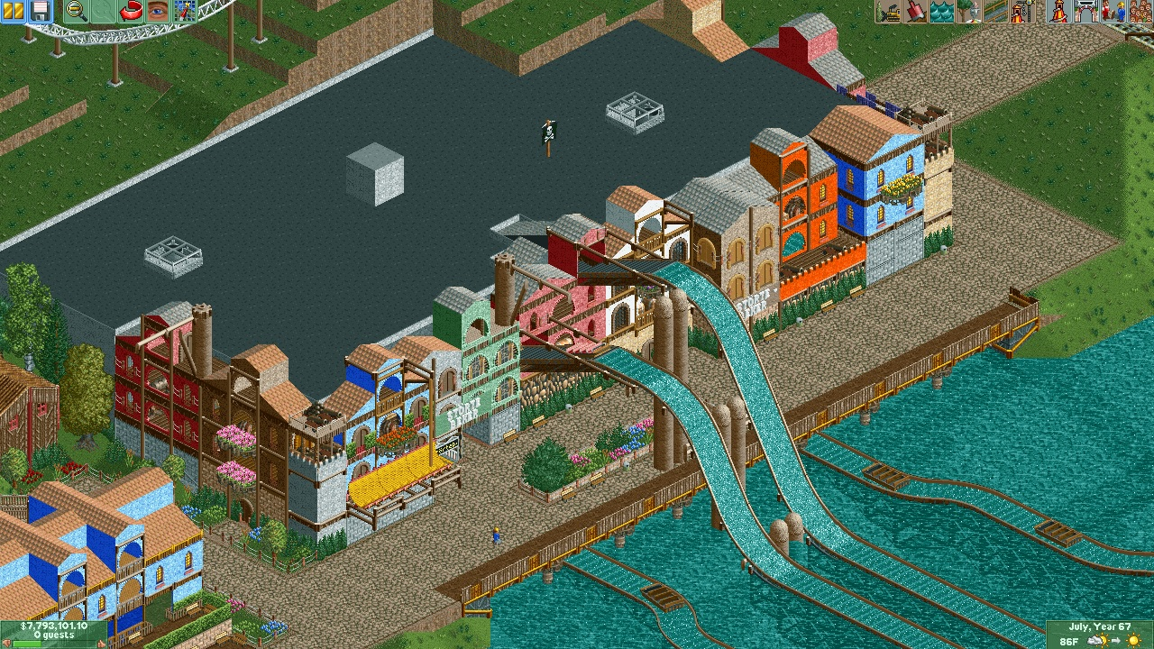
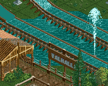
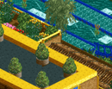
I really like the hanseatic atmosphere, reminds me a lot of (both) Inselfieber versions. Anyhow, it seems quite a bit dead, maybe some plants or stuff in/on the lake, e.g. plants, maybe a scenery ship could lighten it up a bit. One or two entertainer could also rise the atmosphere !
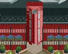
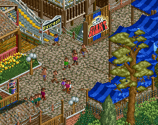
This is just a little bit too messy for my tastes. I like the concept but would like to see more cohesive building facades. I like the creativity though.
I personally don't find this overly messy. The dark orange, I agree, is a little too much of a contrast. My bigger concern is that the facades are essentially all exactly the same [especially the roof]. A one-tile tower with angled roofs up to it copied a bunch of times just with different colours doesn't really do enough to detract from the massive expanse of flat black roof that you've got. I like the idea of a themed facade and like that you've tried to prevent it from being too flat, but having all the roofs exactly the same is killing it for me.
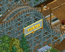
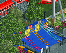
Also, the bobsled awning isn't really working. I get what you're trying to do but because there's no good way to support it without covering the whole tile [and the banked track goes about 3/4 of the way] it just looks redundant. I would maybe just making a standard awning using the bobsled track angled upwards towards the building and then supporting it from there.
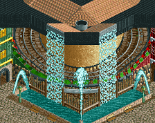
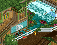
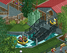
Not bad. A small step of improvement for you. The path works well.
I wouldn't make everything all too colourful. Stick to a theme and make it live. And I'd also lose the green "fences" (hecken) against walls. Looks wrong to me.
Vary your structures up more. Some of them look the same just different colours. Also, establish the theme more because at the moment it looks quite basic.
 12-November 14
BigB Offline
I really like the hanseatic atmosphere, reminds me a lot of (both) Inselfieber versions. Anyhow, it seems quite a bit dead, maybe some plants or stuff in/on the lake, e.g. plants, maybe a scenery ship could lighten it up a bit. One or two entertainer could also rise the atmosphere !
B'B
This is just a little bit too messy for my tastes. I like the concept but would like to see more cohesive building facades. I like the creativity though.
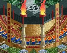
I would try yellow instead of dark orange for the one building.
#VliegenderHollander
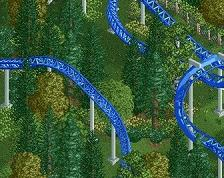
Plus, these double drops could be extra fun, if you have a dueling effect
I personally don't find this overly messy. The dark orange, I agree, is a little too much of a contrast. My bigger concern is that the facades are essentially all exactly the same [especially the roof]. A one-tile tower with angled roofs up to it copied a bunch of times just with different colours doesn't really do enough to detract from the massive expanse of flat black roof that you've got. I like the idea of a themed facade and like that you've tried to prevent it from being too flat, but having all the roofs exactly the same is killing it for me.
Also, the bobsled awning isn't really working. I get what you're trying to do but because there's no good way to support it without covering the whole tile [and the banked track goes about 3/4 of the way] it just looks redundant. I would maybe just making a standard awning using the bobsled track angled upwards towards the building and then supporting it from there.
Not bad. A small step of improvement for you. The path works well.
I wouldn't make everything all too colourful. Stick to a theme and make it live. And I'd also lose the green "fences" (hecken) against walls. Looks wrong to me.
Vary your structures up more. Some of them look the same just different colours. Also, establish the theme more because at the moment it looks quite basic.