The brown arches on the building on the lower right blend too much with the brown path. I would try a different color to brighten this up and help them stand out a bit more. I would also suggest making the roof on the building on the right a different color than the walls. I really like that building though despite those 2 minor suggestions.
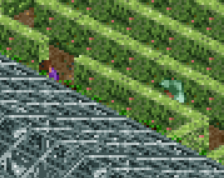
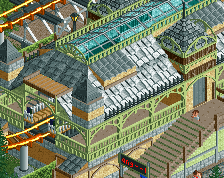
right now it's quite square. definitely try to break it up more with different shapes and stuff like balconies. using some more interesting colours would definitely help too, personally there's just too much grey and brown here. i'ts definitely a good start though
 09-December 14
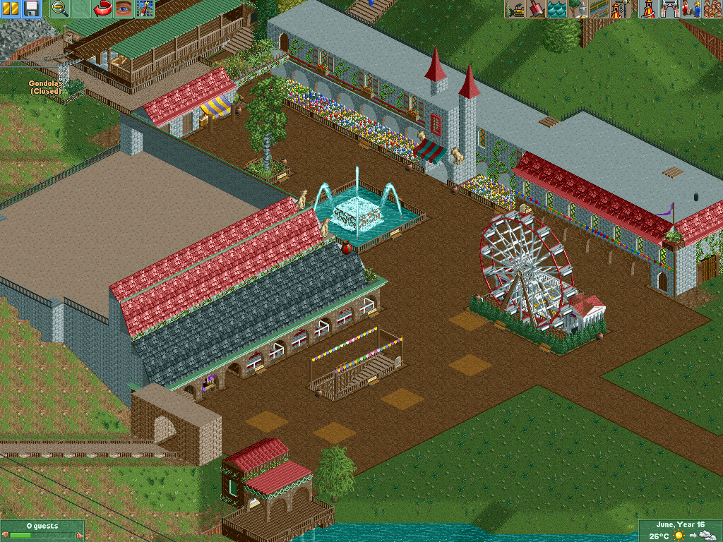
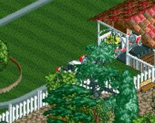
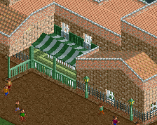
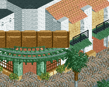
The brown arches on the building on the lower right blend too much with the brown path. I would try a different color to brighten this up and help them stand out a bit more. I would also suggest making the roof on the building on the right a different color than the walls. I really like that building though despite those 2 minor suggestions.
Yeah, from this angle it does blend too much, but from other angles it's much better. Do you think a certain shade of green would do the job ?
I'd go with tan.
right now it's quite square. definitely try to break it up more with different shapes and stuff like balconies. using some more interesting colours would definitely help too, personally there's just too much grey and brown here. i'ts definitely a good start though