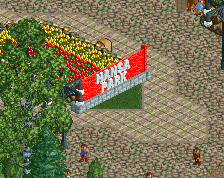
Screenshot / Some Mainstreet Flatrides
-
 11-December 14
-
Shoreside Theme Park (Abandoned)
-
5 of 5
- Views 1,312
- Fans 0
- Comments 3
-
Description
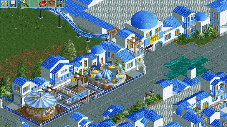
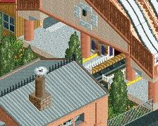
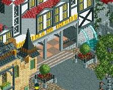
To explain the flat roof once and for all: This area is inspired by Sea World Brisbane, and there this flat roof texture was used. Not in that extend but still. But I will try how it looks with a black or grey roof.
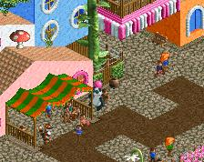
So this is the other side of the mainstreet. I didn't know for a long time what to build there, but I'm fairly happy with the result. The foliage is not done, as I first want to get the buildings in place. -
Full-Size
-
No fans of this screenshot
-
Tags
![screen_7497_[Cancelled] Stadtpark Stuhr](https://www.nedesigns.com/uploads/screens/7497/7497_thumb.png)
Consider the spacing between your rides in a realistic context. They'll look better with their own locations and surroundings, rather than bleeding into each other.
This building style is also starting to get repetitive. See what you can do to switch things up, changing colors slightly, or making gradual shifts to the landscape, introducing foliage, or otherwise making things more interesting.
side note: I finally realized what bothers me so much about the concrete tile paths. The lighting on the edges is reversed.
The colors are really getting repetitive here. Even if you very subtly introduce a few more colors that would help you immensely.
I will say though, you're getting so much better. This project is a remarkable improvement from anything you've built on this site before and I commend you for that.
BigB Offline
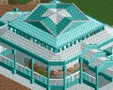
I think the type you used for the flat grey roof is not the best choice, maybe try some normal blocks to give the roof a more monotonous look. Attractions are a good option for colour variation as well as your paths, which are just grey atm. Maybe the brickblock you used for the roof may work for your path.
The water placed in the middle of your path looks out of place, what are you planning to do there?
B'B