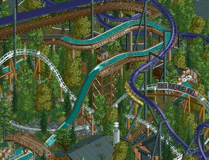
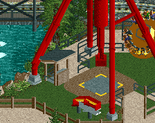
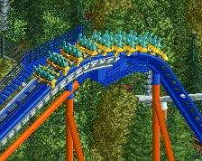
Whilst I still stand by the fact that your park was missing a truly iconic coaster, I'm not a huge fan of this. It looks really forced and uncomplementary - unlike basically the rest of the park. I have no doubt that the station and coaster details are top notch but personally not a huge fan of the interaction - too unnatural in my opinion.
I think what you've done is really unique in terms of RCT. This has a very Herscheypark vibe, where Great Bear is kind of forced into space it doesn't really have. I think the interaction is nice, the colour is striking, I hope the layout is actually decent, and doesn't suffer because of it's location.
That being said, I'm not sure this is the right move for the park. Your park had this nice calm feel to it, the coaster selection was perfect for that family run woodsy park, I personally am just not sure a B&M invert is right for the park, or that it's location is right.
You've basically ruined 2 great points of this park. The lack of a B&M and that every coaster and area had room to breathe, which added to the atmosphere.
But, still, I'm sure the park is still nice lol and I doubt very much you will remove work you've just spent time doing.
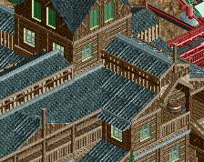
I don't like this at all. This park had sort of a "Rye Playland", small town park vibe before. This doesn't fit and it overpowers what was one of the nicer areas of the park.
Definitely a Hersheypark vibe, but also definitely pulled off wrong. If you are going to do a massive coaster like that, you need to pick better spots to drop in instead of weirdly floating above and having half drops. Hate to say it, but I'd scrap the coaster because the previous area was so beautifully intertwined and low to the ground. This only gets halfway there.
Had I not already known what the rest of the park was like, I'd say keep it. I love coasters piled up like and it's all pretty dynamic. Unfortunately like others have said there was no need for the thing as it doesn't suit your park at all.
Whilst I still stand by the fact that your park was missing a truly iconic coaster, I'm not a huge fan of this. It looks really forced and uncomplementary - unlike basically the rest of the park. I have no doubt that the station and coaster details are top notch but personally not a huge fan of the interaction - too unnatural in my opinion.
This. And what Louis said. I was sort of hoping to see a bigger coaster from you in the park but this is not the way to do it. Sorry
Not a fan at all, sorry. While I have been enjoying the other screens from the project quite a bit, this one is just such a massive step down in my opinion. I agree completely with the more negative points stated above. I loved this area of the park beforehand, and now it looks like a you let some n00b plop an awful layout on top of what was there in like 10 minutes and then added some supports, and the results are just what you'd expect from doing that: an eyesore.
Sorry for being so negative dude, I should add that I absolutely adore this park aside from that invert. Looking forward to the release.
I pretty much agree with everyone else, the first drop looks quite awkward it would be much better had it banked down right, then down left but i don't think that would work due to clearance.
Was there nowhere else in the park to add it? Obviously cant judge the rest of the layout but i hope the rest of the layout works
 04-January 15
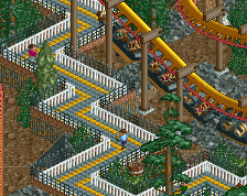
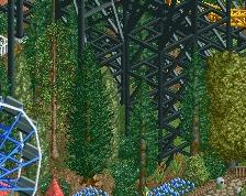
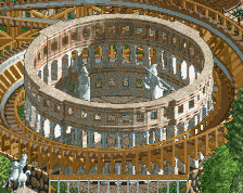
like how high all the coasters are... and how harmonic
Whilst I still stand by the fact that your park was missing a truly iconic coaster, I'm not a huge fan of this. It looks really forced and uncomplementary - unlike basically the rest of the park. I have no doubt that the station and coaster details are top notch but personally not a huge fan of the interaction - too unnatural in my opinion.
I don't think Baker lake needed a #1 coaster, but yea, this looks odd. Curious to see the rest of the layout though.
ew
I think what you've done is really unique in terms of RCT. This has a very Herscheypark vibe, where Great Bear is kind of forced into space it doesn't really have. I think the interaction is nice, the colour is striking, I hope the layout is actually decent, and doesn't suffer because of it's location.
That being said, I'm not sure this is the right move for the park. Your park had this nice calm feel to it, the coaster selection was perfect for that family run woodsy park, I personally am just not sure a B&M invert is right for the park, or that it's location is right.
You've basically ruined 2 great points of this park. The lack of a B&M and that every coaster and area had room to breathe, which added to the atmosphere.
But, still, I'm sure the park is still nice lol and I doubt very much you will remove work you've just spent time doing.
Fuck it, I like this. It's unique, it feels intentionally crammed in there.
This screen works really well. It looks really cool. Its just not the right thing for the park
Oh god if you think it's an awful layout, it must be pretty damn awful
I don't like this at all. This park had sort of a "Rye Playland", small town park vibe before. This doesn't fit and it overpowers what was one of the nicer areas of the park.
I think you've ruined this area. The interaction was great before, I don't understand why you've forced more in.
This. And what Louis said. I was sort of hoping to see a bigger coaster from you in the park but this is not the way to do it. Sorry
Sephiroth Offline
Not a fan at all, sorry. While I have been enjoying the other screens from the project quite a bit, this one is just such a massive step down in my opinion. I agree completely with the more negative points stated above. I loved this area of the park beforehand, and now it looks like a you let some n00b plop an awful layout on top of what was there in like 10 minutes and then added some supports, and the results are just what you'd expect from doing that: an eyesore.
Sorry for being so negative dude, I should add that I absolutely adore this park aside from that invert. Looking forward to the release.
like, if you're going to do this, the invert has to be the best damned thing i've ever seen. smooth out that drop, first of all
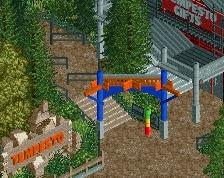
Make the coaster catwalk a combination of gray and black
Richie Offline
I pretty much agree with everyone else, the first drop looks quite awkward it would be much better had it banked down right, then down left but i don't think that would work due to clearance.
Was there nowhere else in the park to add it? Obviously cant judge the rest of the layout but i hope the rest of the layout works