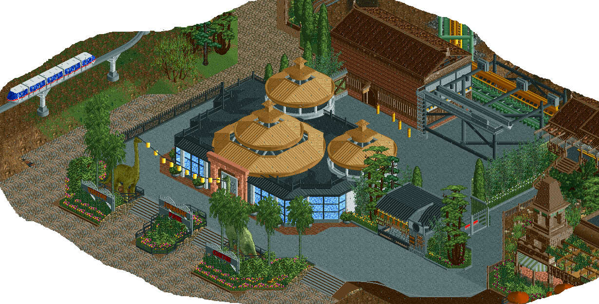
Screenshot / Jurassic Park Visitor Centre
-
 08-January 15
-
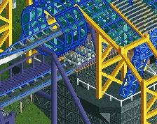
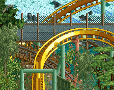
B&M Invert - Extinction
-
3 of 9
- Views 4,316
- Fans 1
- Comments 15
-
Description
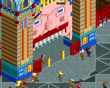
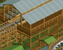
Welcome...TO JURASSIC PARK!
Screen just showing that I do still play this game.
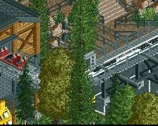
Not 100% convinced by the curved roofs but wasn't really sure how else to build them because I wanted the thatch roof but couldn't combine it with a curve very well. Also picture is the B&M transfer building and a small sneak-peak of the jurassic park monorail. -
Full-Size
-
1 fan Fans of this screenshot
-
Tags
Nice work.
I do think the tarmac path is too similar to the tarmac path in the backstage area, and this is causing a massive area of tarmac path that isn't too pleasing to the eye.
But yeah, lovely stuff. Good to see this continuing.
Not sure how well this goes with the other building to the right of it, but its still wonderful.
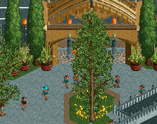
And the dinosaurs holding the string of lanterns, brilliant, makes the screen.
I agree with Louis, I would suggest making the primary gray path closer to white, almost like what Kumba did in Kumba
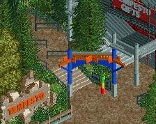
That invert station looks fantastic!
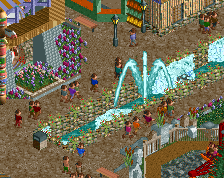
Perhaps try substituting tan crazy stone path for the tarmac in front of the visitor center. Right now its giving off a very dark forest feel, not a more tropical island jungle feel as I would expect with JP.
Great idea with lanterns hanging off of the dinos though!
I couldn't agree more about the path. Also, the gate to the backstage area is nice but it should be solid. Imagine walking through that brilliantly themed area once you get off the ride and looking over and seeing an un-themed backstage / parking area and a (presumably) big ugly wall on the back of the photo booth. That would really take you out of an otherwise magnificent theme.
Everything else is excellent. I can't wait to see how this turns out.
All im thinking of is when Peter Griffins Jurassic is singing ther Park Theme song. Its great, just like this screen
Man I love those supports for your monorail.
I will say the blue glass is a bit off-putting and this mix of the more traditional Rainforest Cafe and JP is a bit weird. As said above the foliage isn't matching either theme right now, giving it a more forest feel rather than jungle, and again I'll repeat that the path needs a bit of work. It's just too much of the same gray and it's odd to isolate this building to the side like this. Being the most important building on the island, the Visitor Center definitely needs more prominence.
I would expect nothing less from you nin haha. I fully understand that what I've built, contextually, isn't quite accurate to the actual Jurassic Park but I felt that these types of buildings would go a long way towards complementing and reinforcing the prehistoric theme that I was going for. I concede that I did have some trouble deciding where to fit this particular building but decided on this location because of the large backstage area and also because it was the best 'large space' that I had available. Even though the location isn't ideal I am trying to make the area in front of it kind of a main hub with one of the monorail stations directly opposite. Hopefully this will help a little with prominence.
Is it more a problem with how light the blue is? I've just been a fan of that lighter blue almost regardless of context, but perhaps a grey could work...
My idea was to have the Visitor Centre as the first main building that people visit from the carpark, and then that would transition into the more prehistorical/forested area. Rather than an entire JP themed coaster, I wanted to go with more of a traditional prehistoric theme that was complemented by features of JP.
Will definitely try out some different pathing options, and thanks for the tip about the solid gate Bill.
No worries, haha. I'll definitely give you the benefit of the doubt here, being that I haven't seen the entire layout of the park.
I would say yes, it's the blue color that's off-putting. Try for the teal green/blue if you're still wanting colored glass, or grey/black. The original building has black windows prohibiting you from seeing the inside, and that may do wonders here. If you're going to keep it pretty transparent, definitely add details on the inside. Take a look at the building at IOA for ways that you could fill in the interior with.
I echo how great the monorail supports are. And I think the curved roofs look fantastic: clean, un-glitchy, and a great complimentary colour to brighten up the tops of the building.
Love the lanterns stretching from the heads of the dinosaurs. And the transfer track area. You've sparked my curiosity to see the queue area towards the right of the screen. Well done overall.
I personally think you're wasting the time on all the realistic stuff, but eh that's just me, as I would replace the tarmac at the back of the centre with foliage. The lanterns are a smart idea.
^Completely understandable. However, I do think that these sort of realistic areas do have a certain aesthetic. When a lot of the rest of the park will probably be foliage I'm trying to take every opportunity to include something else.
Have changed the path to Kumba's off-white and it does work a lot better with the dark brown tarmac/dirt pathing that I'm using. So thanks for that suggestion!
I don't get the visitors center. You have built a pretty great invert station and Rainforest Cafe and then you built that? I'm not questioning it BEING THERE, but rather the skill in which you built it. Honestly it looks horrible and I expect better from you, not to sound too harsh, sorry man. Definitely take nin's advice. I would move it to a new location entirely where it could have so much more of a 'wow' effect. Plus the way you built it now, I'm not even sure people could see the thatch roofs from the paths so why would they bother building them (except for the middle one)? Move it somewhere new, make it grander, make it symmetrical, and make it right. Cause like I said, you are above this! Keep it going dude!