Screenshot / VK: Entrance Gates
-
 22-January 15
-
The Vermillion Resort
-
14 of 36
- Views 1,816
- Fans 3
- Comments 19
-
Description
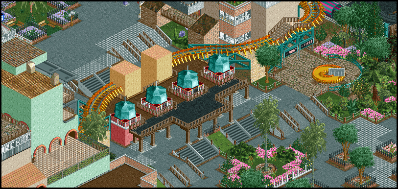
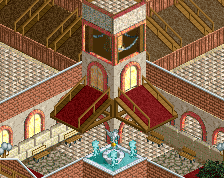
After exiting the monorail or trams, guests approach the Vermillion Kingdoms gate through a sunburst-motif plaza. Pass sales and service buildings flank the stairs leading up to the gates. Guests standing around the sundial outside the First Aid building have a great photo opportunity with the park gates and the Art Deco facades of the Little Kingdom behind them.
[map 4] -
Full-Size
-
3 fans Fans of this screenshot
-
Tags
Some details have changed since this shot, I'll see about getting another angle up later.
just such sex
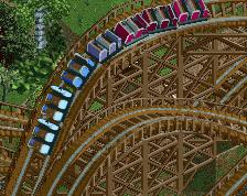
I tad busy in my opinion, mainly because of all the visible supports I think. Possibly reducing the number would help (more so the supports of the black path than the blue of the side-friction coaster). Lovely bold colours though!
Is that a sundial in the top right? If so, awesome! If not, it's still a beautiful theming piece.
Love it. Bold colour choices, but it works so well.
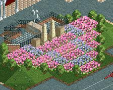
I'd like a bit more information on what the 3 parks are based upon. I'm guessing Kingdom's is some sort of country/nation/historical themes. But the other two is what I'm wondering about, what's the difference between them.
But yeah, great screen, lovely LL. Love this project so much.
It's just so nice to look at.
Is that a sundial? Good stuff.
This is beautiful. I like the significance of the two pillars, shows a lot of thought was put into this entrance. Unrelated though, all of this fuss over a diagonal wooden fence object that looks like crap, someone just copy the view from this sundial and call it good- this is a million times better than that crappy 1/4 tile object. Sorry to taint an LL screen with object talk. Great job again.
I love the entrance. Agreed with the too many supports. I also think the towers could be a bit taller and more prominent. I wouldn't have thought much of them except for your description pointing them out.
Whoa, bit more serious work from you now? Nice.
Some of it is really lovable, some is quite forced.
I'm really digging that. Moreso than the previous stuff. Reminds me a bit of rocky mountain mystique
I had the same though, but I just don't like how it looks. It is indeed a sundial!
I like to leave the path under features like that with the gaps between tiles to simulate broken cobble or grass coming through - like this well from an old screen.
side note: my minigolf stations are all glitching hard and I'm going to have to replace all of them on Map1.
Agreed- most likely moving the pillars up a unit or two.
Happy to oblige.
Vermillion Escape is the first and oldest park which grew out of a boardwalk. It expanded as it grew and is the most compact with the strangest layout. It has no specific overall theme, although it does have rough themed areas that developed as it expanded.
Vermillion Adventures is the second park and launched in the early 90's. The park concept is a [very loosely] interpreted recreation of the park owner's trip across East and Southeast Asia, and the park is essentially a center lake layout except that instead of a lake, it has a mountain in the middle. (Technically a volcano with a launched intamin invert in it.) The park has squished in new rides but has trouble with layout.
Soleil Springs - haven't shown any of it yet - is a themed waterpark launched in the late 90's when it looked like they were the way of the future that has expanded and added rides since to try and keep attendance up.
Vermillion Kingdoms is the third park, launched somewhat incomplete in 1999 in a panic when it became clear Disney and universal were both opening new gates. The park concept is a series of fantasy kingdoms brought to life; there's a snowy nordic kingdom, a desert shah's kingdom, an ancient ruined kingdom, and more; it has seen whole new areas bolted on, but has the most open and intentionally-designed big park layout.
Now posix, all my work is serious! Just not usually this heavily founded in realism or recreation.
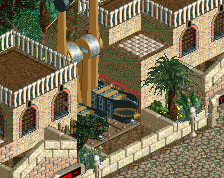
Here's the reverse angle. Still need to ditch some supports.
Do you have any plans for guest appearances?
That reverse angle is the sex.
I would add more lamps and benches to the main path and and also some on the balconies as well.
RMM Offline
very fun to look at. incredible how many colors and textures there are without it being overbearing.
i love it all
<3<3<3