Nice man, Love the little bridge there and I personally like the watertower and the interaction with it, I laughed at the fact you have the orange line for those who aren't on the ride but for those who are in the Q, Its tough shit your getting soaked
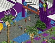
this style of parkmaking is extremely dense. The level of detail per tile is really something that used to be reserved for H2H. On one hand I'm a huge fan and try to emulate it myself, and on the other hand I feel like breathing room and negative space are essential points that can be overlooked with this much detail.
shit, wow. like, everything's just so deliberate here, like the perfect amount of buildings and foliage and whatnot, and everything detailed just as much as it needs to be.
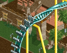
really liking how the queues are executed and how well it works with the station. i'm not so hot on the diag bridge like others are, but it's still good and you should probably keep it
I'm very highly meh on this screen. Its got some brilliant bits, like the bridge, but it also feels a little sterile to me. I think it may be that default fence you used for a lot of the queue, but also there are just a ton of fences for the queue, where one might make it all come together a bit more. Also, some of the parts of the ride look like a car will easily hit fences.
I don't know, i'm just not sold on it. There just seems to be a lot of pieces that don't fit together or could be cleaned up.
It's technically well done but it's also extremely messy. Like the post above mentioned, you have a lot of different fencing and if you stick to merely a couple styles it would really tie everything together I think. I would also reconsider the bridge. It might just be this angle but it looks messy with the coaster track (and gimmicky). Stick to all scenery or all coaster track and try and not have the bridge be so articulated to give it a cleaner look. Everything else looks great!
This is the first screen that I've ever seen where I like the trackitecture (just personal taste). Apart from maybe the fences in within the queue, everything just looks so clean and realistic. What a great job!
@hulkpower: more rides are coming. They probably won't be super compact, but it'll still be more lively.
@S_F: my logic was that if you're in the queue, you're already willing to get a little wet when you hit the splashdown on the ride itself.
@][: I'm not sure it's *that* dense. I mean, it's heavier than most of the stuff I've done before, but it'll have breathing room too.
@robbie: I don't think we'll have issues with this hitting the object limit, because neither of use are going to build as intricate of architecture as you tend to.
@shotguns: the bridge will probably look awful with peeps on it, tbh. I'm considering straightening it up because of that.
@FK, rcter2, steve: I was trying to use different fences for different purposes. I should probably narrow the variation in selection down a bit, but I don't think it's as much of a negative as you're making it out to be.
@pierrot: what shogo said, plus the fence styles, and foliage should help reinforce the theme.
 07-February 15
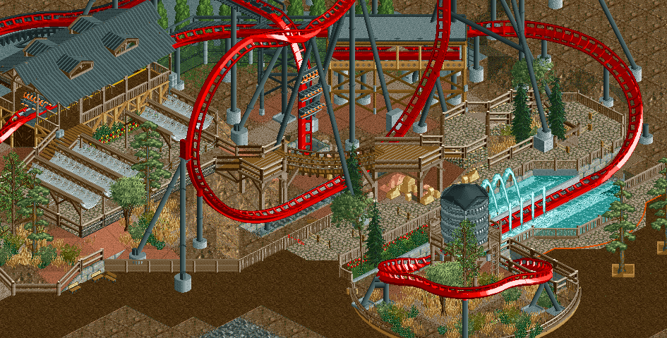
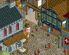
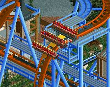
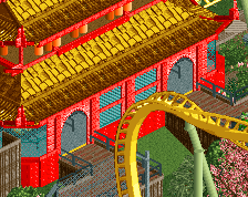
I really like the queue and the interaction going on. I'm not sold on the trackitechture watertower and the orange line on the path (?)
^The orange line is to show the area where you can stand and get wet, it's the splash zone.
I really like how this has turned out. Both of our ideas have created a great coaster with some lovely interaction
hulkpower25 Offline
Nice man, Love the little bridge there and I personally like the watertower and the interaction with it, I laughed at the fact you have the orange line for those who aren't on the ride but for those who are in the Q, Its tough shit your getting soaked
this style of parkmaking is extremely dense. The level of detail per tile is really something that used to be reserved for H2H. On one hand I'm a huge fan and try to emulate it myself, and on the other hand I feel like breathing room and negative space are essential points that can be overlooked with this much detail.
DON'T DO TOO MUCH DETAIL. DON'T BE LIKE ME. DON'T DO IT.
I love this.
The diagonal bridge is still my absolute favourite feature here. Looking really promising.
looks pretty damn good. you need to show me more of this
shit, wow. like, everything's just so deliberate here, like the perfect amount of buildings and foliage and whatnot, and everything detailed just as much as it needs to be.
really liking how the queues are executed and how well it works with the station. i'm not so hot on the diag bridge like others are, but it's still good and you should probably keep it
thats really solid. great work.
I'm very highly meh on this screen. Its got some brilliant bits, like the bridge, but it also feels a little sterile to me. I think it may be that default fence you used for a lot of the queue, but also there are just a ton of fences for the queue, where one might make it all come together a bit more. Also, some of the parts of the ride look like a car will easily hit fences.
I don't know, i'm just not sold on it. There just seems to be a lot of pieces that don't fit together or could be cleaned up.
another solid screen from you. it seems every single objects has a right purpose.
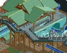
my only gripe is it lacks of solid theme. I believe you could solve this problem easily.
i wouldn't say that it's ambigously themed. the water tower, the rugged queue awnings, and how the station is styled points to a western theme here
RCTER2 Offline
7 types of railing here
In such a small zone you use 7 railings.
It's technically well done but it's also extremely messy. Like the post above mentioned, you have a lot of different fencing and if you stick to merely a couple styles it would really tie everything together I think. I would also reconsider the bridge. It might just be this angle but it looks messy with the coaster track (and gimmicky). Stick to all scenery or all coaster track and try and not have the bridge be so articulated to give it a cleaner look. Everything else looks great!
This is the first screen that I've ever seen where I like the trackitecture (just personal taste). Apart from maybe the fences in within the queue, everything just looks so clean and realistic. What a great job!
I don't mind the bridge, or the watertower. Although some netting might be a good safety feature to put in underneath it though perhaps.
Reply time:
@faas: orange line is splash zone.
@hulkpower: more rides are coming. They probably won't be super compact, but it'll still be more lively.
@S_F: my logic was that if you're in the queue, you're already willing to get a little wet when you hit the splashdown on the ride itself.
@][: I'm not sure it's *that* dense. I mean, it's heavier than most of the stuff I've done before, but it'll have breathing room too.
@robbie: I don't think we'll have issues with this hitting the object limit, because neither of use are going to build as intricate of architecture as you tend to.
@shotguns: the bridge will probably look awful with peeps on it, tbh. I'm considering straightening it up because of that.
@FK, rcter2, steve: I was trying to use different fences for different purposes. I should probably narrow the variation in selection down a bit, but I don't think it's as much of a negative as you're making it out to be.
@pierrot: what shogo said, plus the fence styles, and foliage should help reinforce the theme.
@the rest: thanks! glad you all like it!