I would've just attached this to your other screen to be honest...
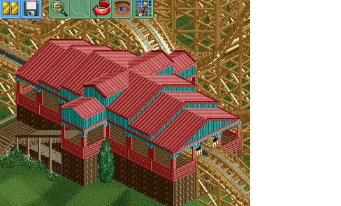
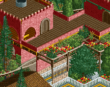
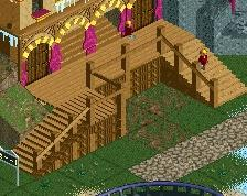
Anyways, like everyone has said much improved! CSO has really helped you I think, taking more consideration for building forms. The colours are decent here, although I'd support those stairs a little differently personally.
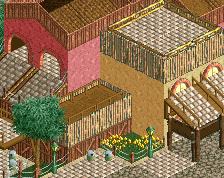
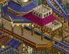
I don't think I will find too much time to build in the next couple of days, so I decided to upload my improved station. Instead of pointless stone there is wood now.
 19-February 15
![screen_7497_[Cancelled] Stadtpark Stuhr](https://www.nedesigns.com/uploads/screens/7497/7497_thumb.png)
BigB Offline
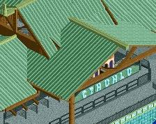
Looks way better
I would've just attached this to your other screen to be honest...
Anyways, like everyone has said much improved! CSO has really helped you I think, taking more consideration for building forms. The colours are decent here, although I'd support those stairs a little differently personally.
Keep at it!
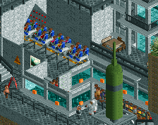
Why;d you pull the blue things? I liked those. I think the only real problem is the height. The cieling is too short, imo