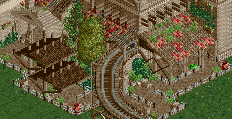
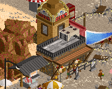
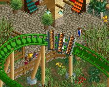
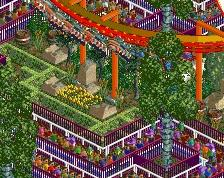
I feel like the brown issue wouldn't be as glaring if the woodie had another accent of brown on it, like the chocolate brown for the rails or something of that effect.
Yeah, too much brown. Even if you used the different shades of brown it'd be an improvement. I agree the doubled fences are unnecessary, and I'd even change the path to cobblestone or the standard brown path. Nice job on the structures though!
Every map something shit-themed. Also lots of liquor.
To be more on-topic: the form of the structure is great and I like the atmosphere being formed by the textures, but there is way, way too much brown. I also don't like the doubled fences or how you're trying to make it look overgrown or abandoned (?) on the paths. It can look old-fashioned/dirty without having shrubs growing out of the queue. I also wonder if it wouldn't be better to have some inverted slope quarter-tile object beneath the roof objects to make that space look smoother (rather than diagonally stacked wedges - I hope that makes sense).
The other colors called; they want you to fire Brown
Hilarious! Very true though, both the floor texture and the coaster could be altered really to break it up and the fences. I'm struggling with the two left hand structures, other than that though the architecture is great.
you have a ton of missed color opportunities in this. change out that path for probably crazy pathing, reclolor the tops of those queue coverings, chage the coaster colors to that saturated brown, as well as replace the tile awning's color with that brown or something less dull, black would even work
 20-February 15
BigB Offline
This poison green thing looks out of place
the doubled fences are giving me a headache. looks really good though.
The other colors called; they want you to fire Brown
I feel like the brown issue wouldn't be as glaring if the woodie had another accent of brown on it, like the chocolate brown for the rails or something of that effect.
Yeah, too much brown. Even if you used the different shades of brown it'd be an improvement. I agree the doubled fences are unnecessary, and I'd even change the path to cobblestone or the standard brown path. Nice job on the structures though!
Looks like he might have what it takes to be a Hurricane...
If the hurricanes are going to be known for being brown, we might have to start calling them the shitstorms.
Fuck
Fix the fences, nothing else I really have a problem with other than the colors.
"Jim Lahey's Shithawks"
Every map something shit-themed. Also lots of liquor.
To be more on-topic: the form of the structure is great and I like the atmosphere being formed by the textures, but there is way, way too much brown. I also don't like the doubled fences or how you're trying to make it look overgrown or abandoned (?) on the paths. It can look old-fashioned/dirty without having shrubs growing out of the queue. I also wonder if it wouldn't be better to have some inverted slope quarter-tile object beneath the roof objects to make that space look smoother (rather than diagonally stacked wedges - I hope that makes sense).
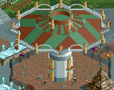
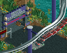
Nice screen.
Loose the double fences and some color here and there could give it some more balance, it's too much brown now.
Keep it up!
Lol at inthemanual.
This... absolutely this. I agree about the double fences too but for the most part this is great work.
Needs more brown
Hilarious! Very true though, both the floor texture and the coaster could be altered really to break it up and the fences. I'm struggling with the two left hand structures, other than that though the architecture is great.
you have a ton of missed color opportunities in this. change out that path for probably crazy pathing, reclolor the tops of those queue coverings, chage the coaster colors to that saturated brown, as well as replace the tile awning's color with that brown or something less dull, black would even work
The brown's an issue but I'm excited to see more.