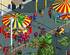
It's brown and browner. But that's ok, since all those different shapes and angles make it interesting to look at. I do suggest changing the colours of those tea cups.
Love it! I personally enjoy open spaces in any park and love how you have such an open space in this plaza. In reality, such a space would be needed (due to pictures and meet-ups) and the color is perfect in my opinion as well. I am of course assuming that the use of color will grow rapidly as guests move through the park to further pull them in.
Love the tea-cups too by the way, being an attraction and part of the scenery is always nice
Faceman you have my respect. I love how it the archy flows well even though it is very "blocky" (which can't really be avoided) I Think the only flaw I can see right off the bat are the awnings. They are all one solid color and because of its texture it looks bad. Other than that Keep up the good work.
 25-April 15
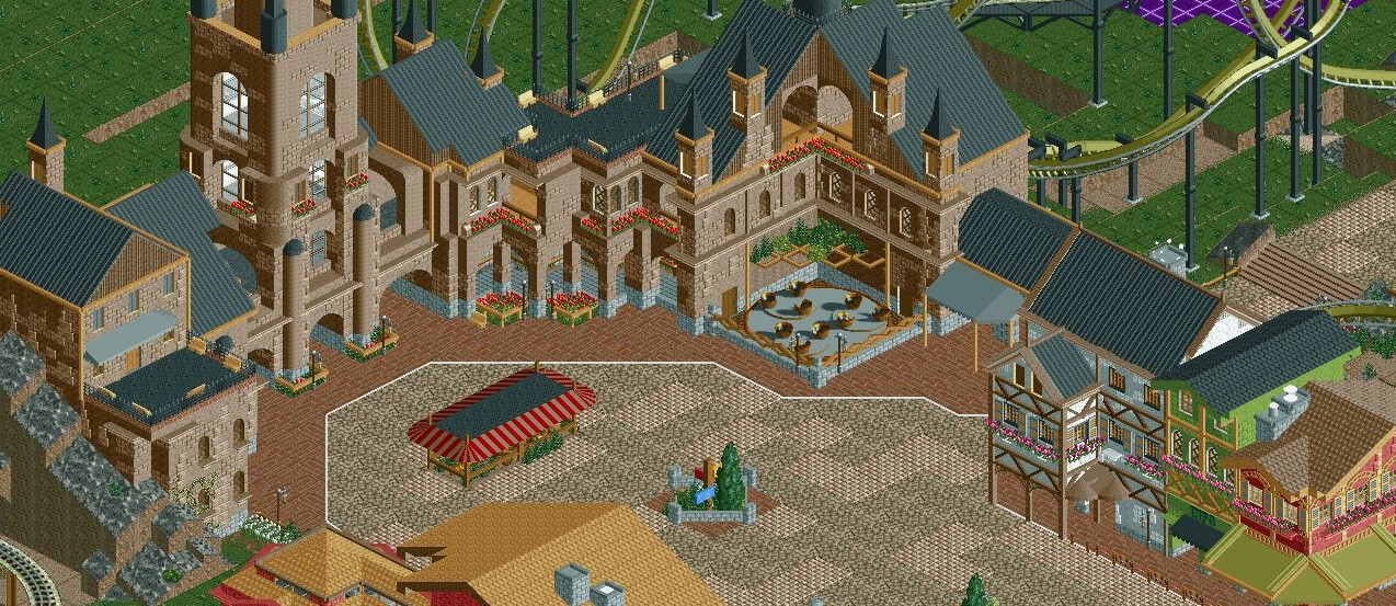
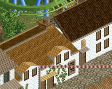
Looks great, although the massive expanse of path could maybe be improved a little with additional planters/market stalls.
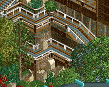
very hogwartsy
Love that.
It's brown and browner. But that's ok, since all those different shapes and angles make it interesting to look at. I do suggest changing the colours of those tea cups.
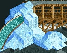
Not sure the Kumba rooves are the right texture, but the structure is certainly impressive
Shingled rooves would look sooo much better. They'd also get rid of the need for the texture underneath the 1K ones, which also isn't fitting here.
Echo : Not sure the Kumba rooves are the right texture, but the structure is certainly impressive
Love it! I personally enjoy open spaces in any park and love how you have such an open space in this plaza. In reality, such a space would be needed (due to pictures and meet-ups) and the color is perfect in my opinion as well. I am of course assuming that the use of color will grow rapidly as guests move through the park to further pull them in.
Love the tea-cups too by the way, being an attraction and part of the scenery is always nice
Faceman you have my respect. I love how it the archy flows well even though it is very "blocky" (which can't really be avoided) I Think the only flaw I can see right off the bat are the awnings. They are all one solid color and because of its texture it looks bad. Other than that Keep up the good work.