^What Liampie says is very true [especially re: zero-clearancing].
Walls have their place, although I think I understand where shotguns is coming from. In that the 1/4, 1/8 etc. objects help develop the detailing side so walls become an aesthetic choice rather than a basis for all architecture.
 11-June 15
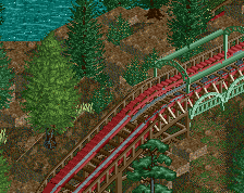
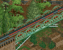
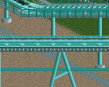
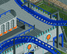
thats a super short launch track
It looks like it's rather a powered launch.
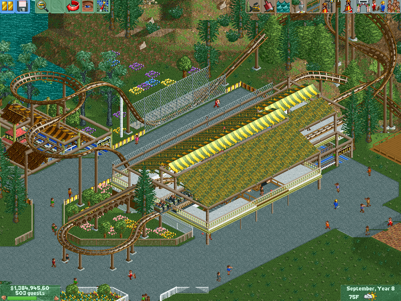
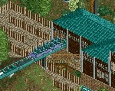
The station structure is quite boring. I don't like the colours either.
Dude, if you do what i'm about to say for a while, you'll get better extremely fast.
"Don't use walls"
Looks interesting to me. Curious how the rest of the layout looks. The station roof could use some improvement though imo.
don't listen to shotguns, walls are great
Better advice is to not forget to restore clearances after zero clearancing, as well as not putting trees through coaster track.
^What Liampie says is very true [especially re: zero-clearancing].
Walls have their place, although I think I understand where shotguns is coming from. In that the 1/4, 1/8 etc. objects help develop the detailing side so walls become an aesthetic choice rather than a basis for all architecture.
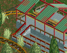
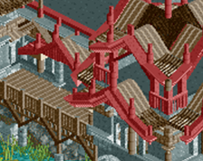
THERE AREN'T EVEN WALLS IN THIS SCREEN WHY ARE WE ARGUING?