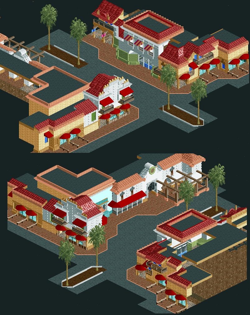
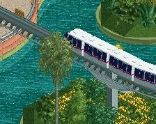
Screenshot / Entrance for a mini-park project.
-
 05-October 13
-
Americana something.
-
2 of 2
- Views 1,650
- Fans 1
- Comments 6
Community Forum Software by IP.Board


its alright. It seems like its very inspired by the hollywood/whatever styles done extremely well by robbie, pac, rrp, etc, which sort of makes it lose its charm. I think you have a lot of skill but you often spend it emulating other people's work very closely- why don't you pick something more unusual and run with that instead? maybe try your hand at san francisco instead, that could be very interesting. idk
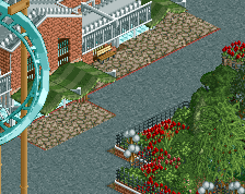
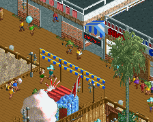
in terms of actual composition- it seems a little awkward. the buildings are maybe too short and same-y, especially texture wise and frankly, they don't really make sense- it should be sort of spanish/art deco in style but those tan buildings are awkward conglomerations of nothing really with strange roofs. The white building on the left on the top screen doesn't seem to match anything I can think of. Also, you can use more awning colors than red (and I've never been a fan of dark brown path under foliage)
hope that helps, because it seems like you have the skill to do something unique and original
Keep going buddy!
I dunno... it could be great, but currently it is looking really bland to me. It's very flat in it's coloring. I'm also missing interesting details which make it interesting a.k.a. the little touches.
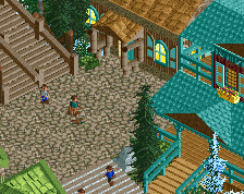
I echo gee. Needs more plant life.
Airtime Fan Offline
Don't like the brown path under the trees but wow Sho Go your getting good. Love it.