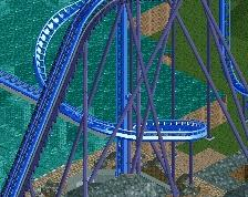
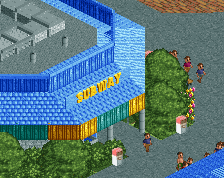
I know it's a seaworld park but looking at all the screens that you have posted on this site, don't you think it's time to try and work with more different colours for a change?
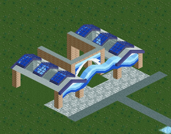
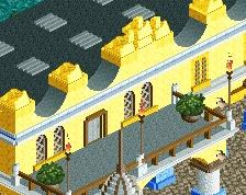
I dont know if the bricks really fit here, maybe I'm wrong but I feel its a little bit of an odd conflict. Would of liked to see a little more finished screen though, not much we can help you with until you post a finished building.
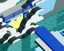
Just because the park is called SeaWorld doesn't mean everything has to look like the sea... There are a lot of sea related themes you can do to make things more varied and interesting. Ports and wharfs and shit.
White would look better than the brown bricks. And yeah, you do pretty much exclusively use these exact colors - it's something you should try to break out of. Not much else to comment on.
For the entrance I think these colors are good start to the park. I quickly looked at some images and Sea World is along these lines. Perhaps you can toss in some yellow, and maybe some colorful foliage, like 2 darker pink shades perhaps. However, make sure you include more varieties within the park itself or it will get boring and repetitive.
I'll agree with bigshootergrill here. These colors are great for a SeaWorld park entrance, but like others have said you consistently used these for literally every major subject in your park. Stadiums, coasters.. Everything is the same blue.
Manta is blue, Kraken is blue, Journey to Atlantis contains blue.. yet they all have a unique identity and vary from each other. Each is different enough and contains so many other colors in their track and surroundings, yet they all scream "SeaWorld". When you build a chain park you have to take into account so many factors to get the feel right, appropriate color is just one of many different characteristics to consider.
I decided to restart Seaworld from scratch, This is the main entrance building. Also I have been inspired by a unfinished sea world park . because I am not very good with organizing how the park will be
 22-August 15

I know it's a seaworld park but looking at all the screens that you have posted on this site, don't you think it's time to try and work with more different colours for a change?
I dont know if the bricks really fit here, maybe I'm wrong but I feel its a little bit of an odd conflict. Would of liked to see a little more finished screen though, not much we can help you with until you post a finished building.
hulkpower25 Offline
like what colors because if you see a seawolrd park there its a lot of blue. what colors for entrance building
I think the bricks go fine with them.
White would look better than the brown bricks. And yeah, you do pretty much exclusively use these exact colors - it's something you should try to break out of. Not much else to comment on.
yeah I actually remember seaworld being pretty colorful. coral reefs and all that tropical stuff
I think it looks fine for a main entrance tbh. Just needs finishing. Foliage will help loads.
hulkpower25 Offline
thanks guys
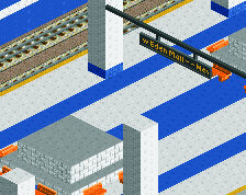
I am working on the main entrance
don't be afraid of new colors, post finished or more finished screens. I like whats there though
For the entrance I think these colors are good start to the park. I quickly looked at some images and Sea World is along these lines. Perhaps you can toss in some yellow, and maybe some colorful foliage, like 2 darker pink shades perhaps. However, make sure you include more varieties within the park itself or it will get boring and repetitive.
Manta is blue, Kraken is blue, Journey to Atlantis contains blue.. yet they all have a unique identity and vary from each other. Each is different enough and contains so many other colors in their track and surroundings, yet they all scream "SeaWorld". When you build a chain park you have to take into account so many factors to get the feel right, appropriate color is just one of many different characteristics to consider.